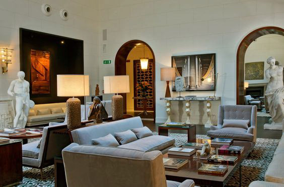
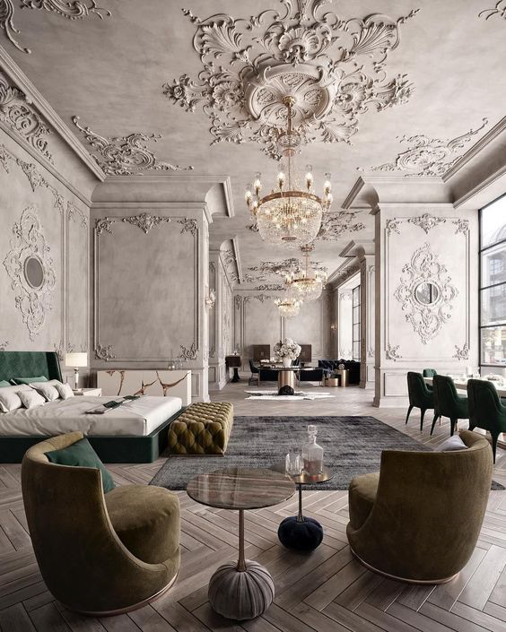
Client profile
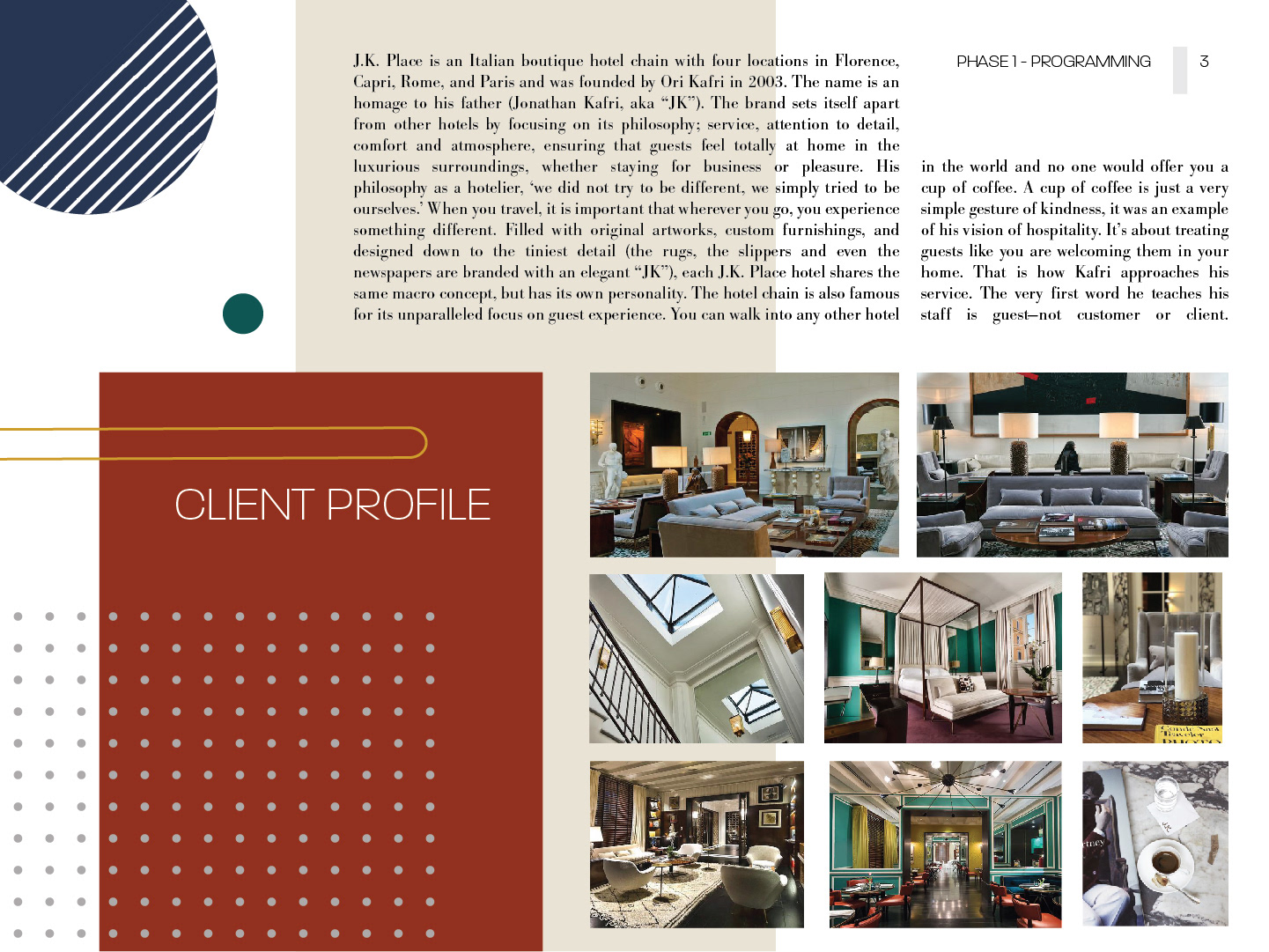
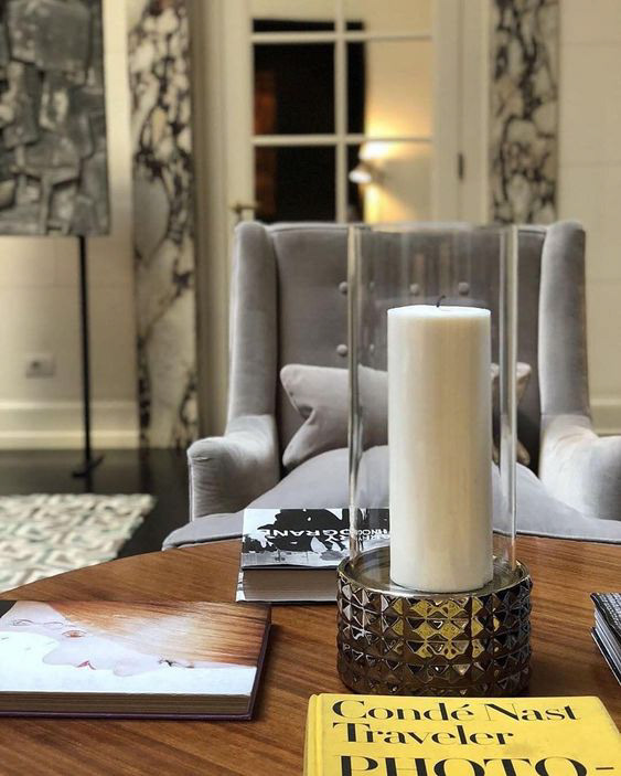
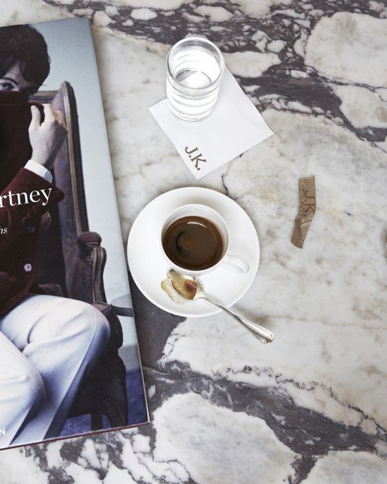
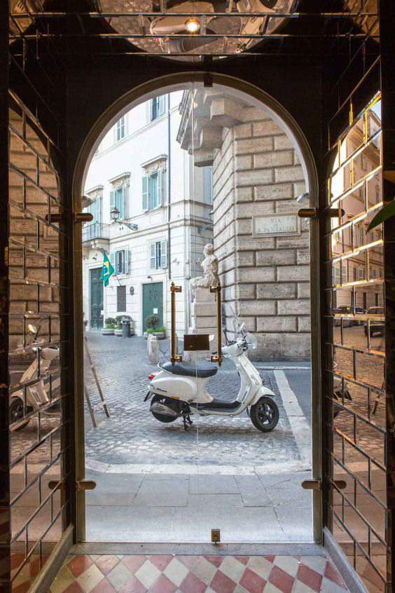
J.K. Place is an Italian boutique hotel chain with four locations in Florence, Capri, Rome, and Paris and was founded by Ori Kafri in 2003. The name is an homage to his father (Jonathan Kafri, aka “JK”). The brand sets itself apart from other hotels by focusing on its philosophy; service, attention to detail comfort and atmosphere, ensuring that guests feel totally at home in the luxurious surroundings, whether staying for business or pleasure. His philosophy as a hotelier, ‘we did not try to be different, we simply tried to be ourselves.’ When you travel, it is important that wherever you go, you experience something different. Filled with original artworks, custom furnishings, and designed down to the tiniest detail (the rugs, the slippers and even the newspapers are branded with an elegant “JK”), each J.K. Place hotel shares the same macro concept, but has its own personality. The hotel chain is also famous for its unparalleled focus on guest experience. You can walk into any other hotel in the world and no one would offer you a cup of coffee. A cup of coffee is just a very simple gesture of kindness, it was an example of his vision of hospitality. It’s about treating guests like you are welcoming them in your home. That is how Kafri approaches his service. The very first word he teaches his staff is guest—not customer or client.

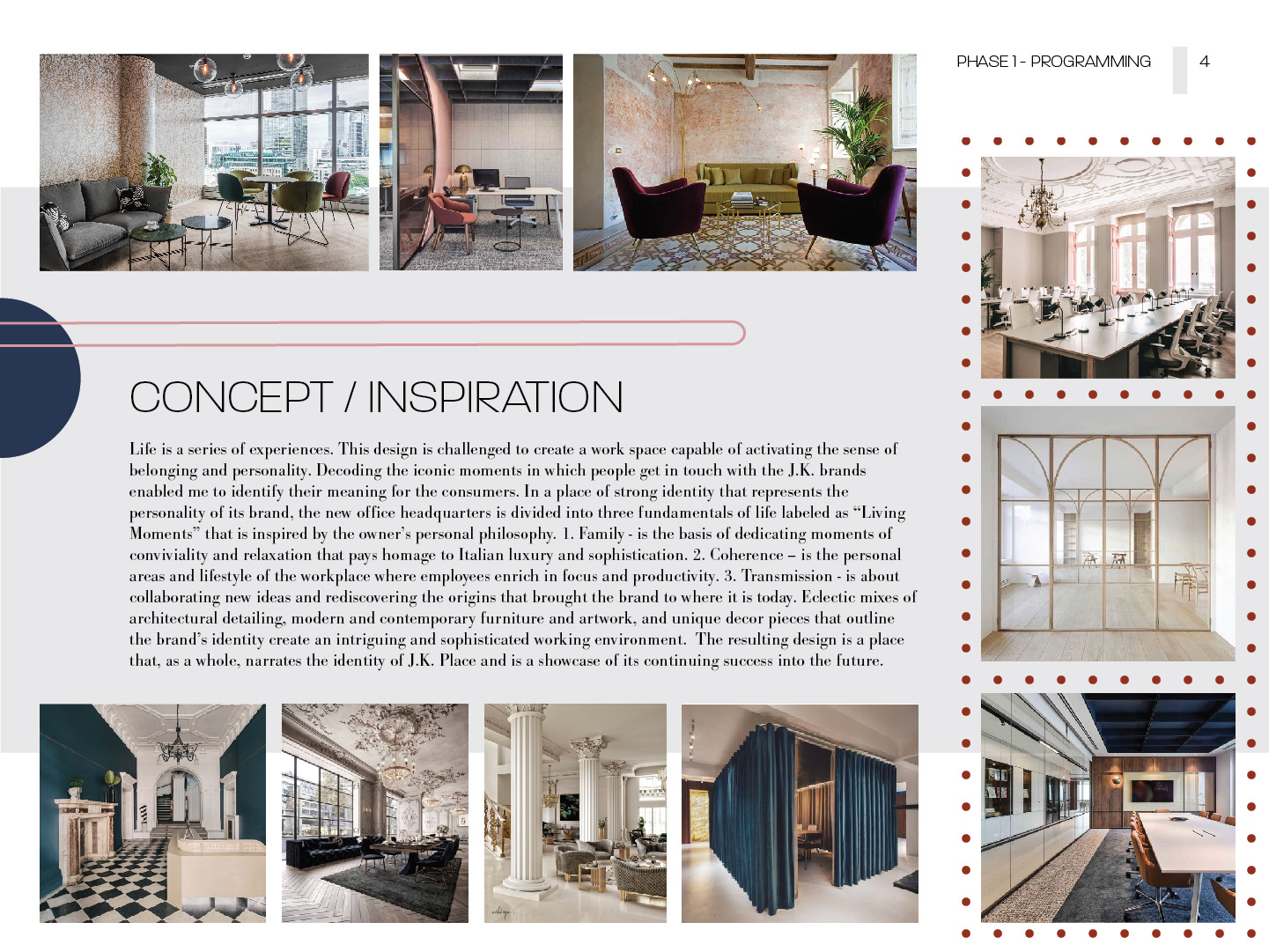
Concept/Inspiration
Life is a series of experiences. This design is challenged to create a work space capable of activating the sense of belonging and personality. Decoding the iconic moments in which people get in touch with the J.K. Hotel brands enabled me to identify their meaning for the consumers. In a place of strong identity that represents the personality of its brand, the new office headquarters is divided into three fundamentals of life labeled as “Living Moments” that is inspired by the owner’s personal philosophy:
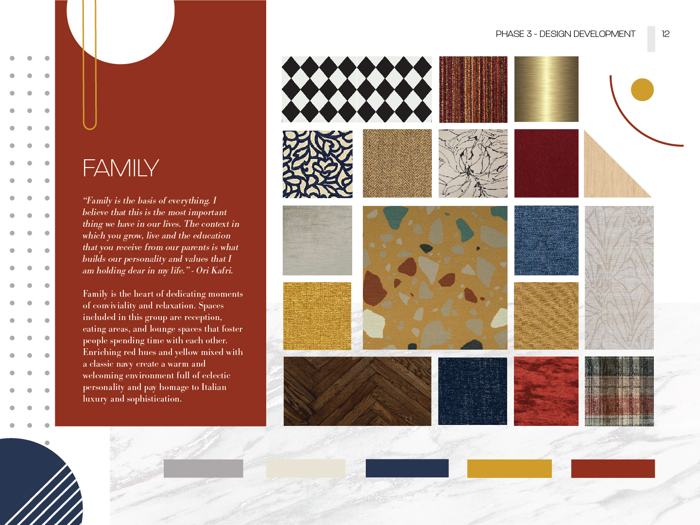
1. Family - is the heart of dedicating moments of conviviality and relaxation. Spaces included in this group are reception, eating areas, and lounge spaces that foster people spending time with each other. Enriching red hues and yellow mixed with a classic navy create a warm and welcoming environment full of eclectic personality and pay homage to Italian luxury and sophistication.
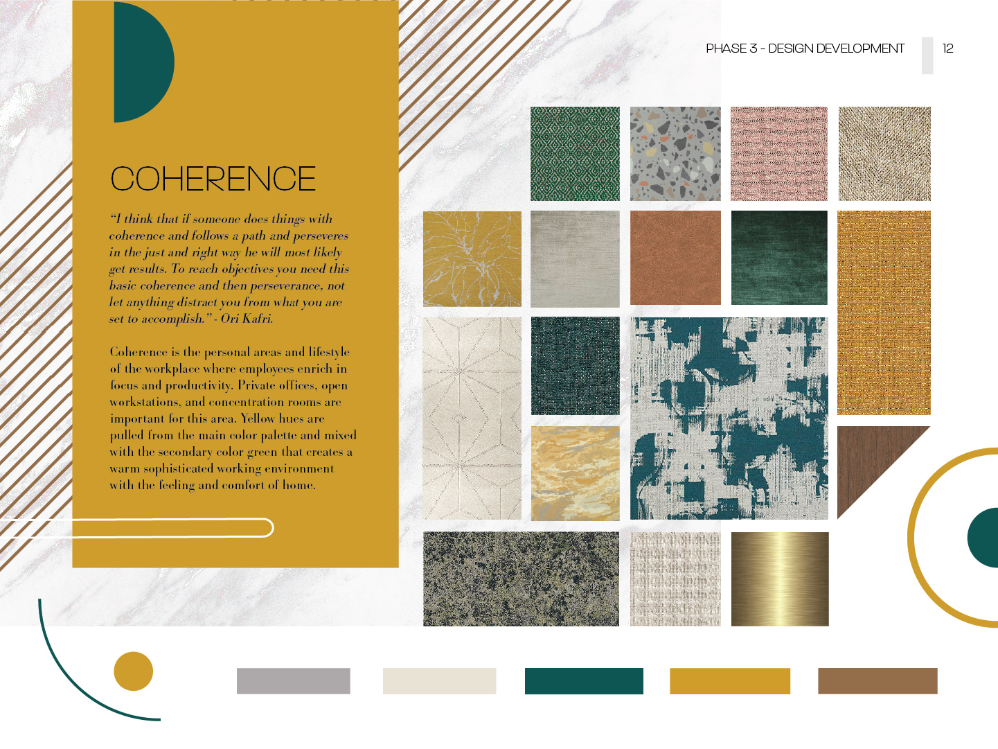
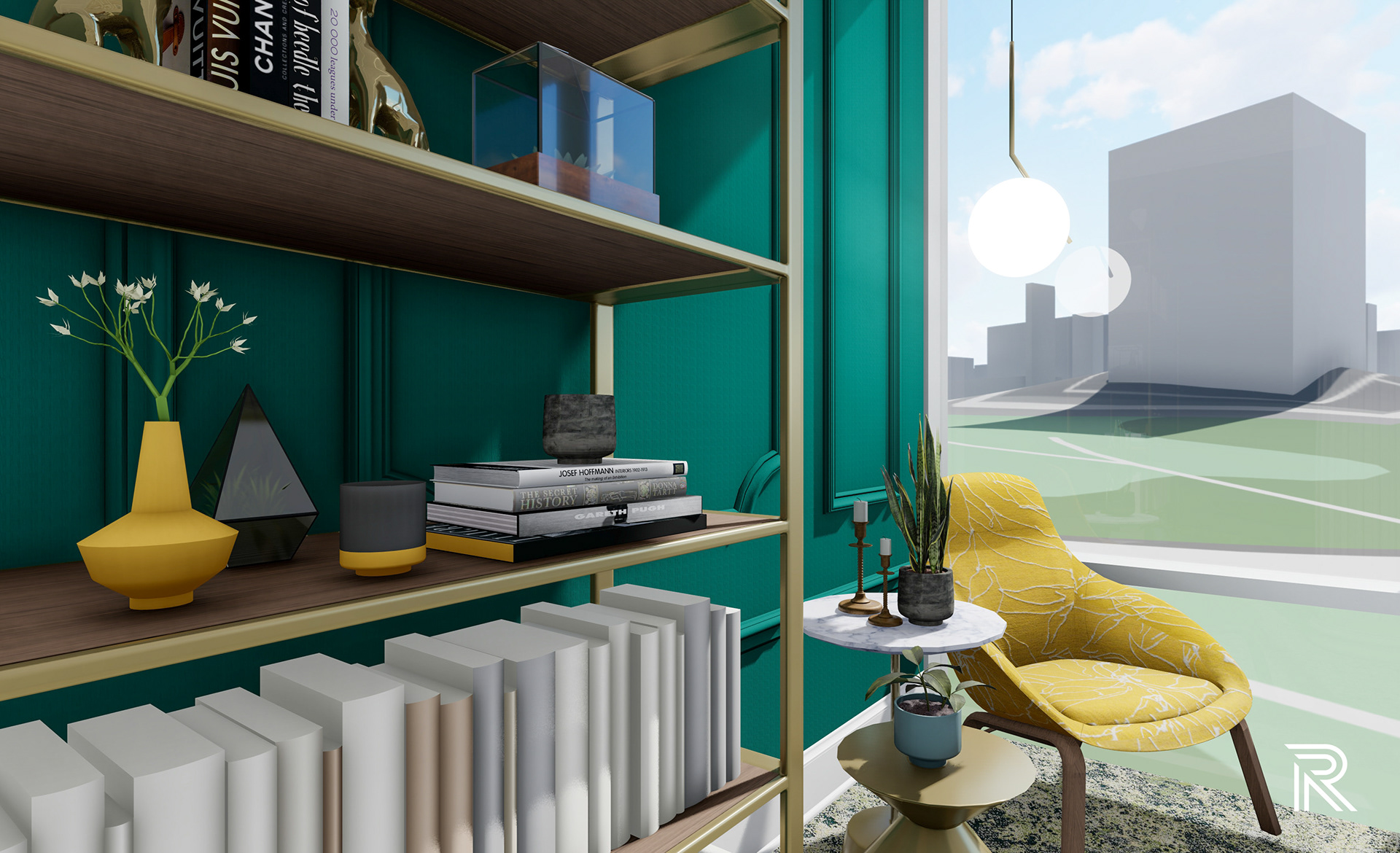
2. Coherence - is the personal areas and lifestyle of the workplace where employees enrich in focus and productivity. Private offices, open workstations, and concentration rooms are important for this area. Yellow hues are pulled from the main color palette and mixed with the secondary color green that creates a warm sophisticated working environment with the feeling and comfort of home.
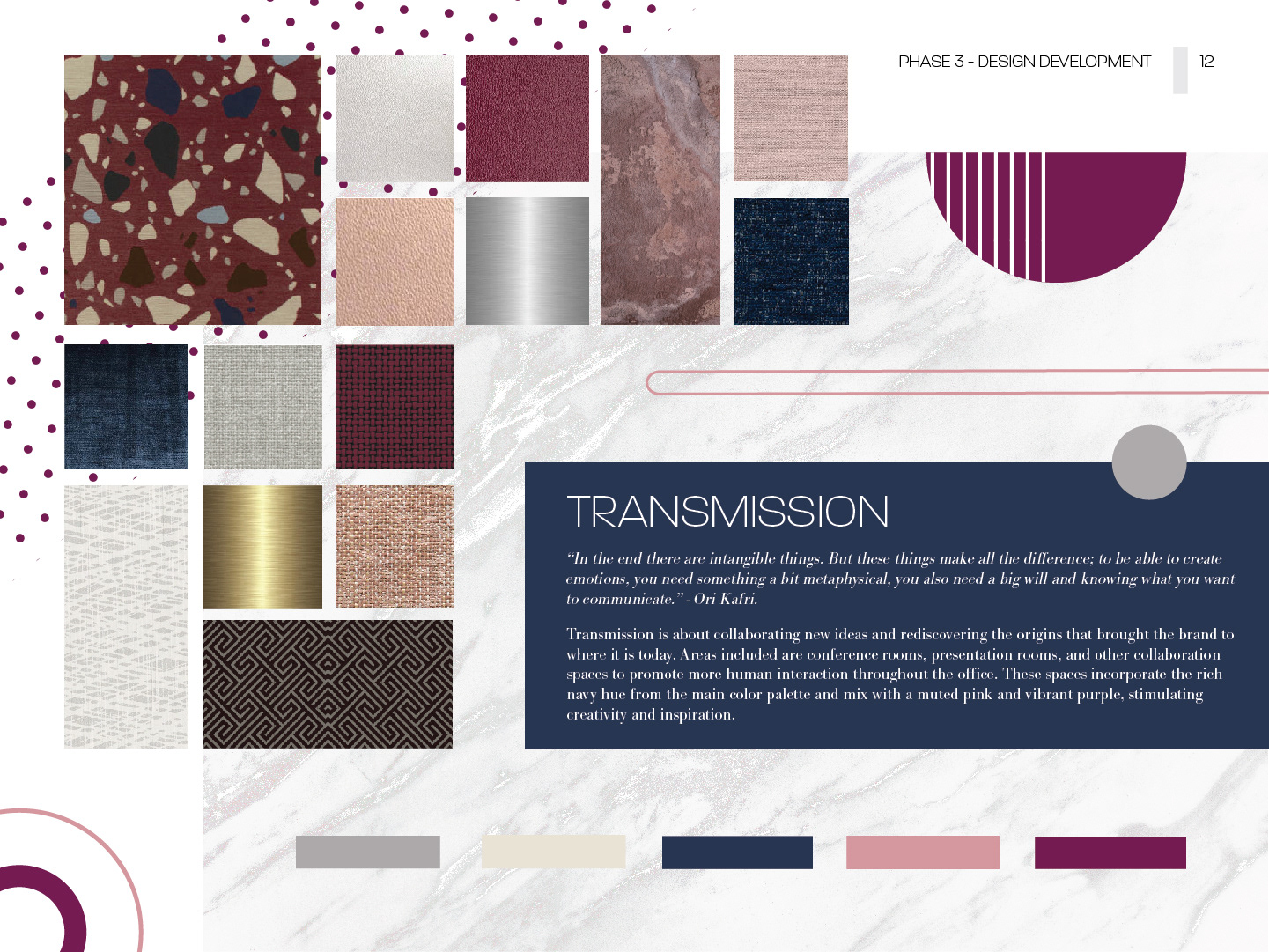
3. Transmission - is about collaborating new ideas and rediscovering the origins that brought the brand to where it is today. Areas included are conference rooms, presentation rooms, and other collaboration spaces to promote more human interaction throughout the office. These spaces incorporate the rich navy hue from the main color palette and mix with a muted pink and vibrant purple, stimulating creativity and inspiration.
Eclectic mixes of architectural detailing, modern and contemporary furniture and artwork, and unique decor pieces that outline the brand’s identity create an intriguing and sophisticated working environment. The resulting design is a place that, as a whole, narrates the identity of J.K. Place and is a showcase of its continuing success into the future.

Headquarters location
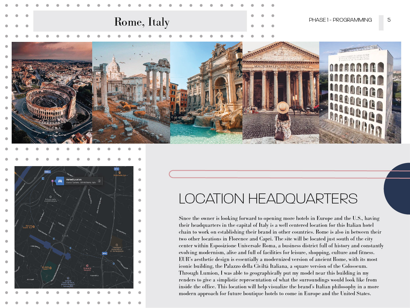
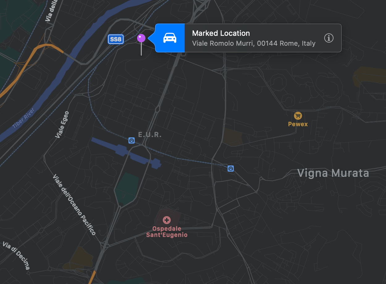
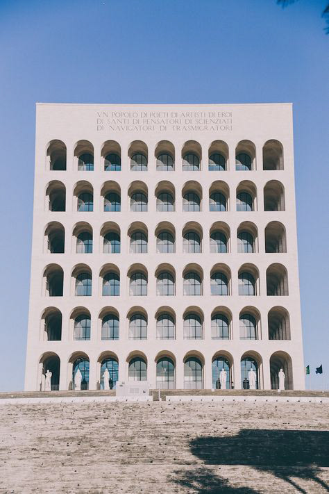
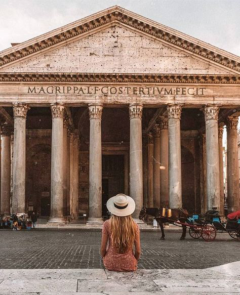
Since the owner is looking forward to opening more hotels in Europe and the U.S., having their headquarters in the capital of Italy is a well centered location for this Italian hotel chain to work on establishing their brand in other countries. Rome is also in between their two other locations in Florence and Capri. The site will be located just south of the city center within Esposizione Universale Roma, a business district full of history and constantly evolving modernism, alive and full of facilities for leisure, shopping, culture and fitness. E.U.R.’s aesthetic design is essentially a modernized version of ancient Rome, with its most iconic building, the Palazzo della Civiltà Italiana, a square version of the Colosseum. Through Lumion, I was able to geographically put my model near this building in my renders to give a simplistic representation of what the surroundings would look like from inside the office. This location will help visualize the brand’s Italian philosophy in a more modern approach for future boutique hotels to come in Europe and the United States.


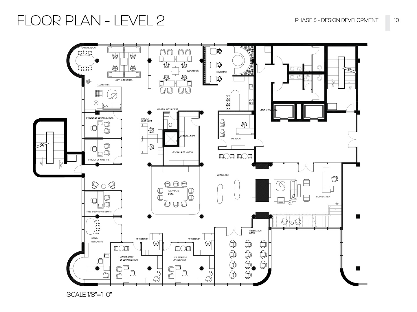
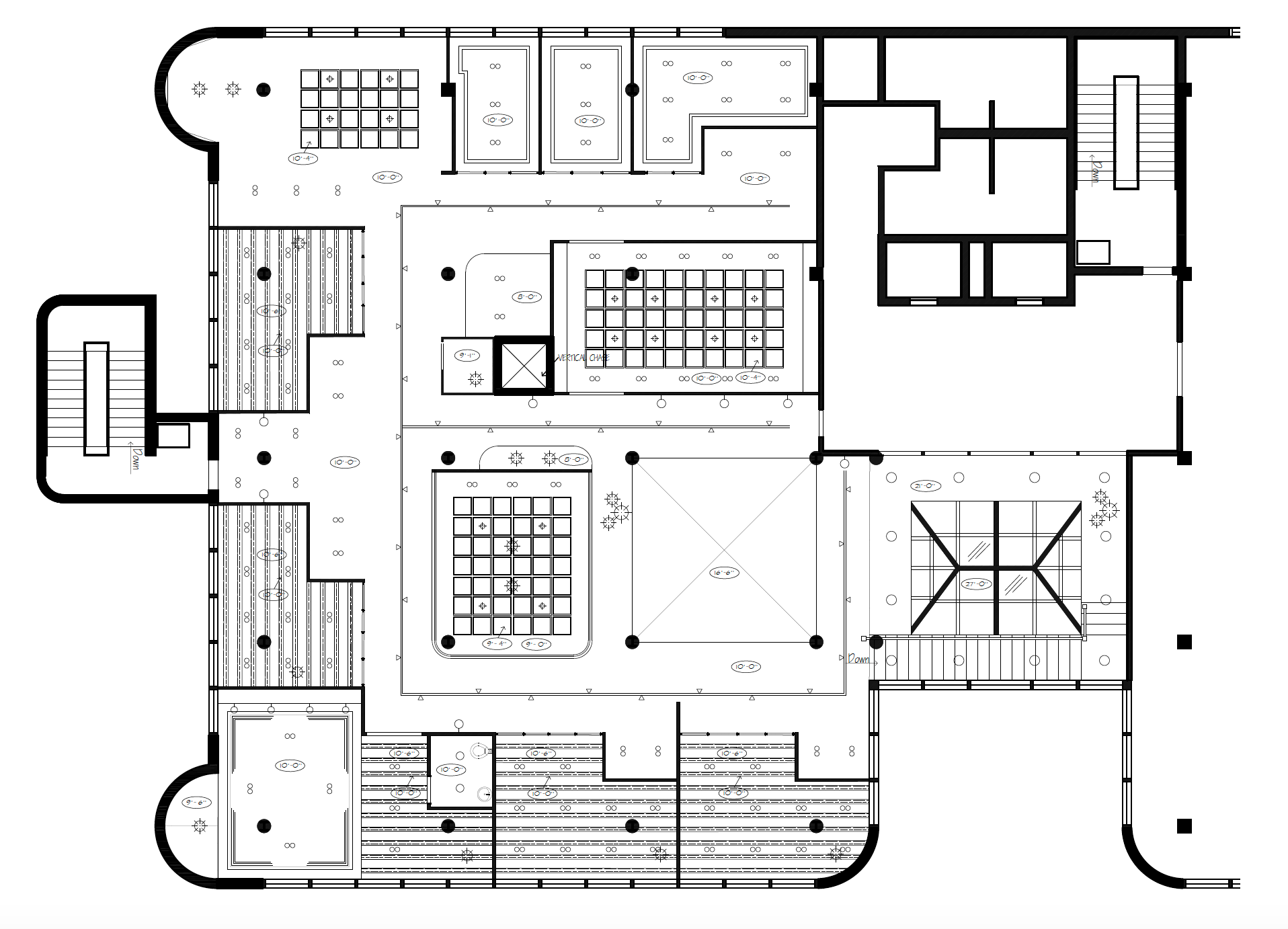
floor plan - level 2
*Note: Level 1 to be occupied by local food and retail tenants.
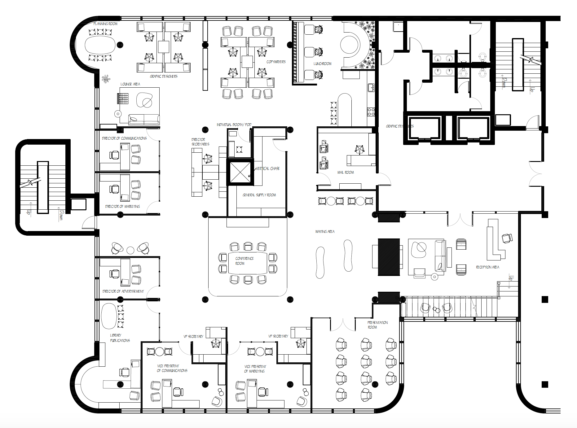
Scale 1/8" = 1'-0"
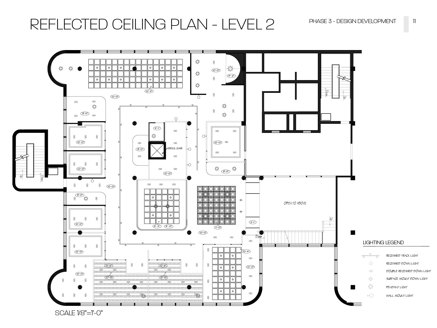
Reflected ceiling plan - level 2

Scale 1/8" = 1'-0"
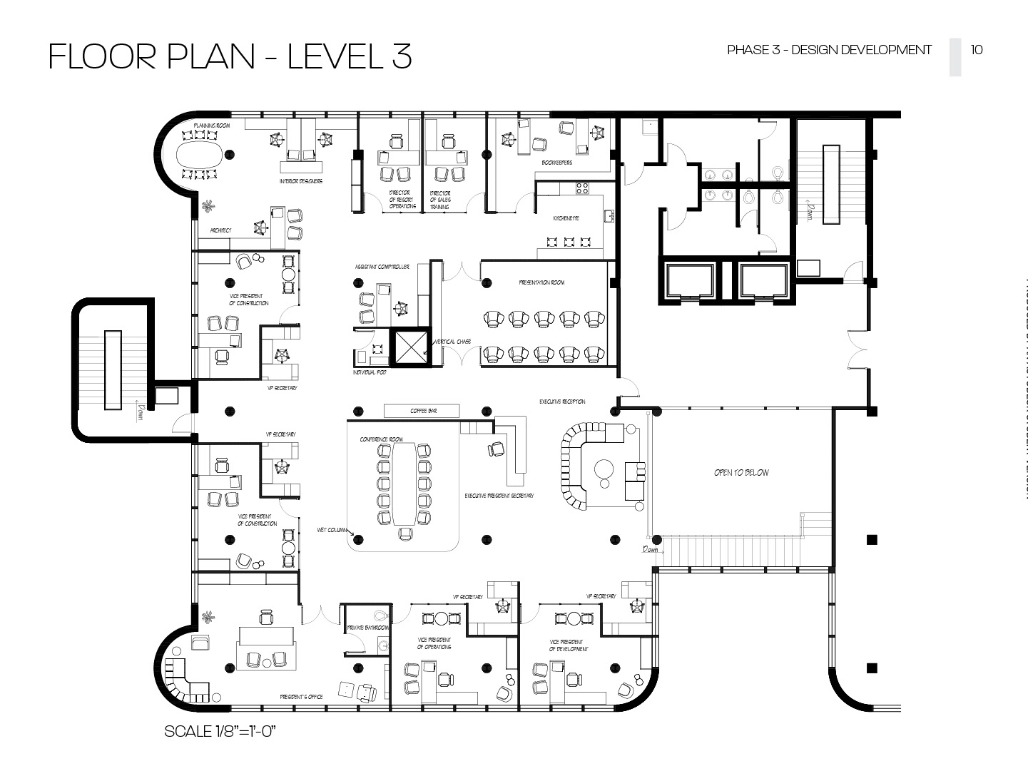
Floor plan - level 3
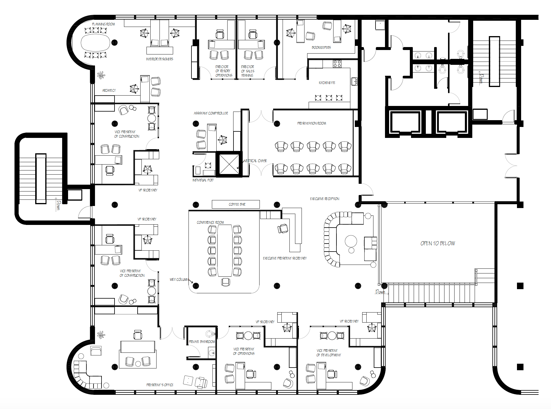
Scale 1/8" = 1'-0"
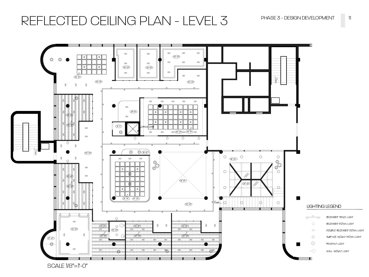
Reflected ceiling plan - level 3
Scale 1/8" = 1'-0"
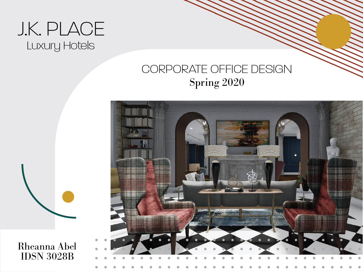
Final design and renderings
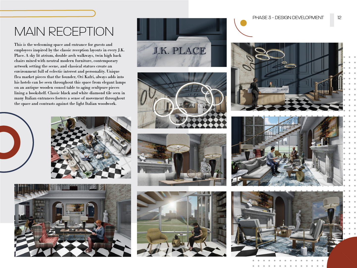
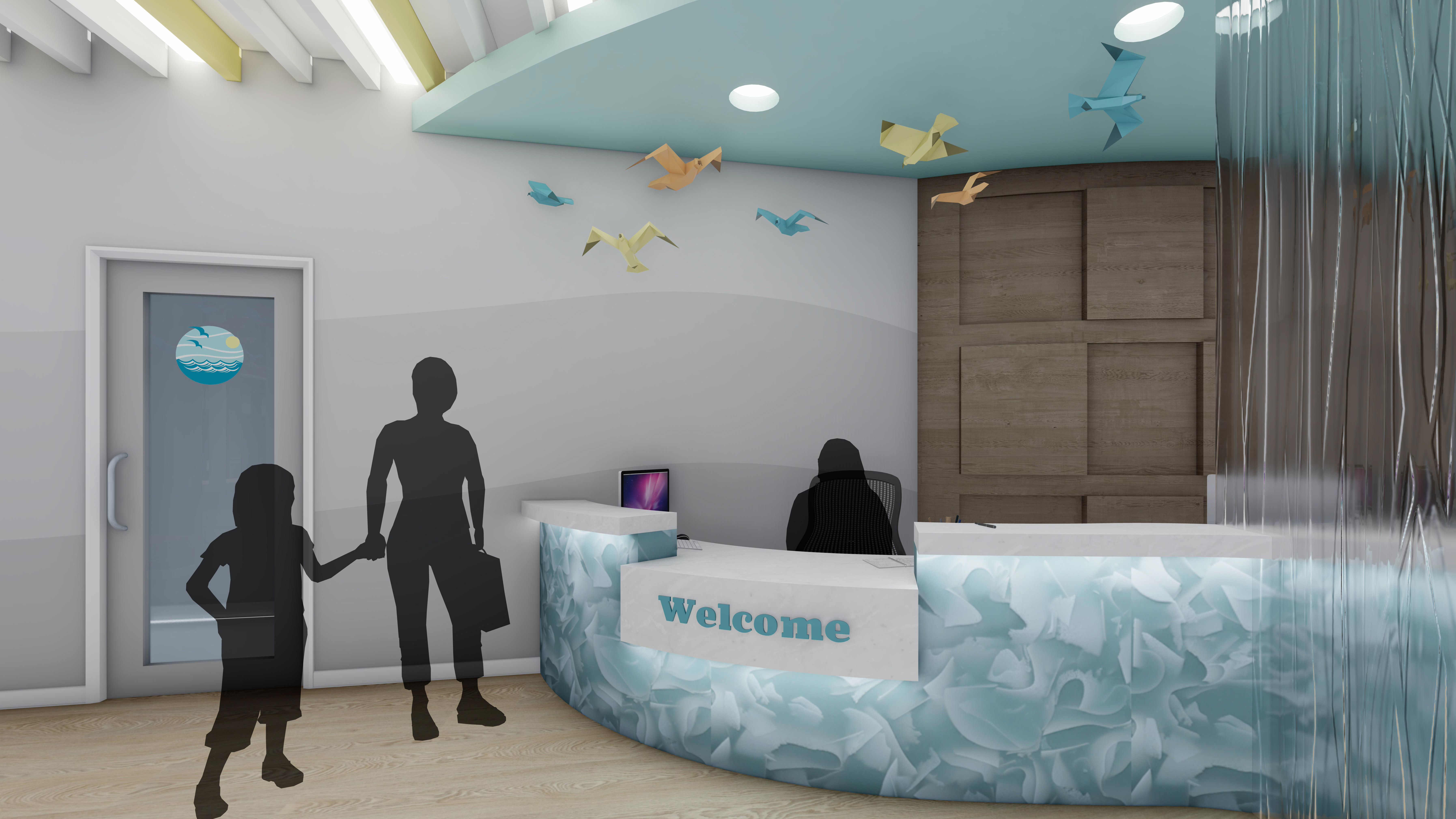
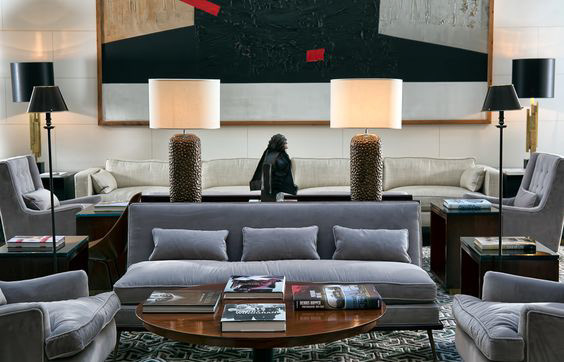
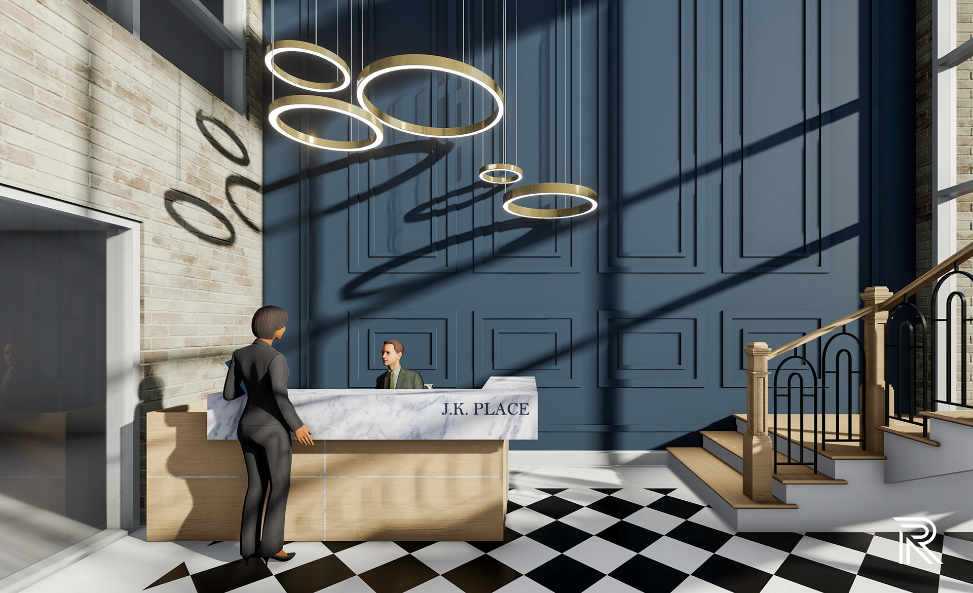
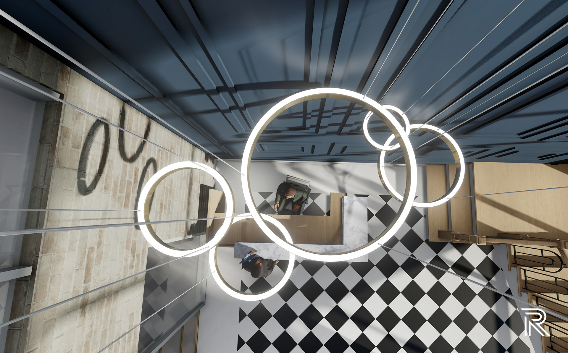
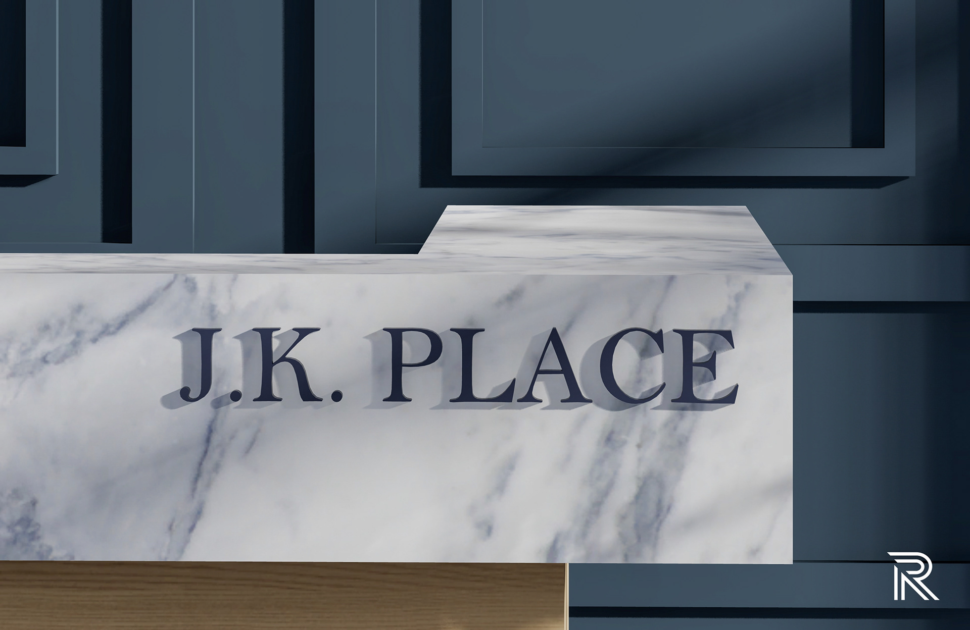
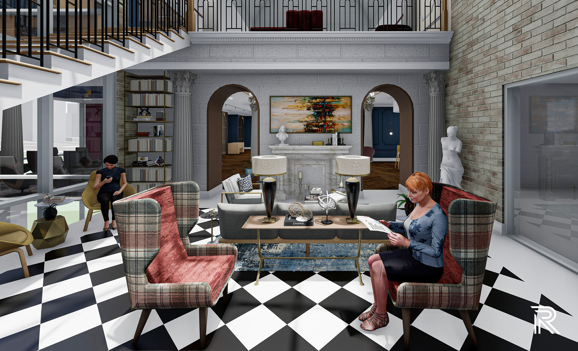
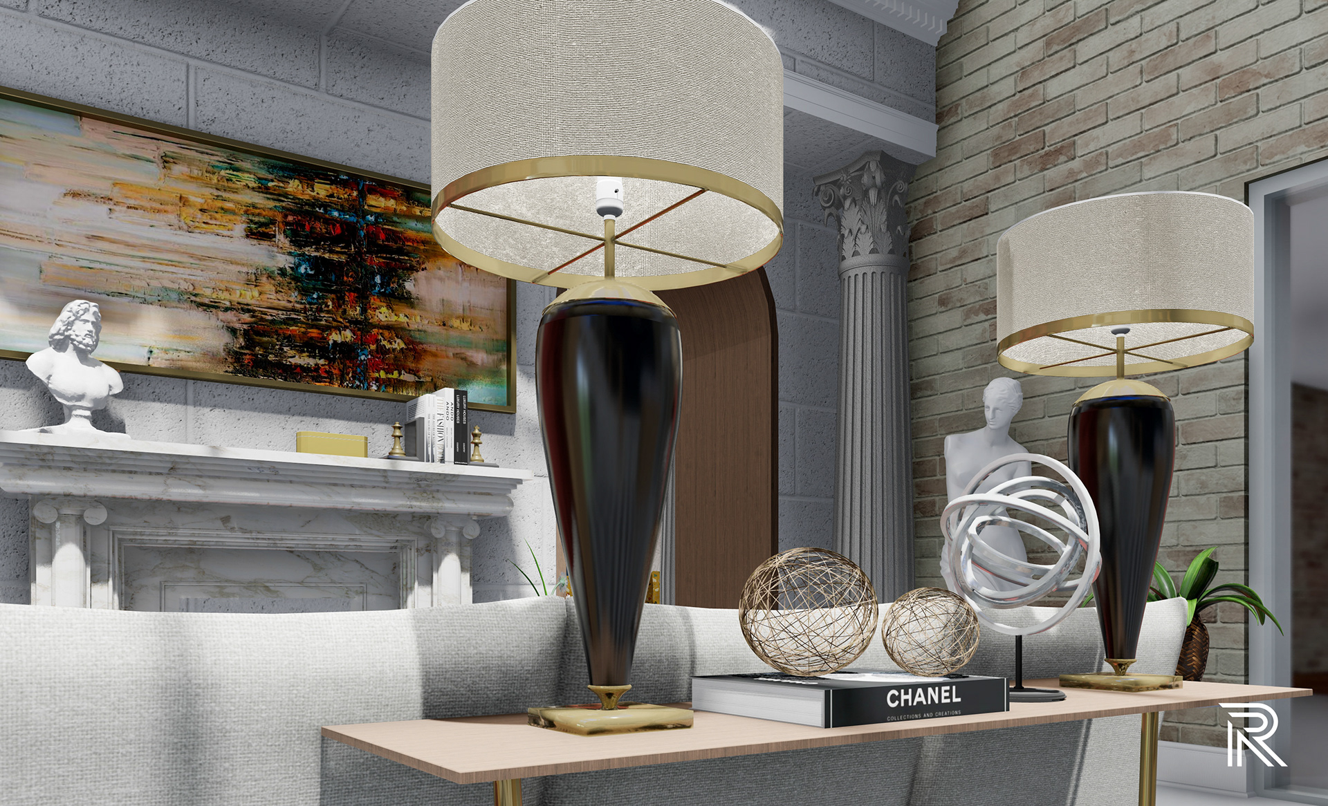
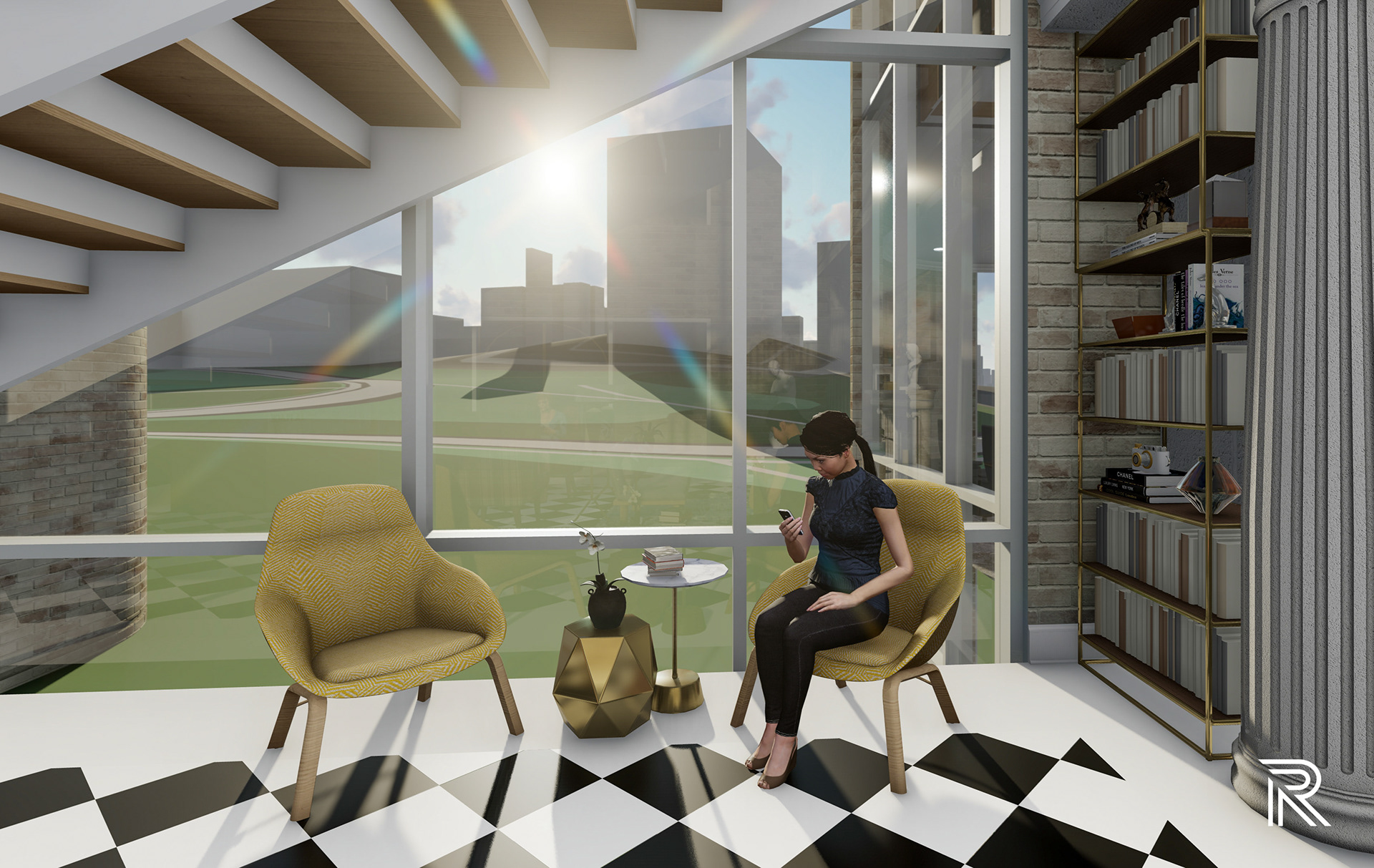
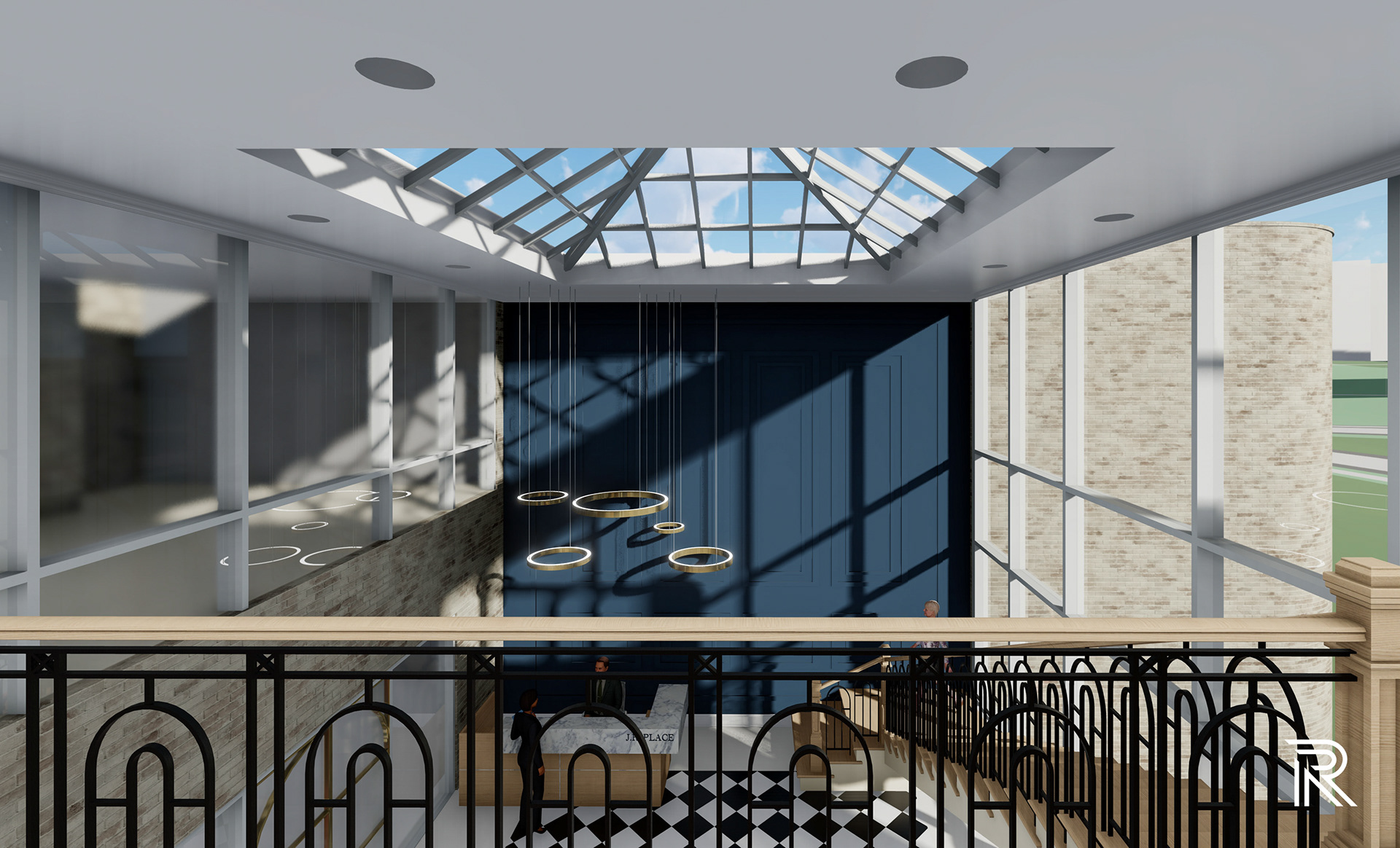
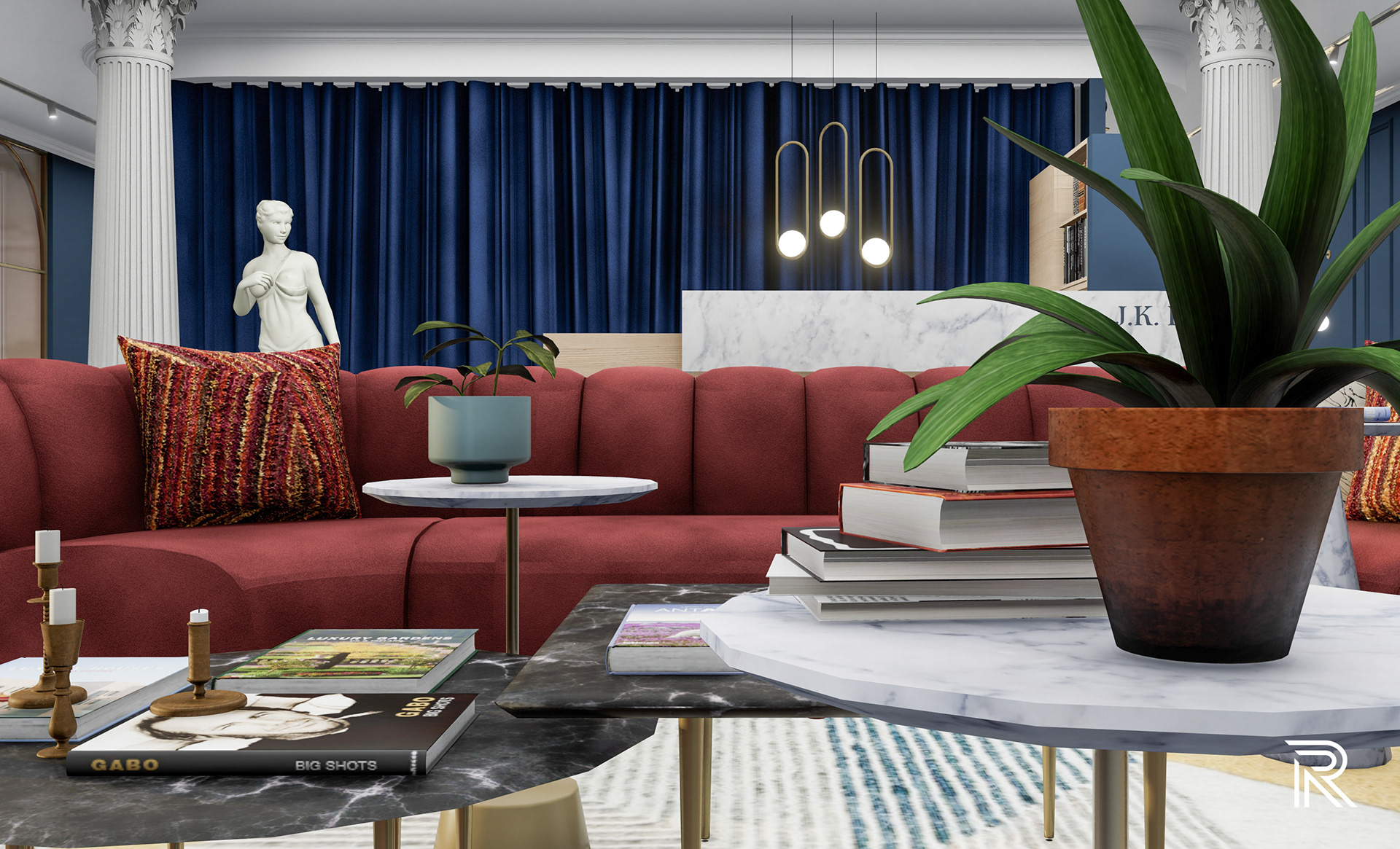
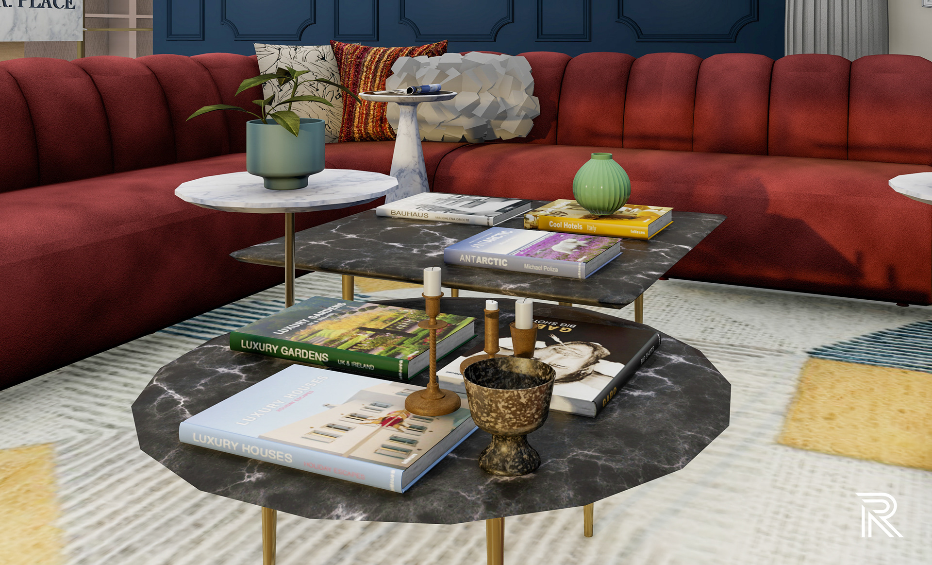
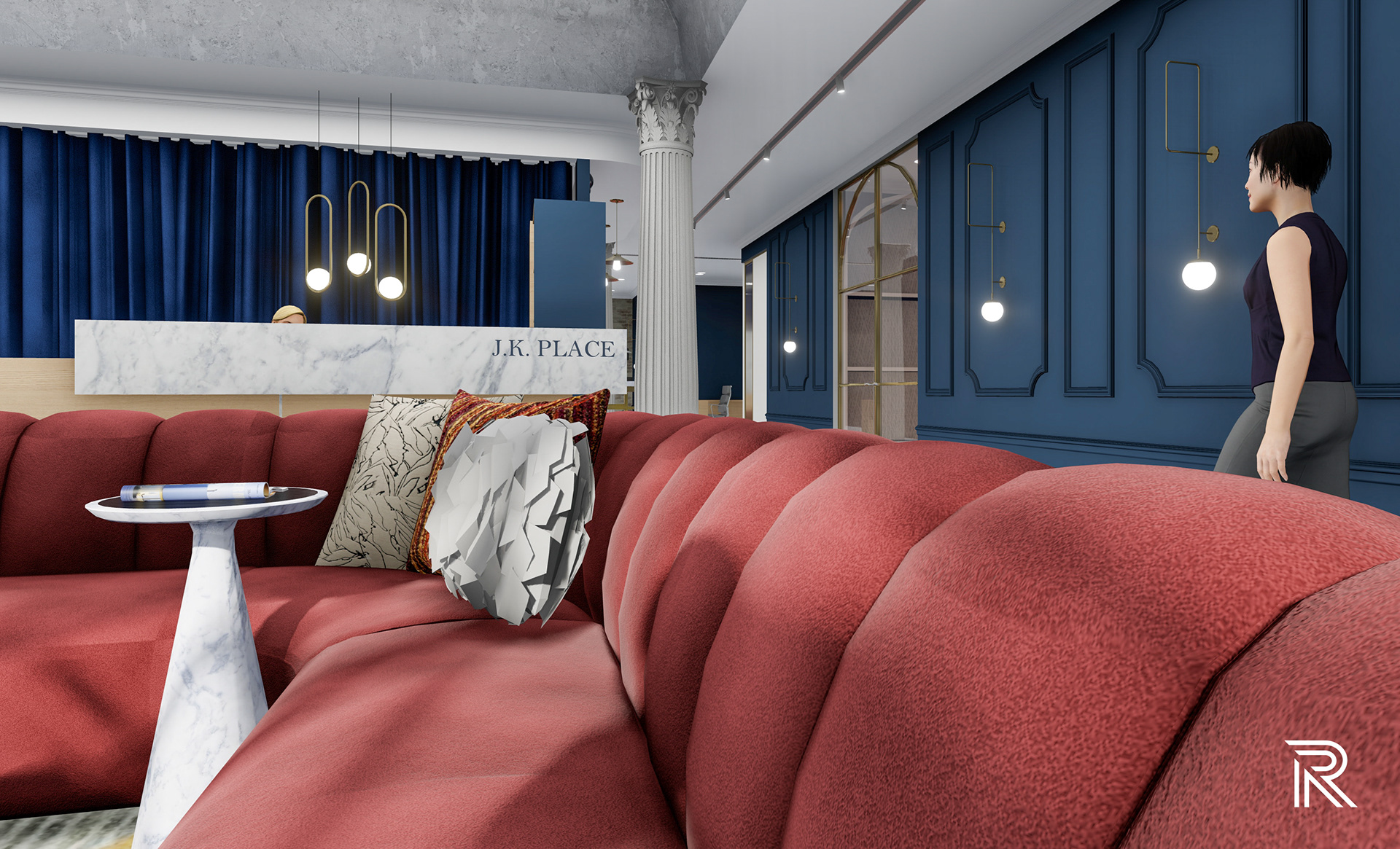
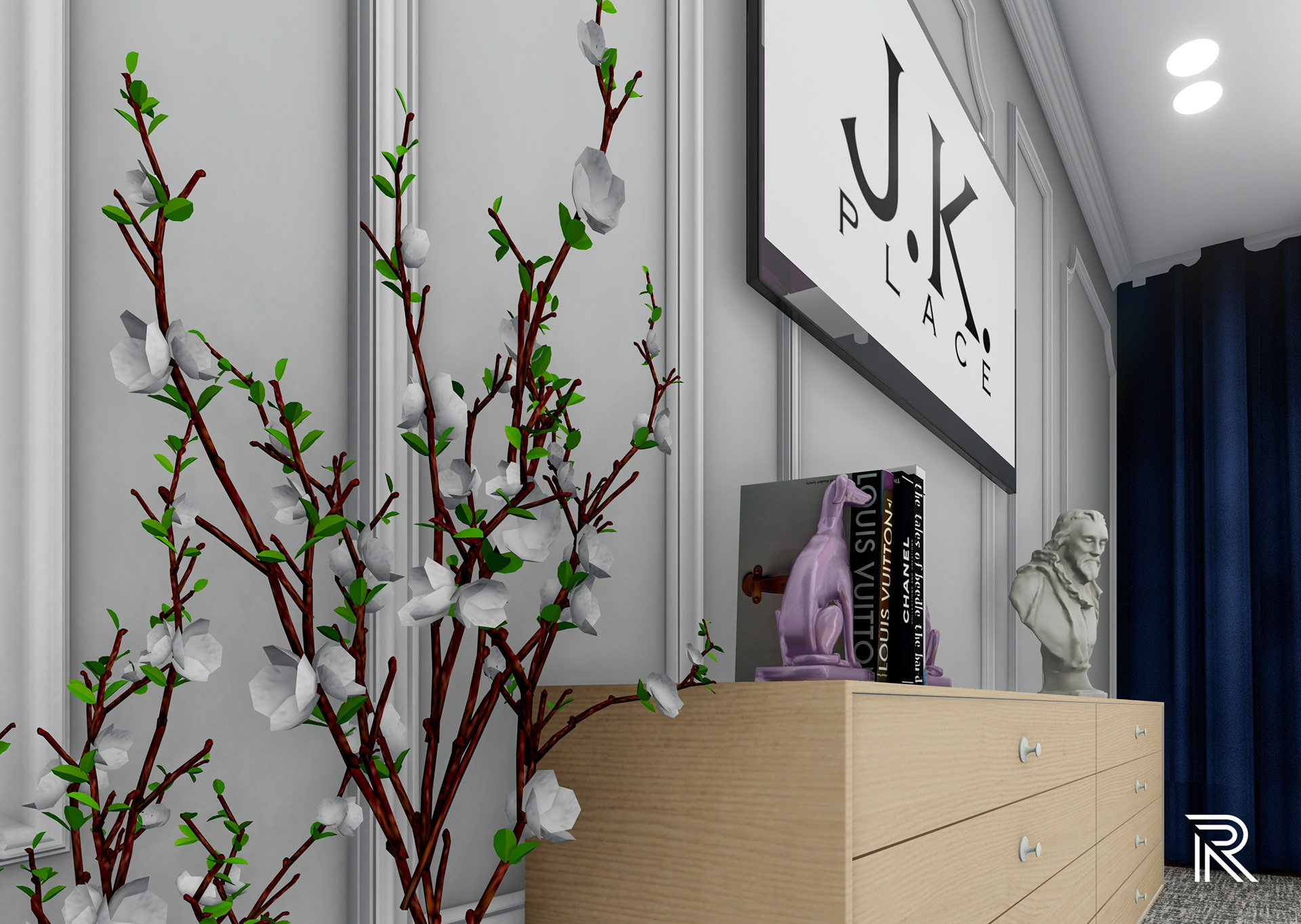
MAIN RECEPTIOn
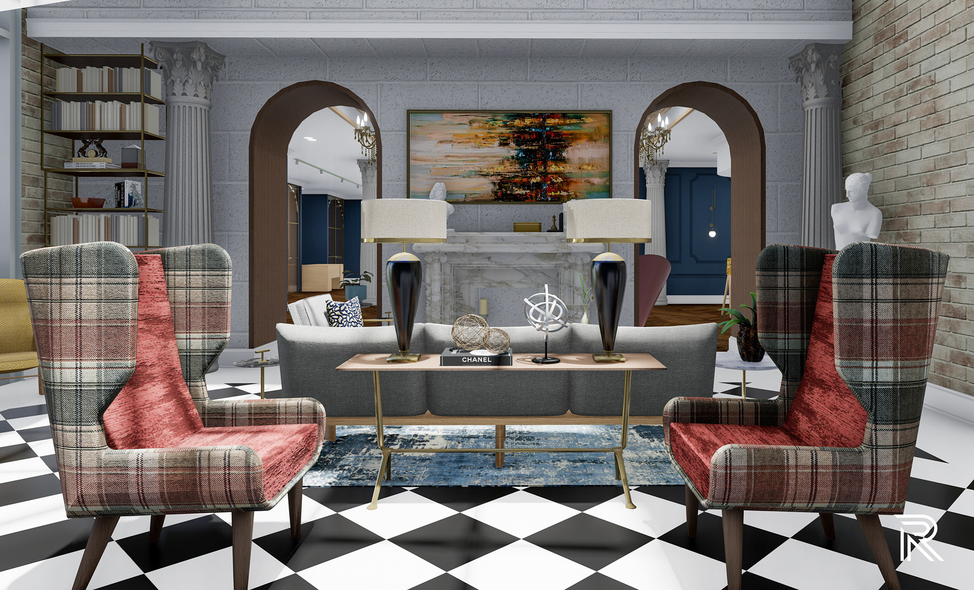
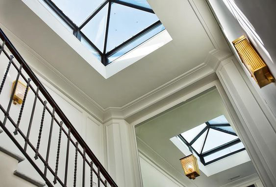
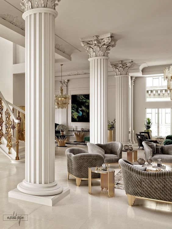
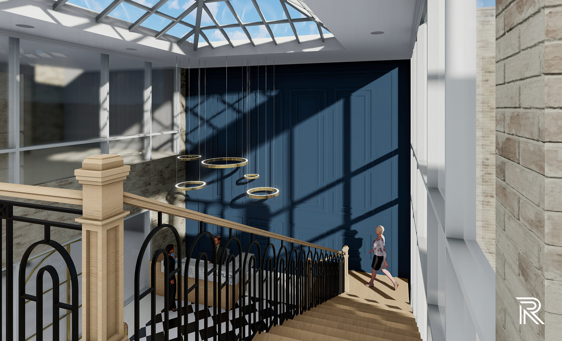
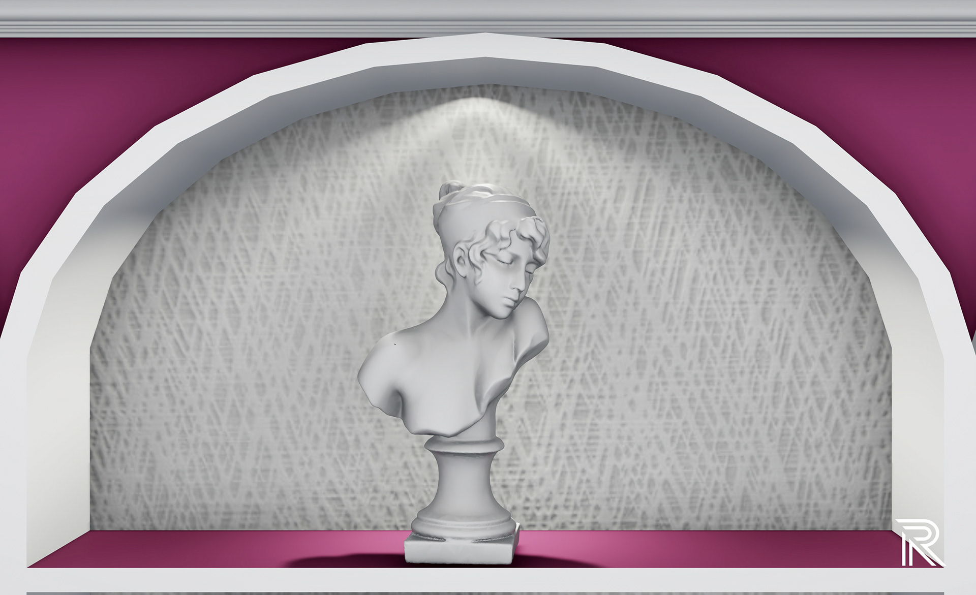
This is the welcoming space and entrance for guests and employees inspired by the classic reception layouts in every J.K. Place. A sky lit atrium, double arch walkways, twin high back chairs mixed with neutral modern furniture, contemporary artwork setting the scene, and classical statues create an environment full of eclectic interest and personality. Unique flea market pieces that the founder, Ori Kafri, always adds into his hotels can be seen throughout this space from elegant lamps on an antique wooden console table to aging sculpture pieces lining a bookshelf. Classic black and white diamond tile seen in many Italian entrances fosters a sense of movement throughout the space and contrasts against the light Italian woodwork.
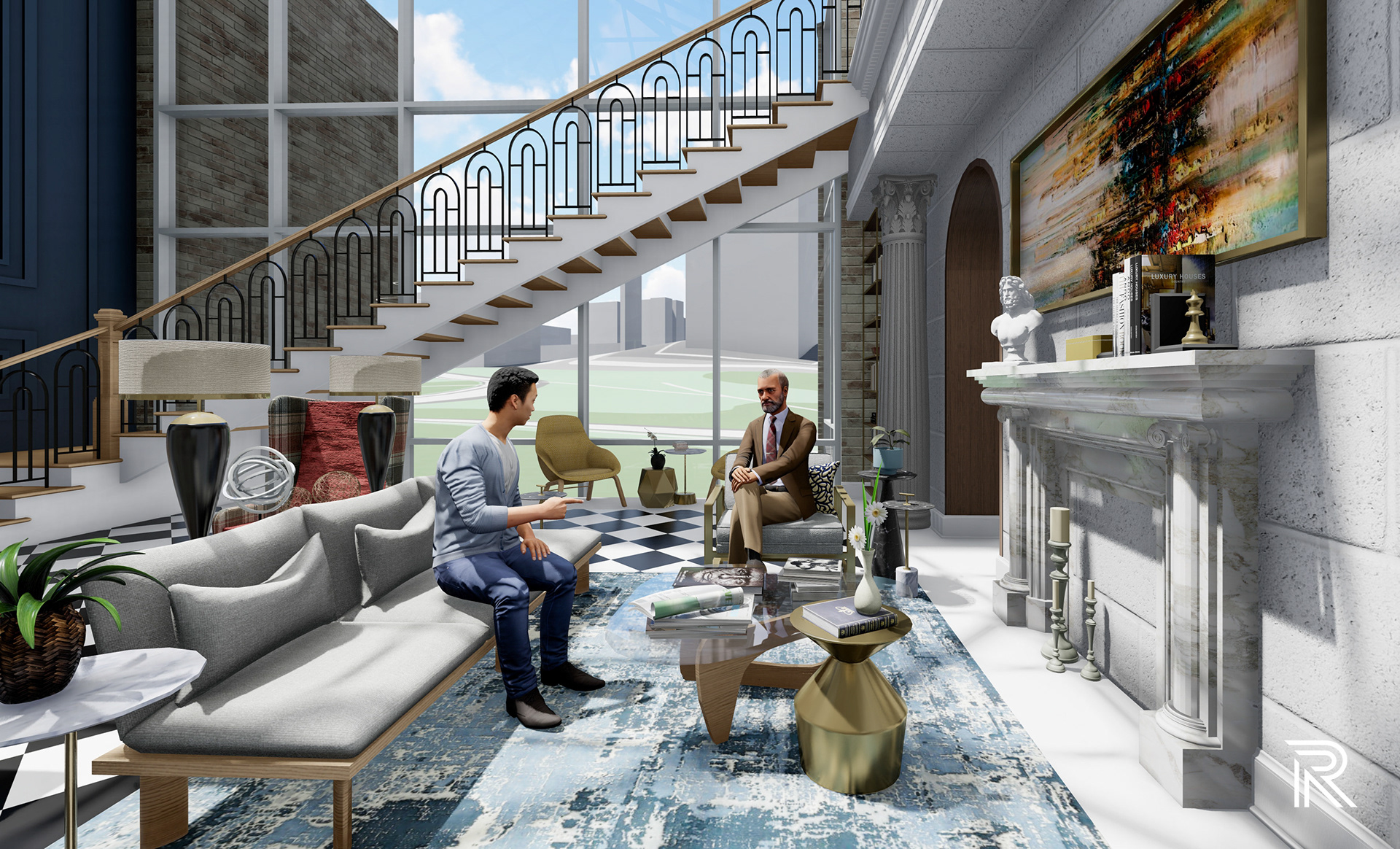
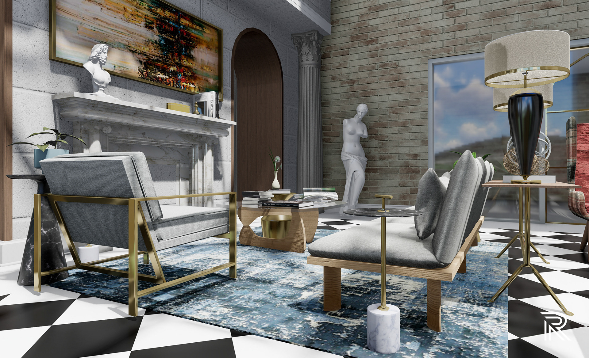

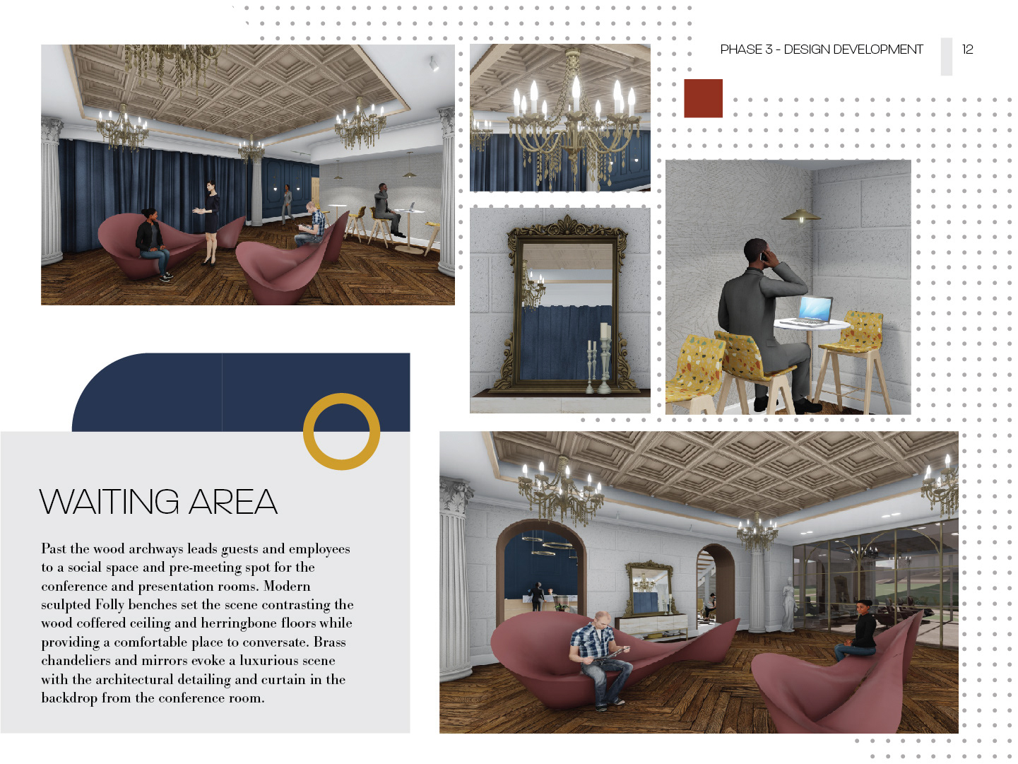
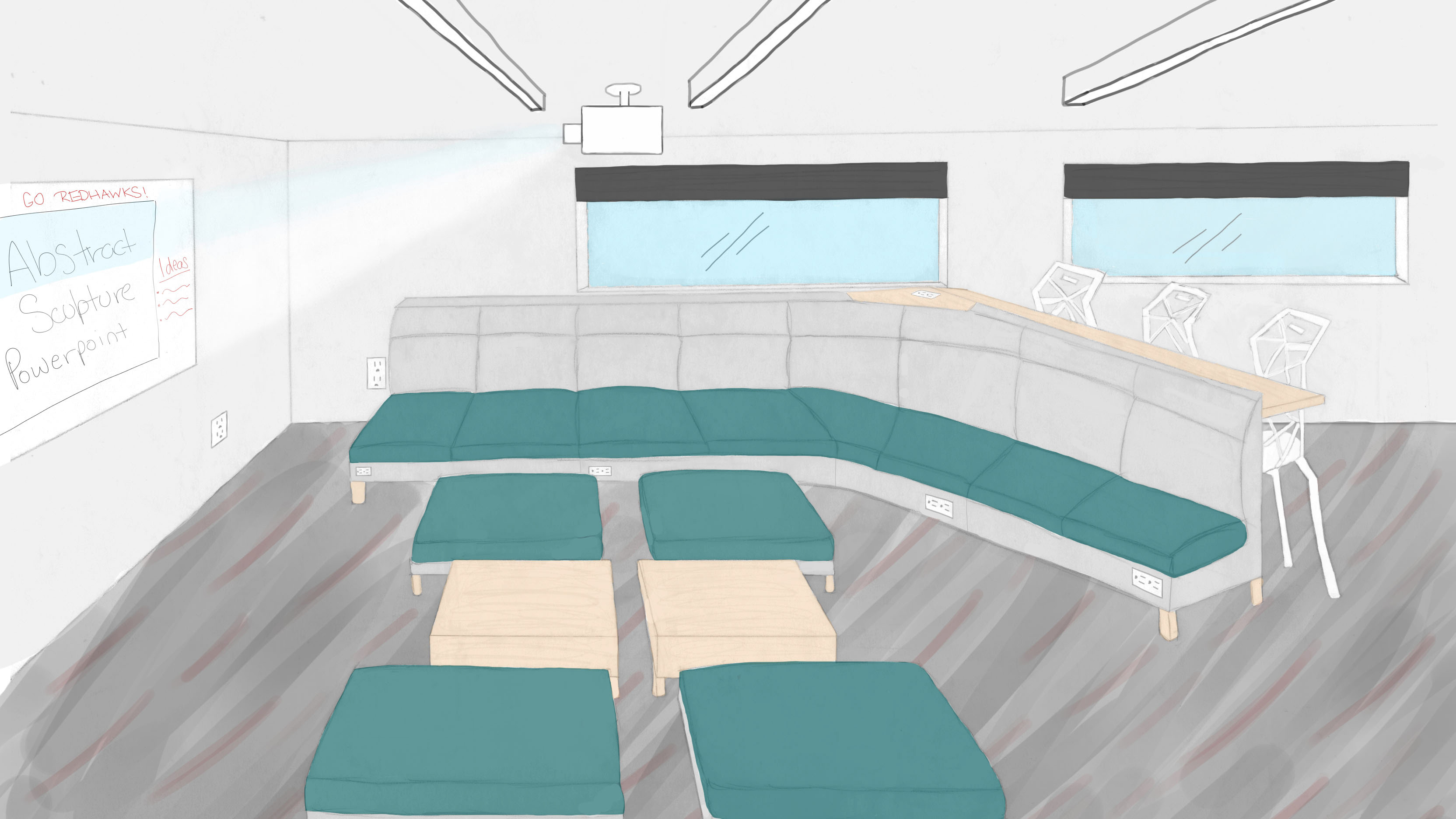
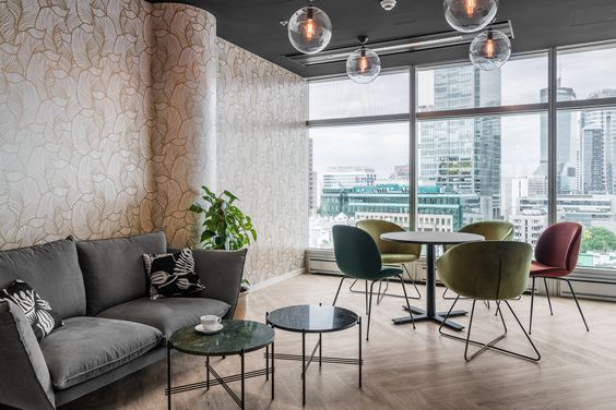
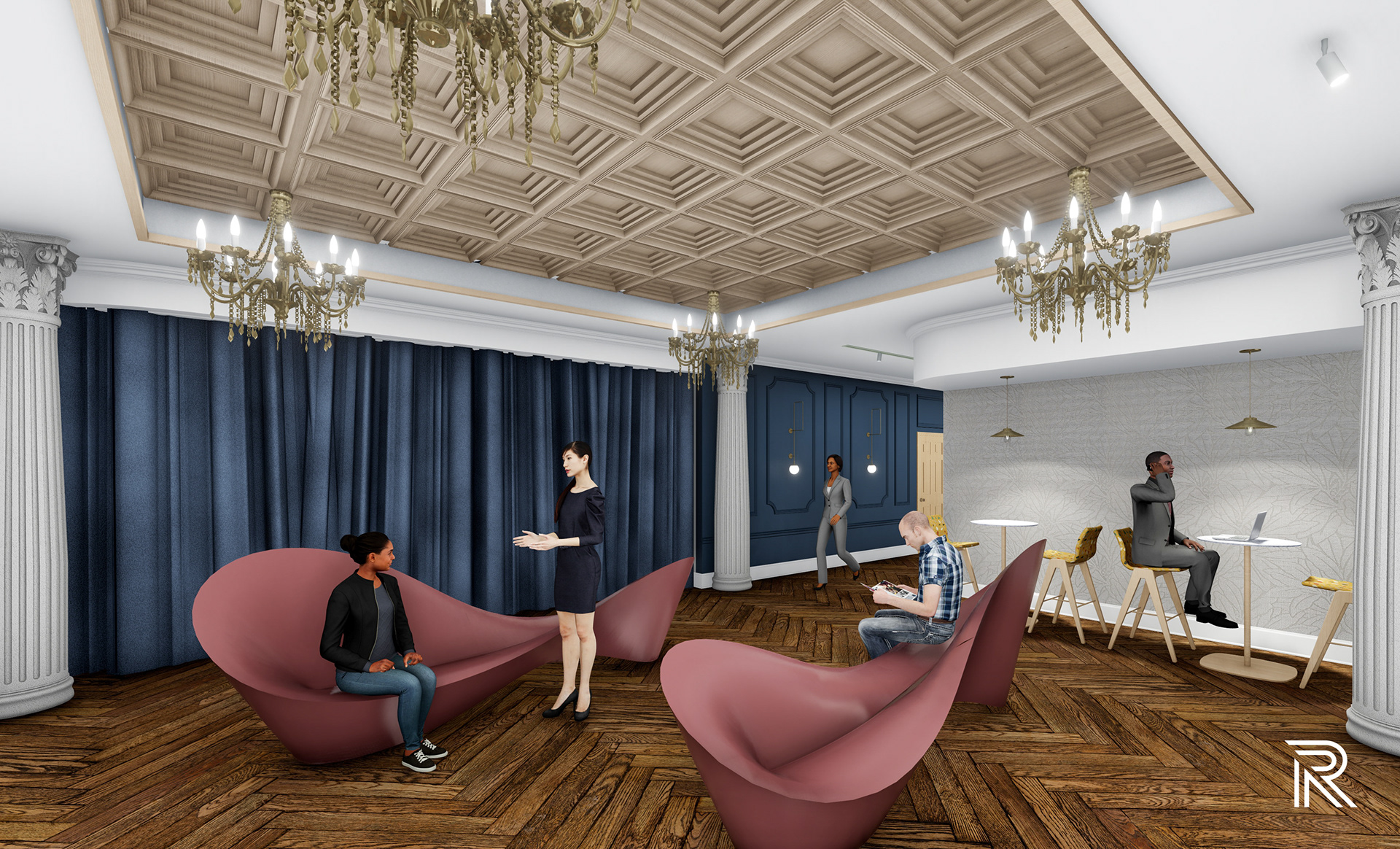
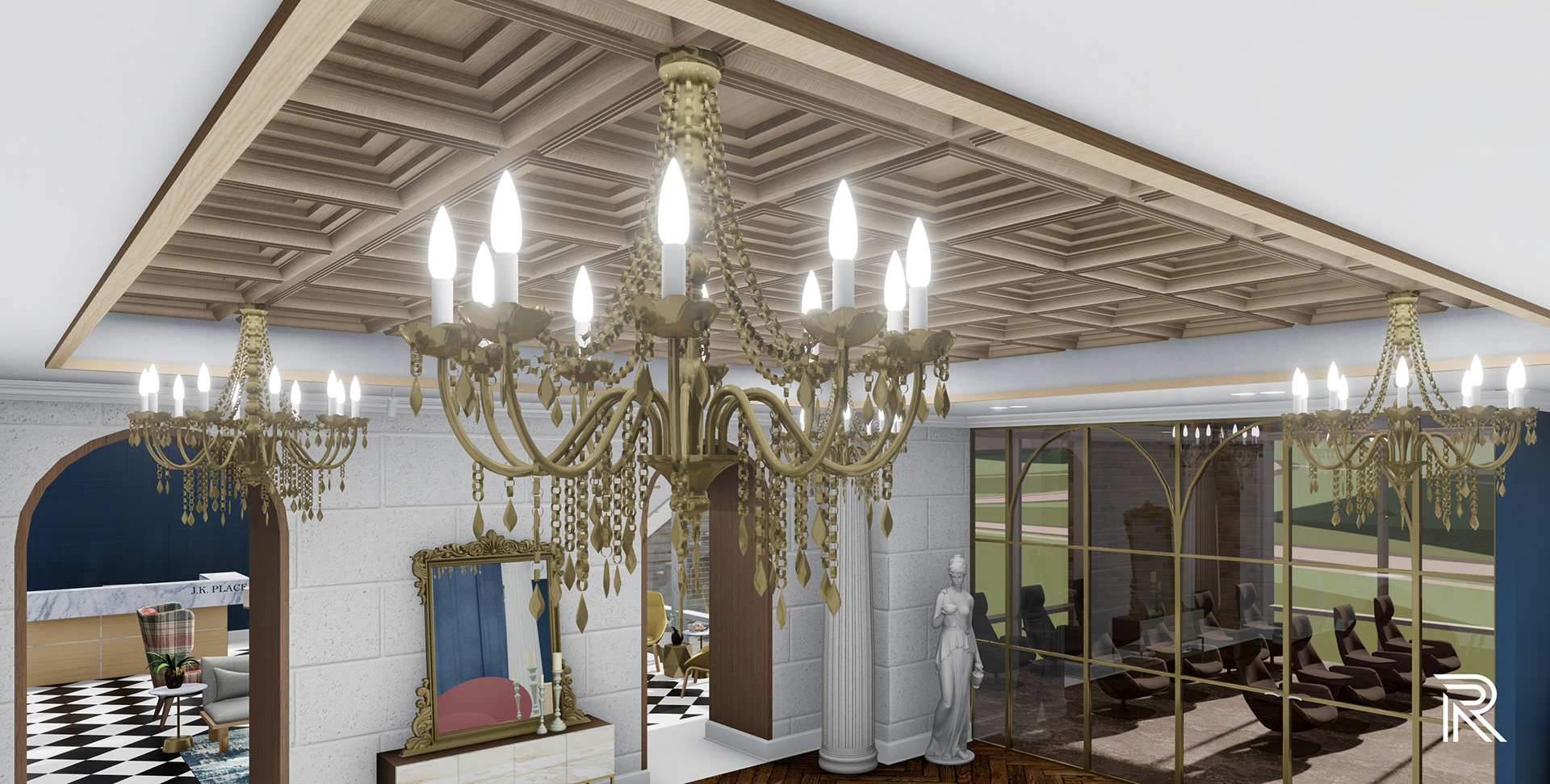
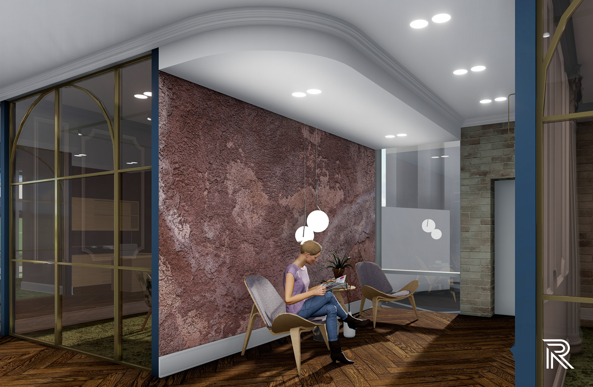
waiting area
Past the wood archways leads guests and employees to a social space and pre-meeting spot for the conference and presentation rooms. Modern sculpted Folly benches set the scene contrasting the wood coffered ceiling and herringbone floors while providing a comfortable place to conversate. Brass chandeliers and mirrors evoke a luxurious scene with the architectural detailing and curtain in the backdrop from the conference room.


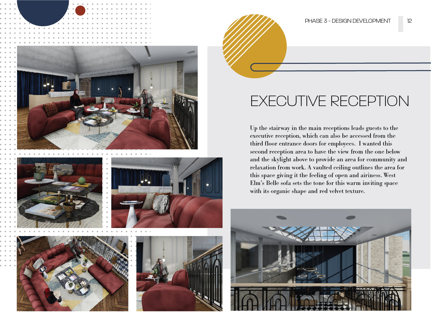
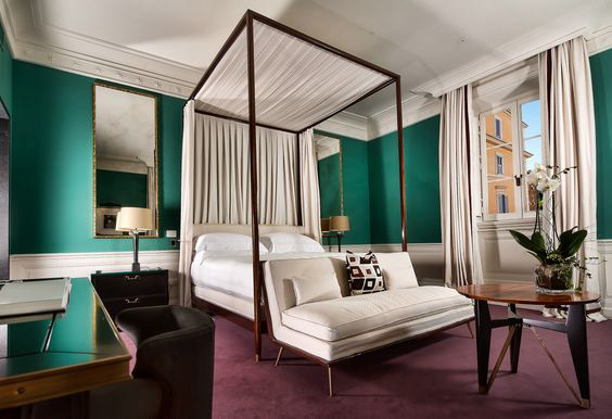
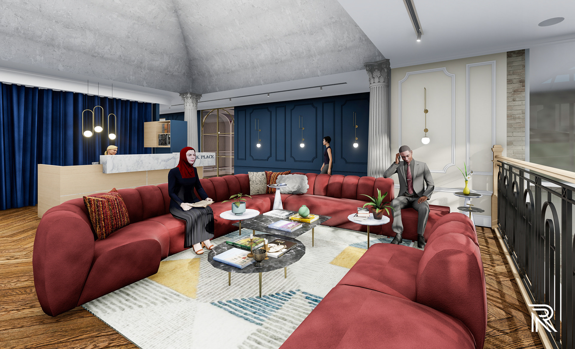
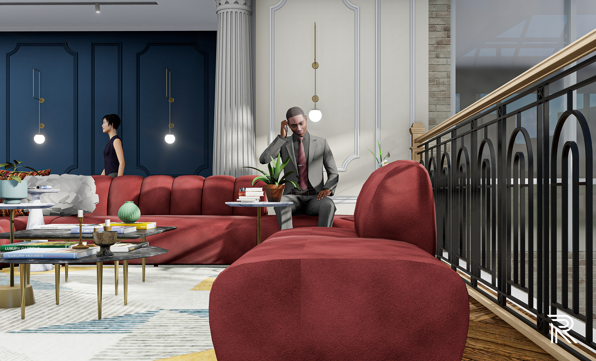
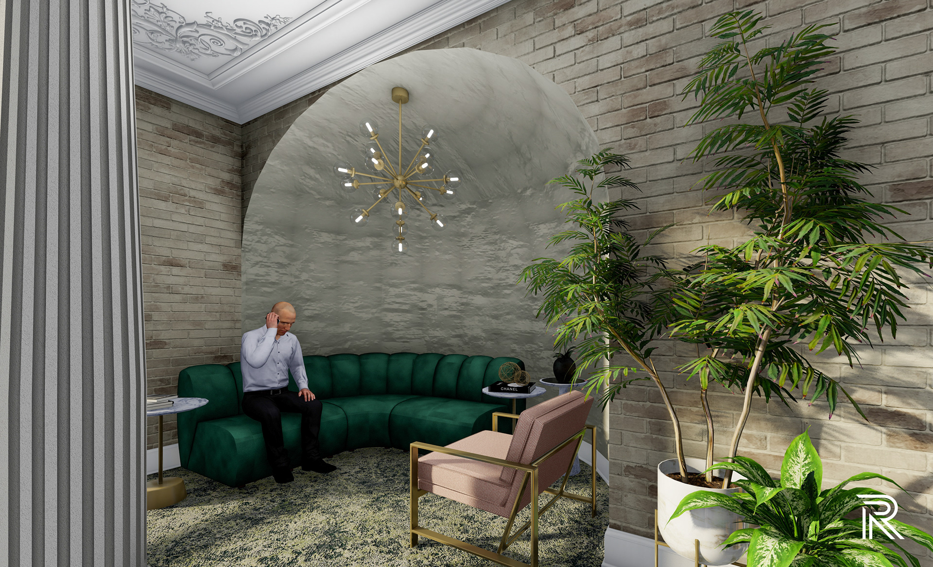
Executive reception
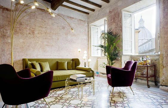
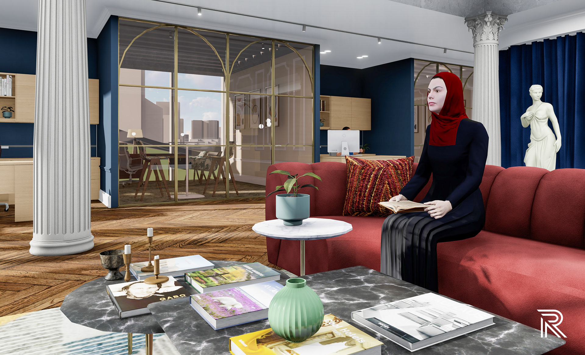
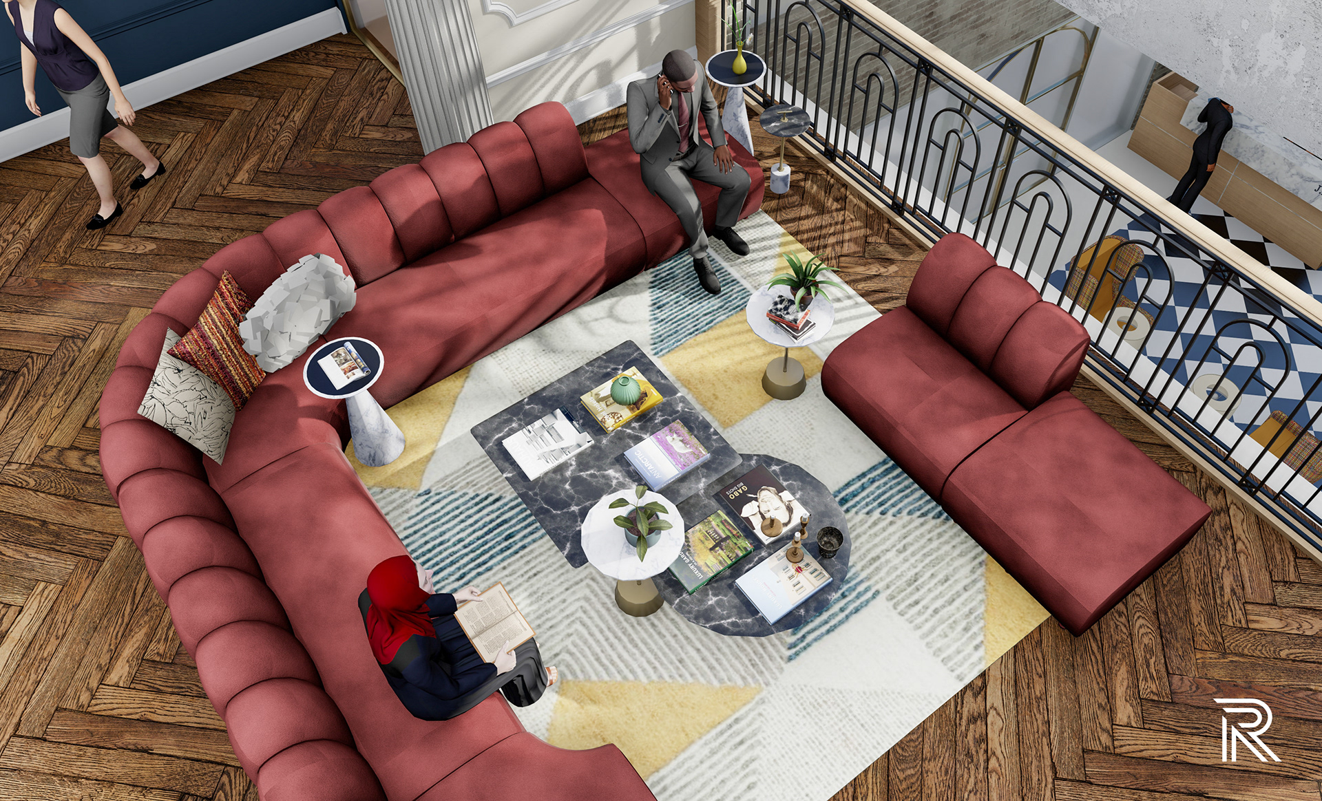
Up the stairway in the main receptions leads guests to the executive reception, which can also be accessed from the third floor entrance doors for employees. I wanted this second reception area to have the view from the one below and the skylight above to provide an area for community and relaxation from work. A vaulted ceiling outlines the area for this space giving it the feeling of open and airiness. West Elm’s Belle sofa sets the tone for this warm inviting space with its organic shape and red velvet texture.
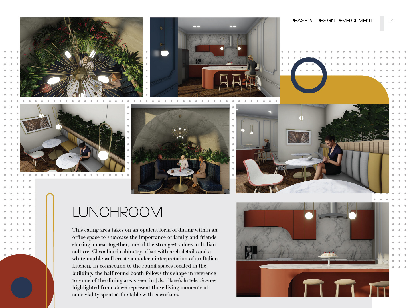
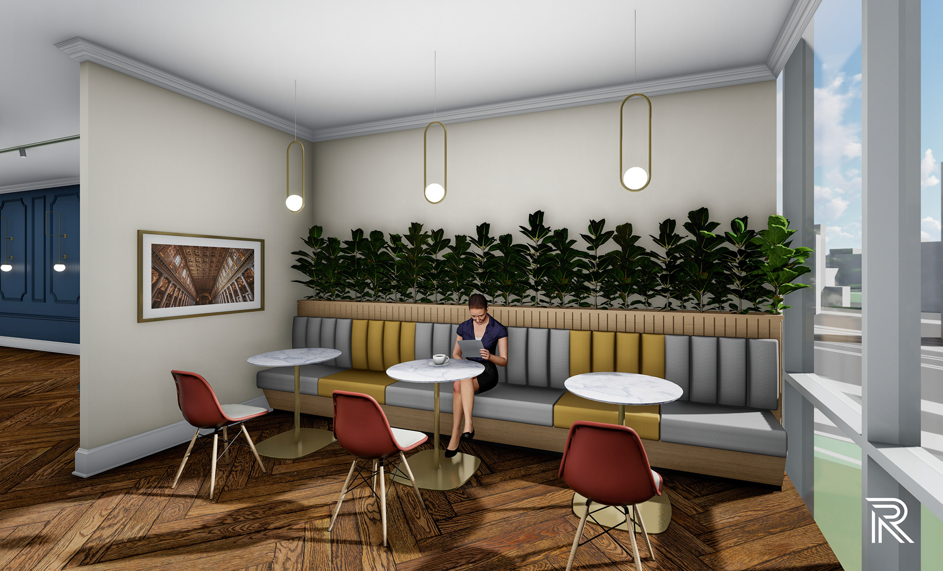
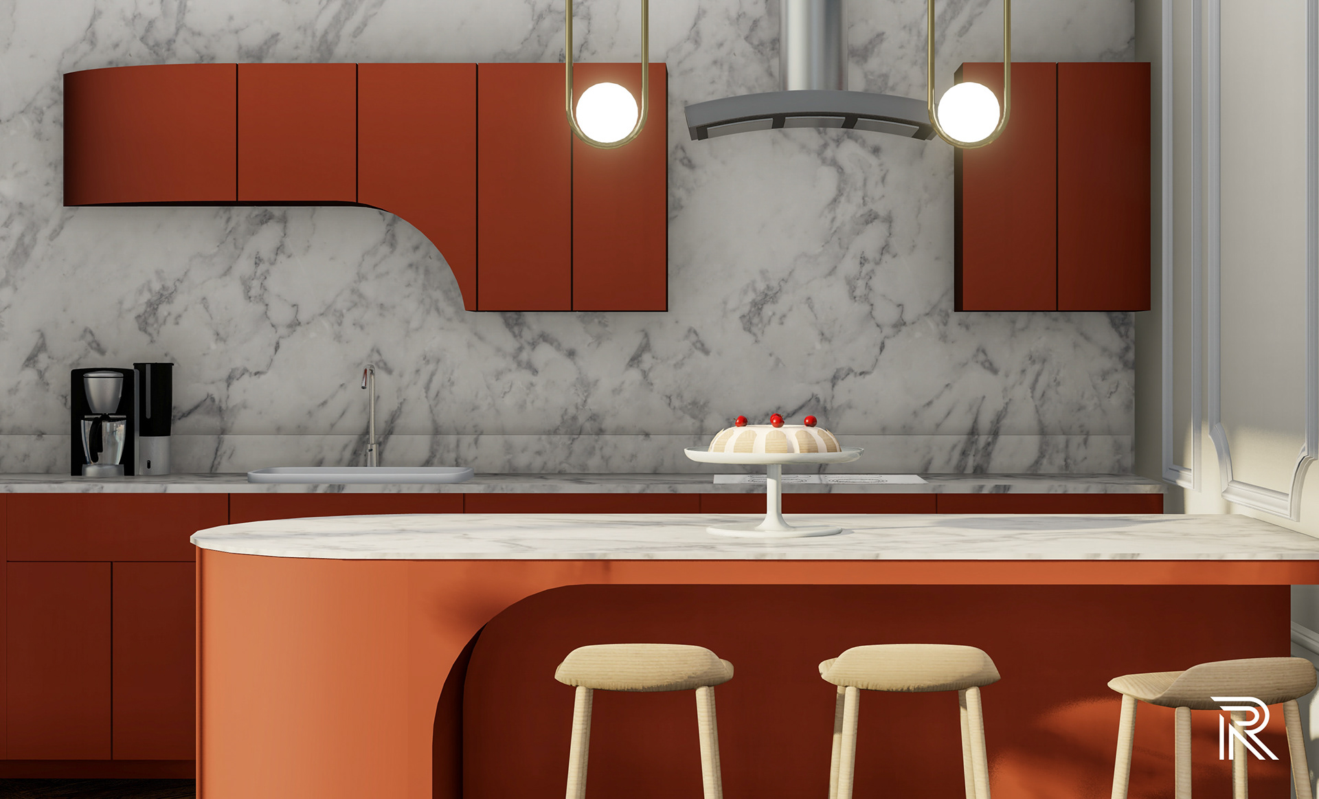
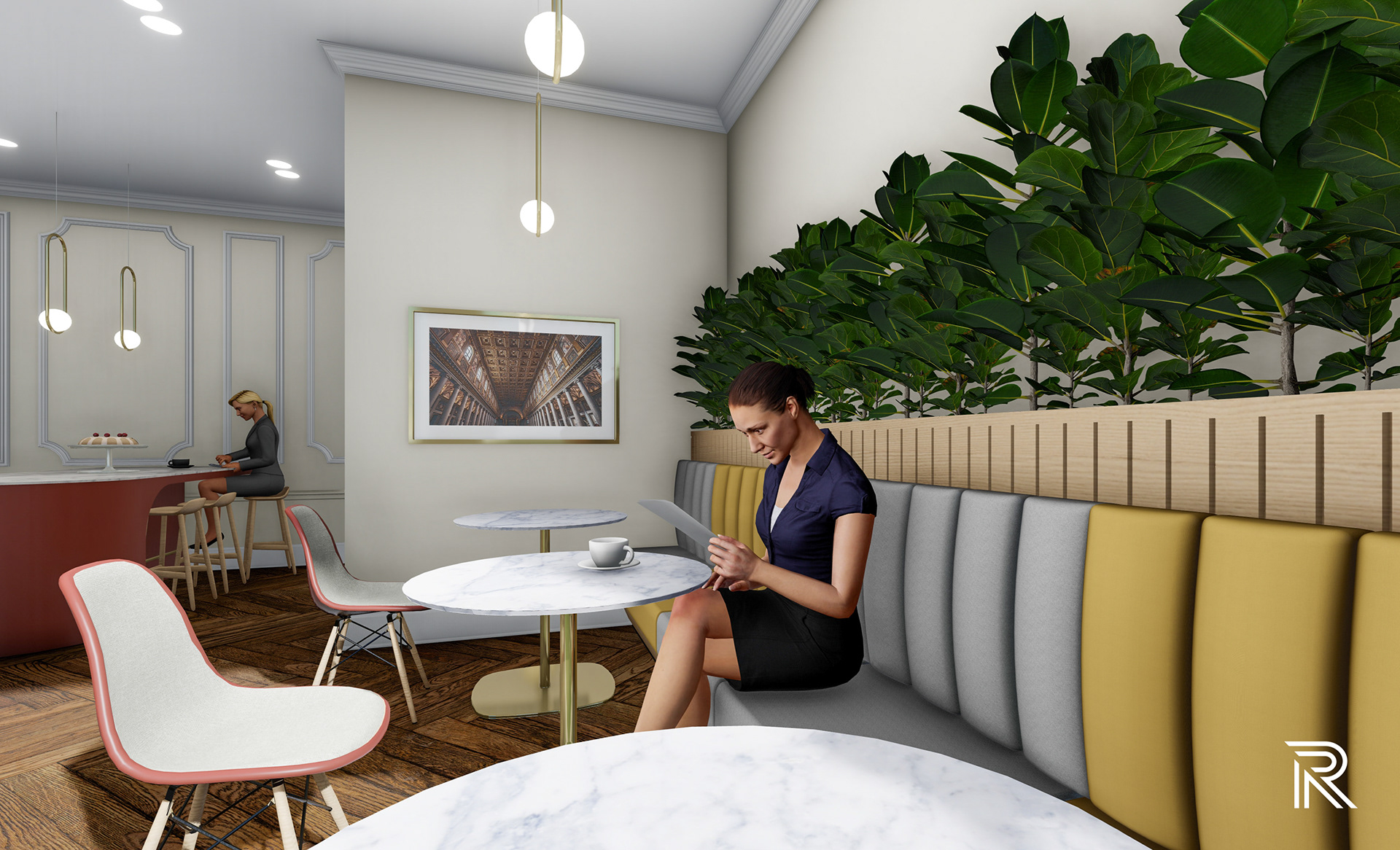
lunchroom
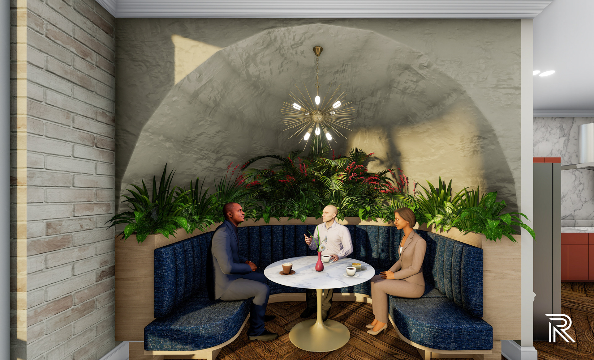
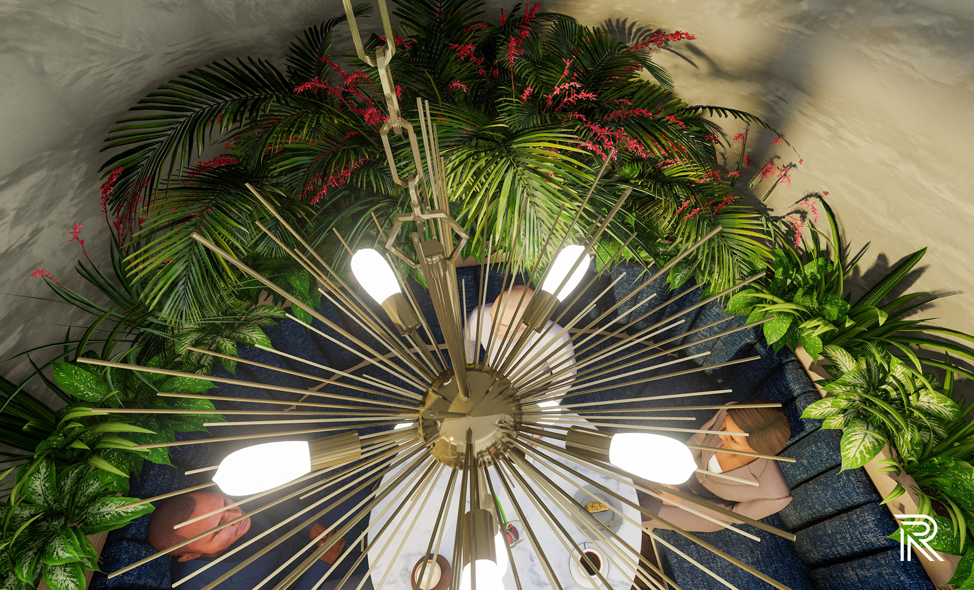
This eating area takes on an opulent form of dining within an office space to showcase the importance of family and friends sharing a meal together, one of the strongest values in Italian culture. Clean-lined cabinetry offset with arch details and a white marble wall create a modern interpretation of an Italian kitchen. In connection to the round spaces located in the building, the half round booth follows this shape in reference to some of the dining areas seen in J.K. Place’s hotels. Scenes highlighted from above represent those living moments of conviviality spent at the table with coworkers.


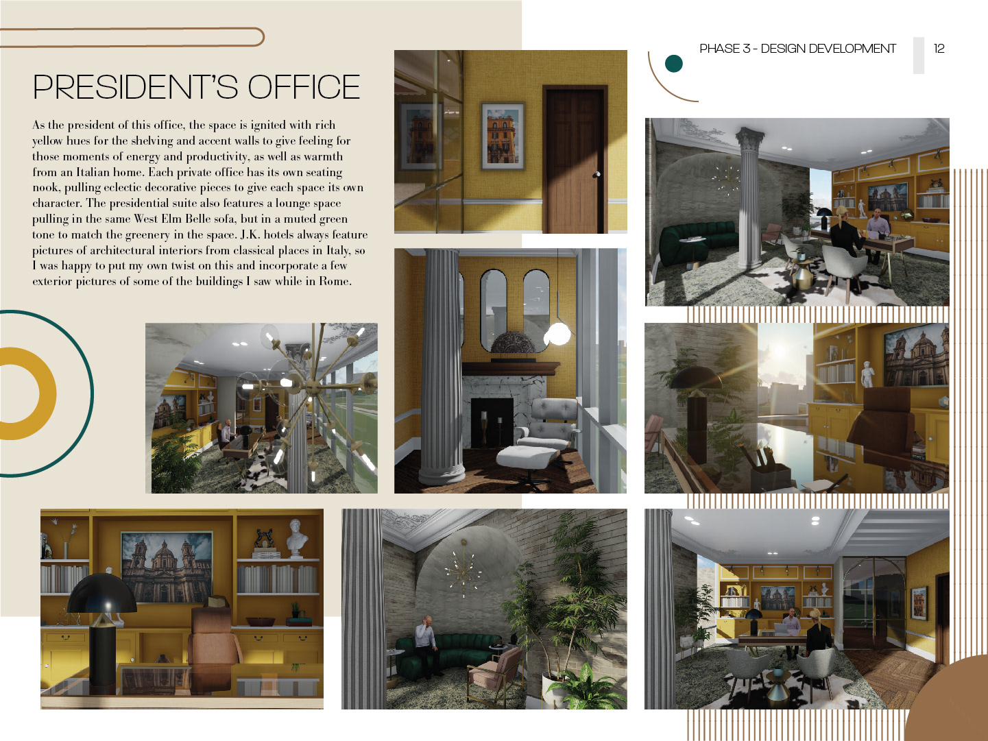
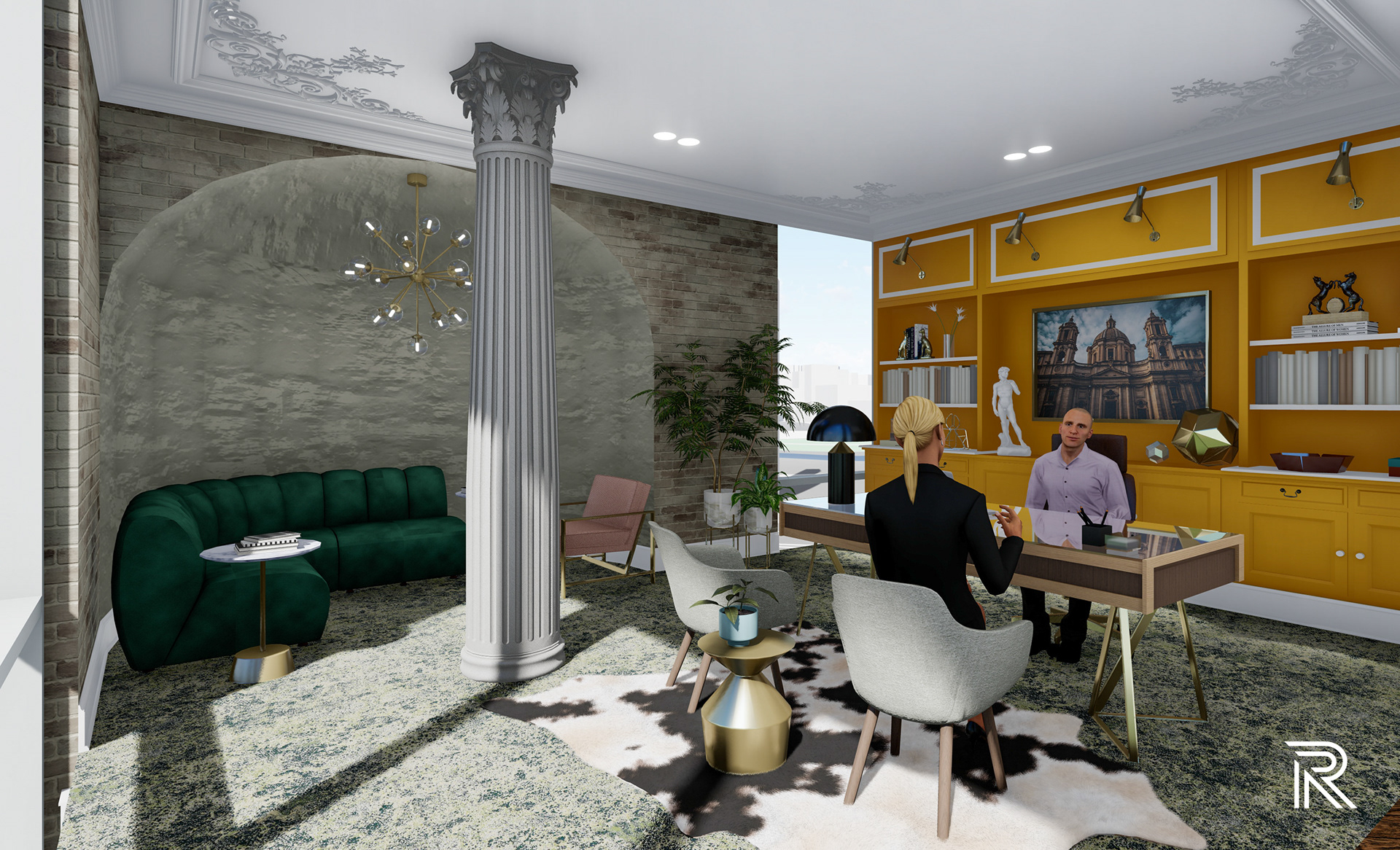
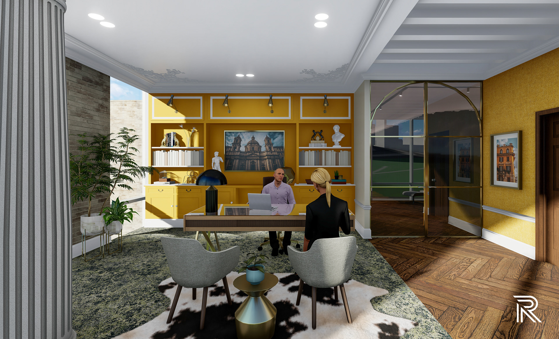
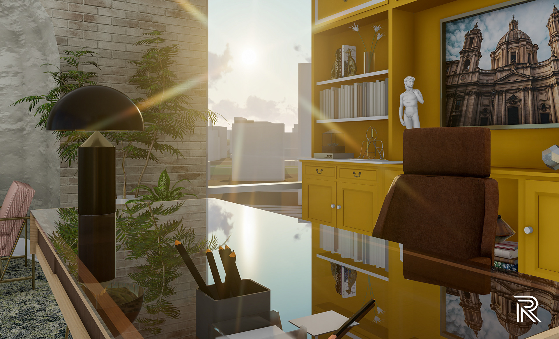
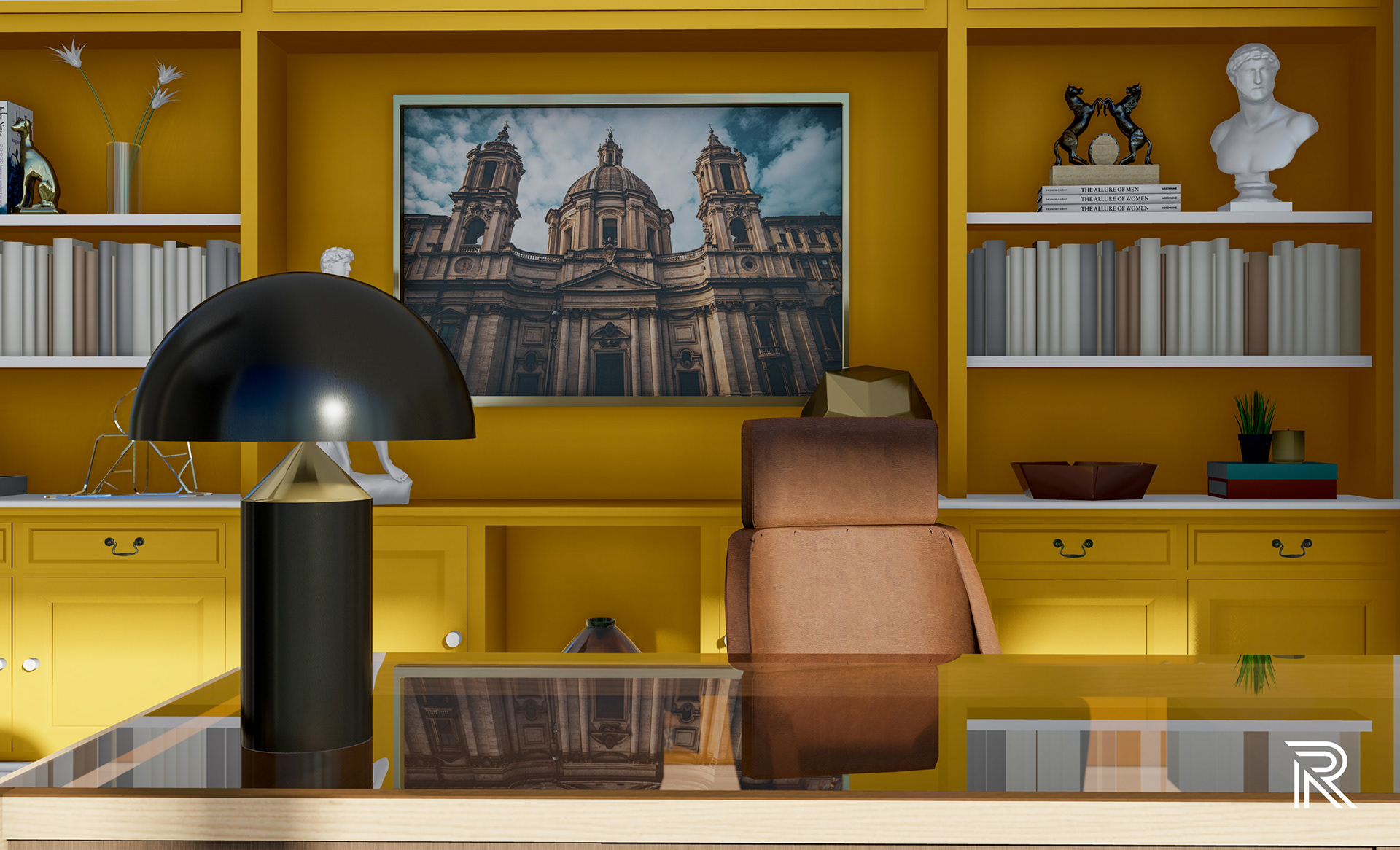
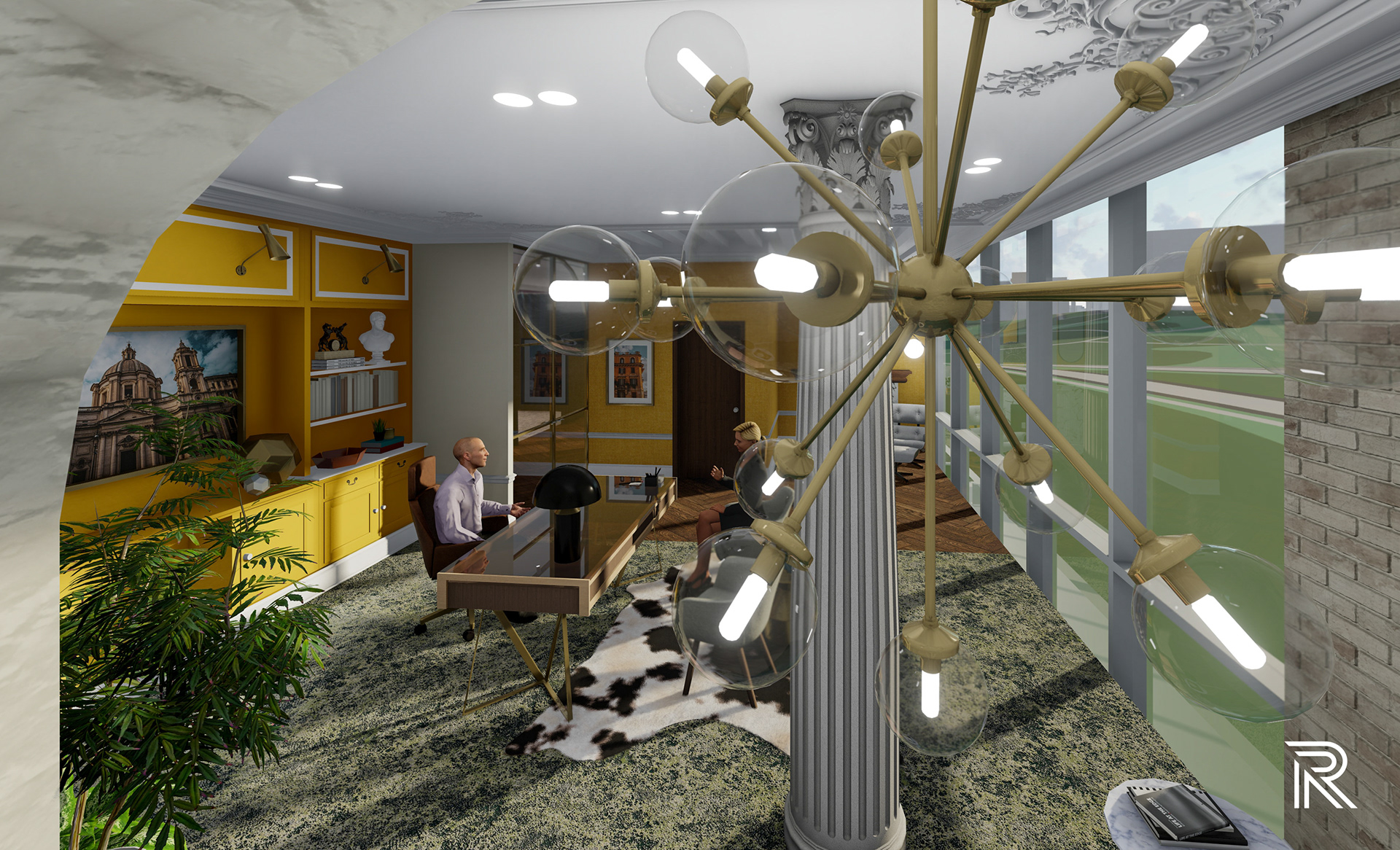
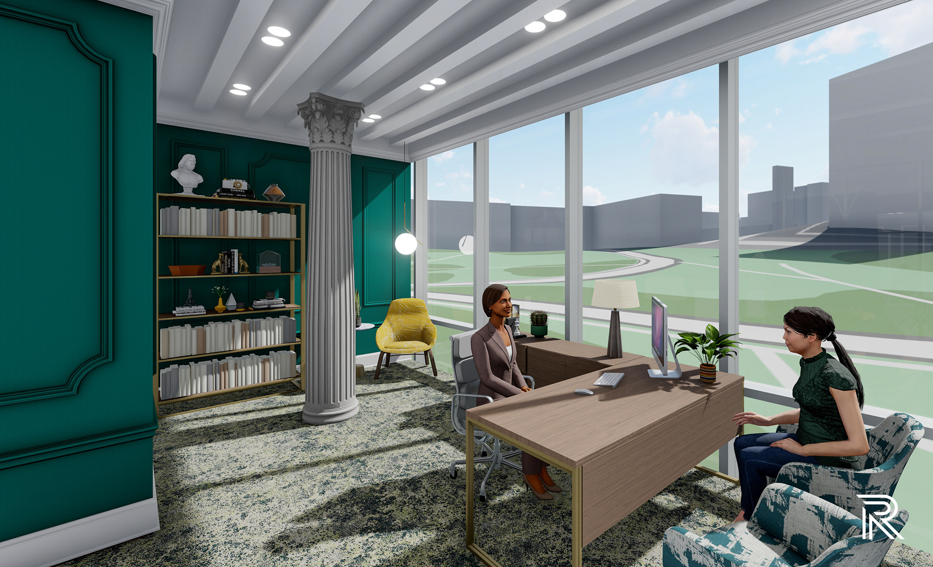
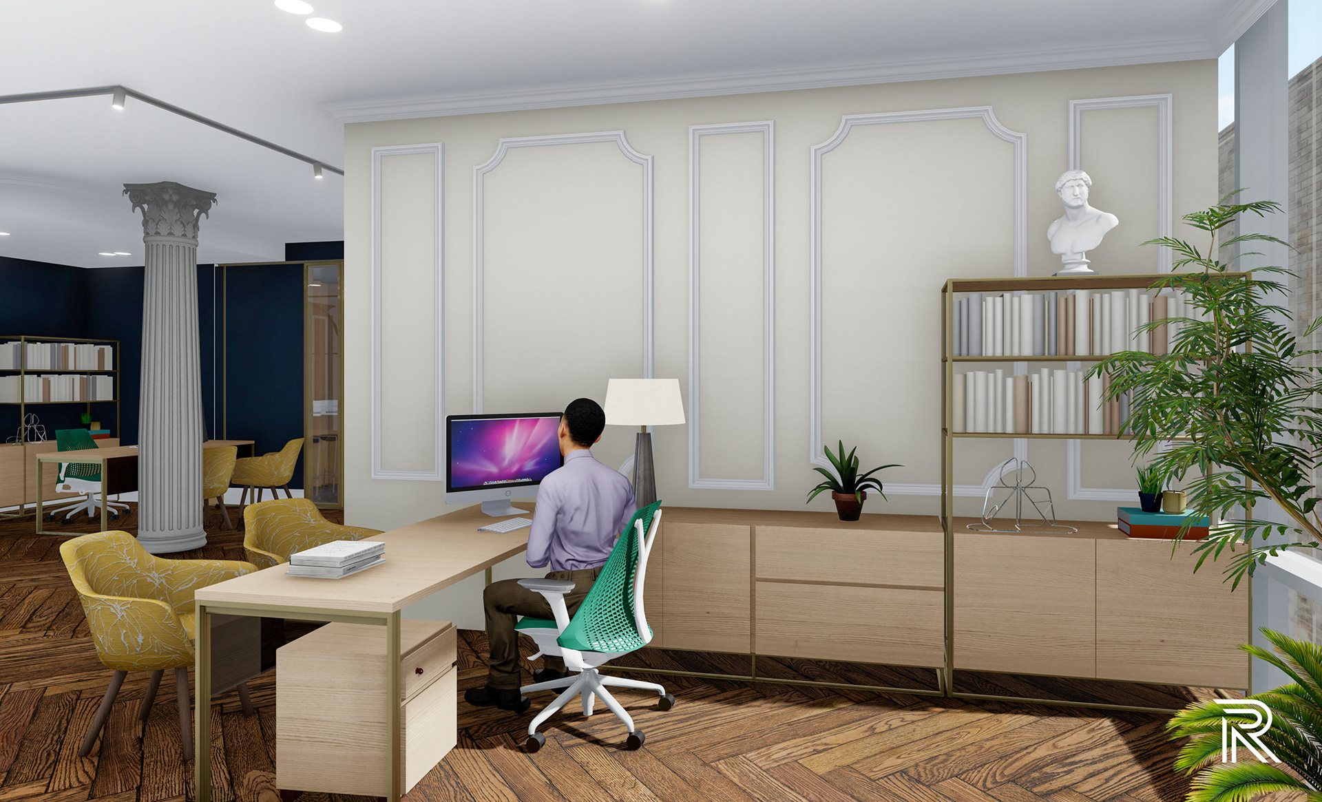
President's office
As the president of this office, the space is ignited with rich yellow hues for the shelving and accent walls to give feeling fo those moments of energy and productivity, as well as warmth from an Italian home. Each private office has its own seating nook, pulling eclectic decorative pieces to give each space its own character. The presidential suite also features a lounge space pulling in the same West Elm Belle sofa, but in a muted green tone to match the greenery in the space. J.K. hotels always feature pictures of architectural interiors from classical places in Italy, so I was happy to put my own twist on this and incorporate a few exterior pictures of some of the buildings I saw while in Rome.
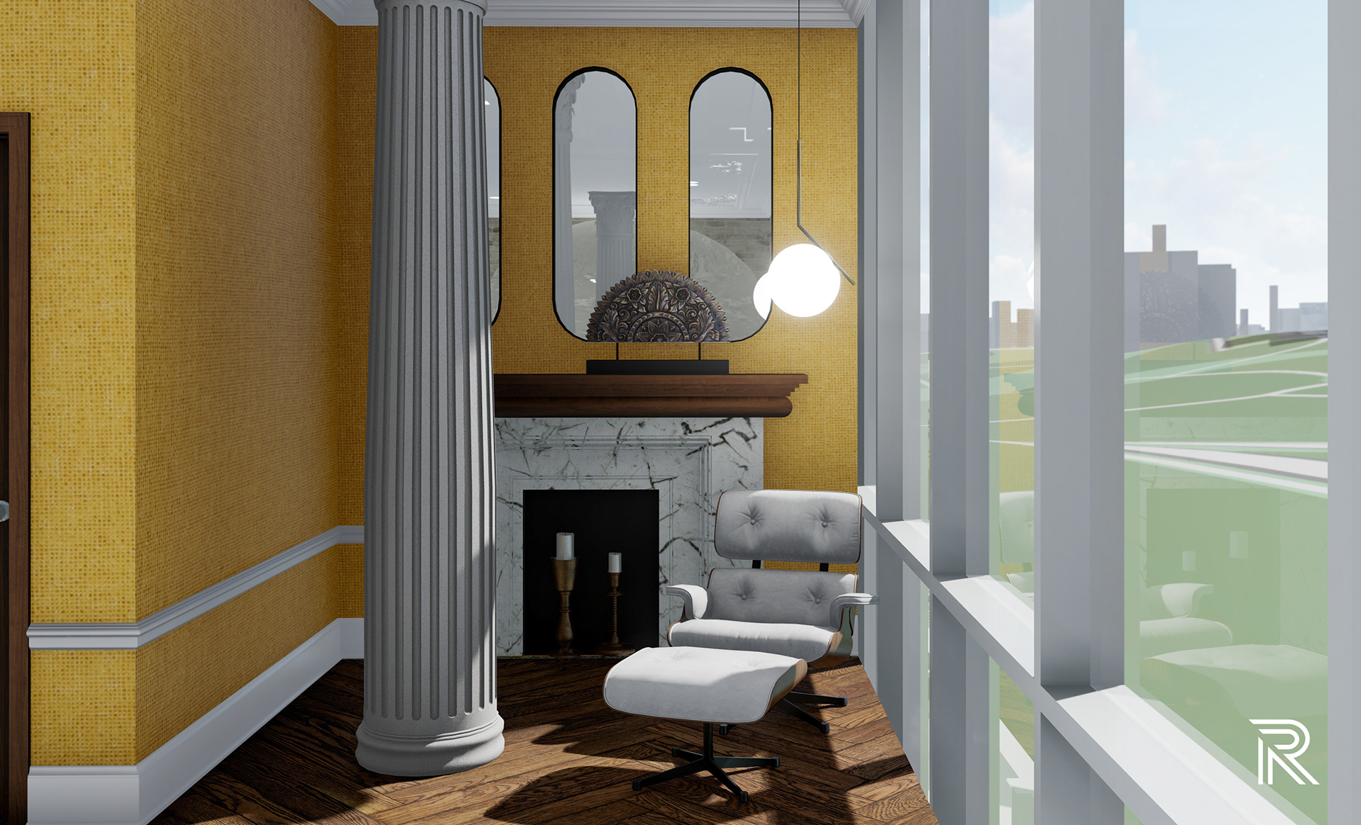
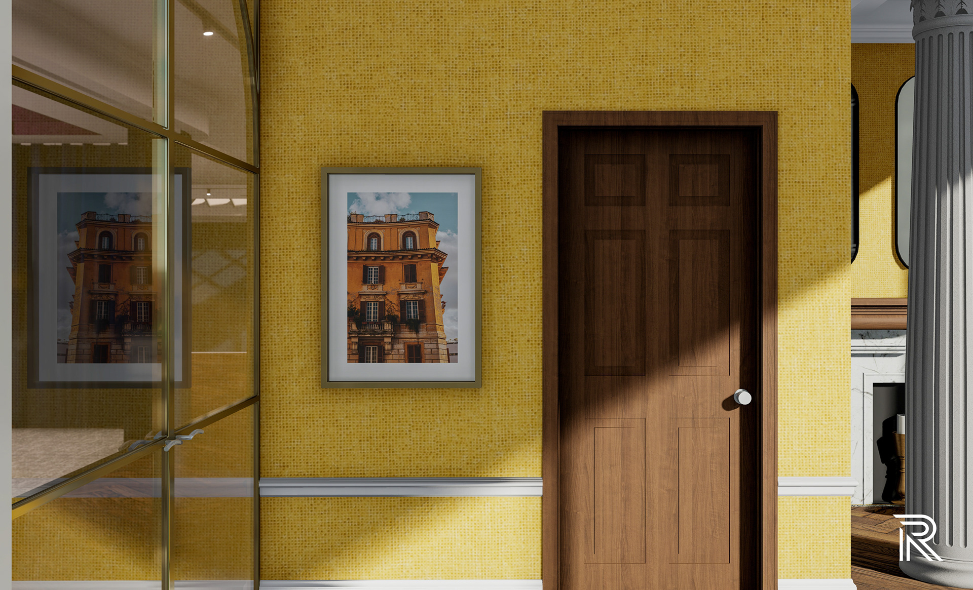
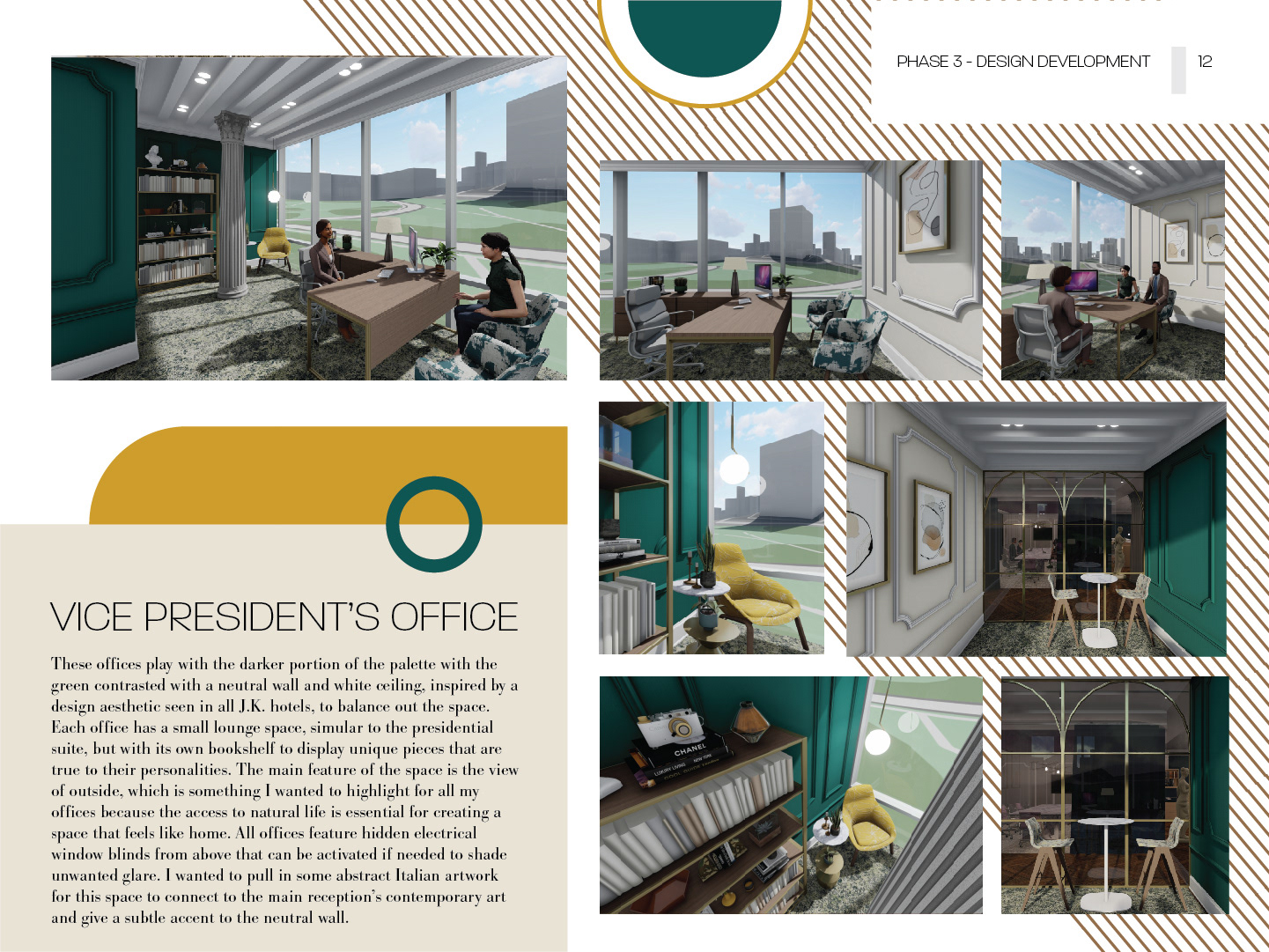
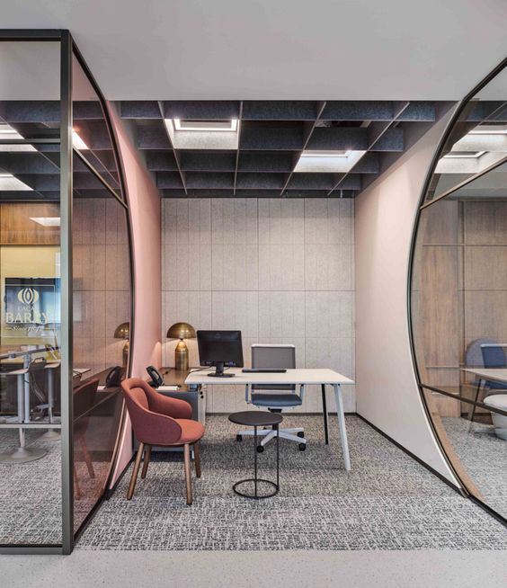
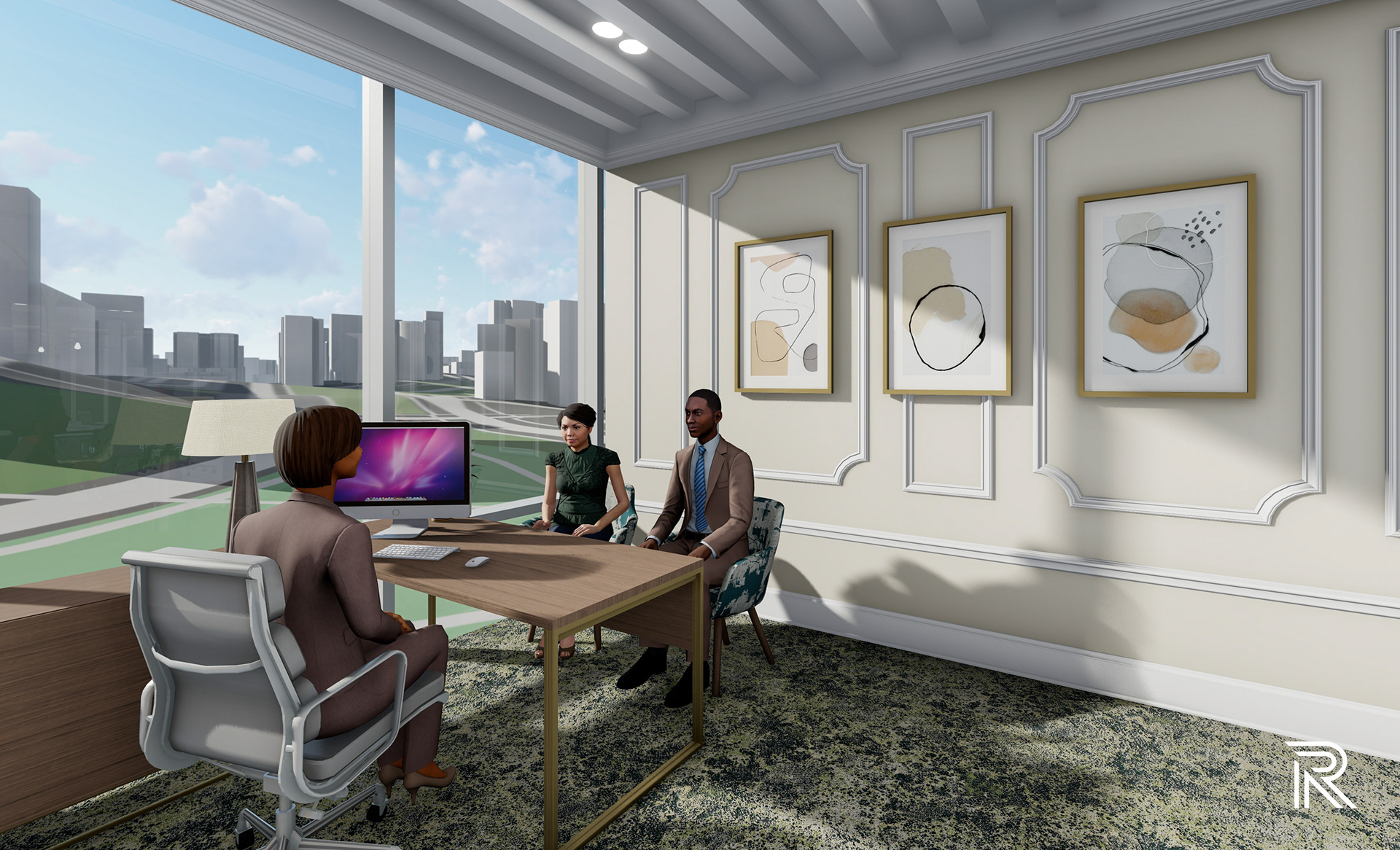
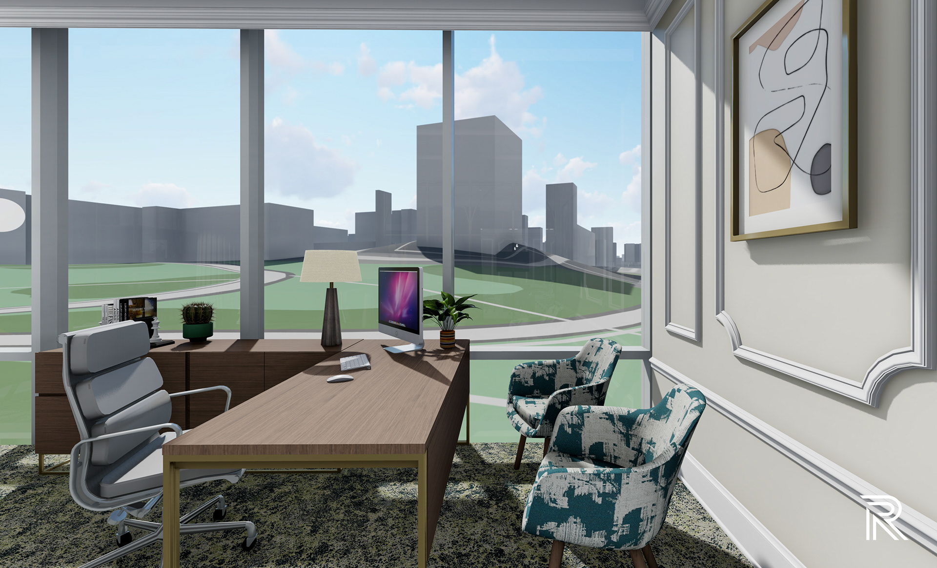
Vice President's office
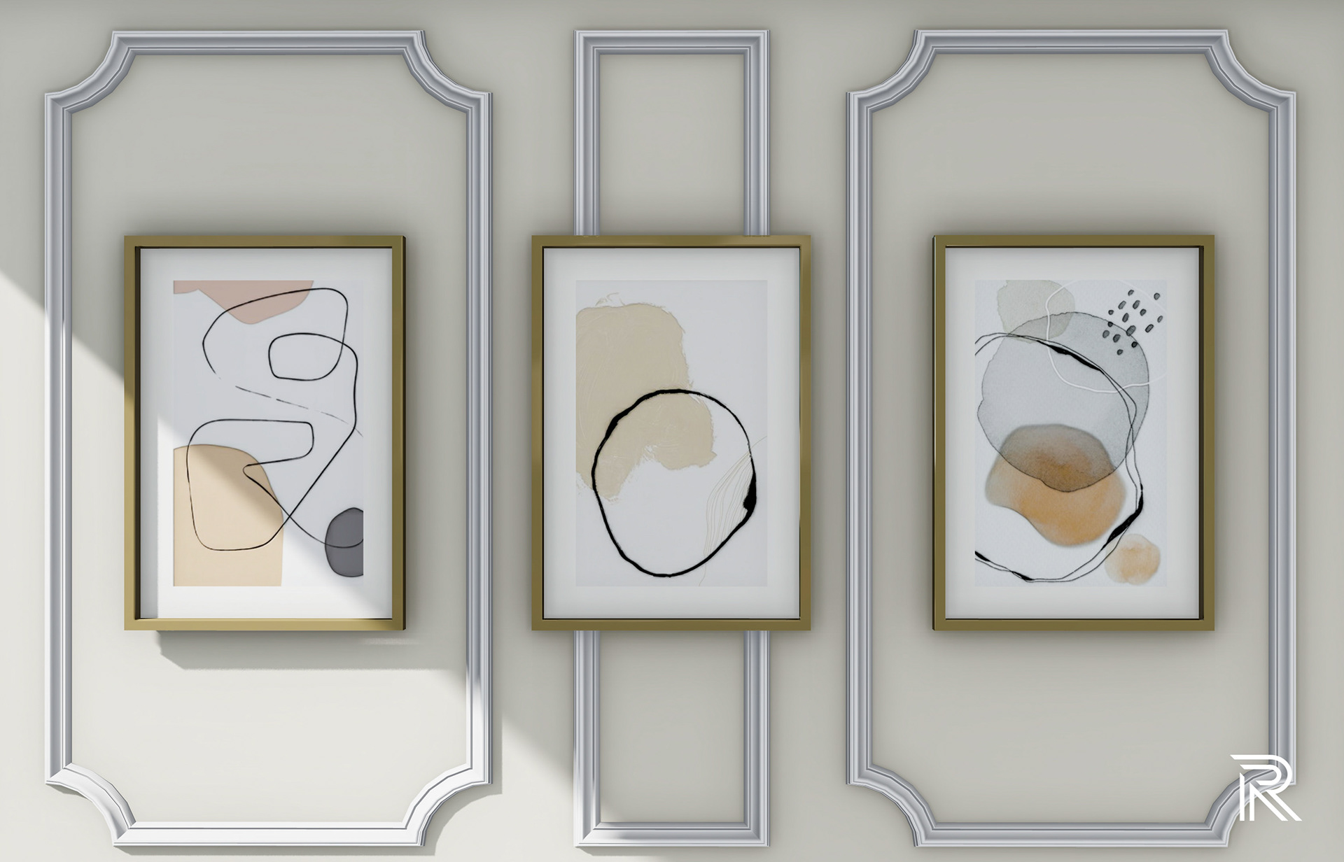
These offices play with the darker portion of the palette with the green contrasted with a neutral wall and white ceiling, inspired by a design aesthetic seen in all J.K. hotels, to balance out the space. Each office has a small lounge space, similar to the presidential suite, but with its own bookshelf to display unique pieces that are true to their personalities. The main feature of the space is the view of outside, which is something I wanted to highlight for all my offices because the access to natural life is essential for creating a space that feels like home. All offices feature hidden electrical window blinds from above that can be activated if needed to shade unwanted glare. I wanted to pull in some abstract Italian artwork for this space to connect to the main reception’s contemporary art and give a subtle accent to the neutral wall.
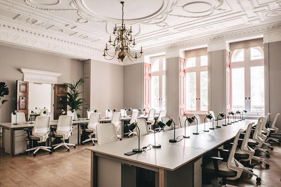
INTERIOR DESIGNERS & ARCHITECT
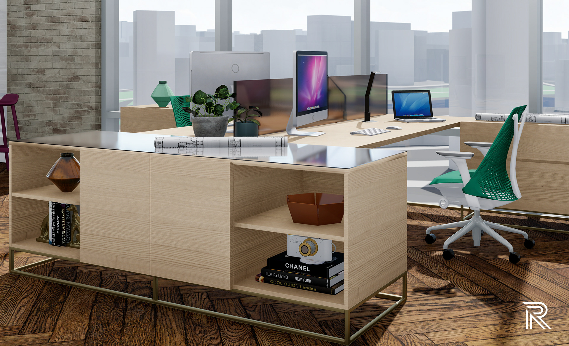
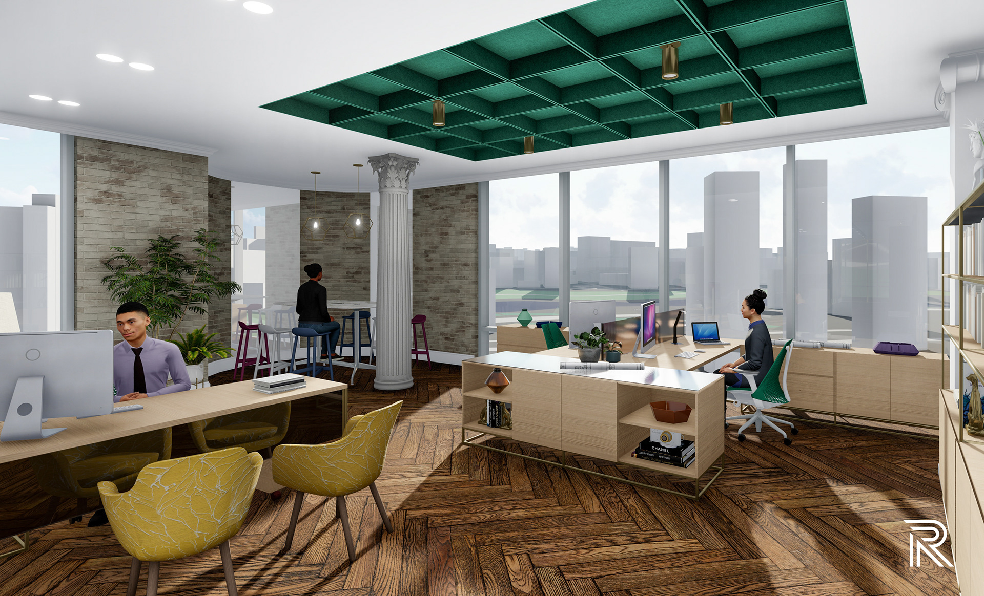
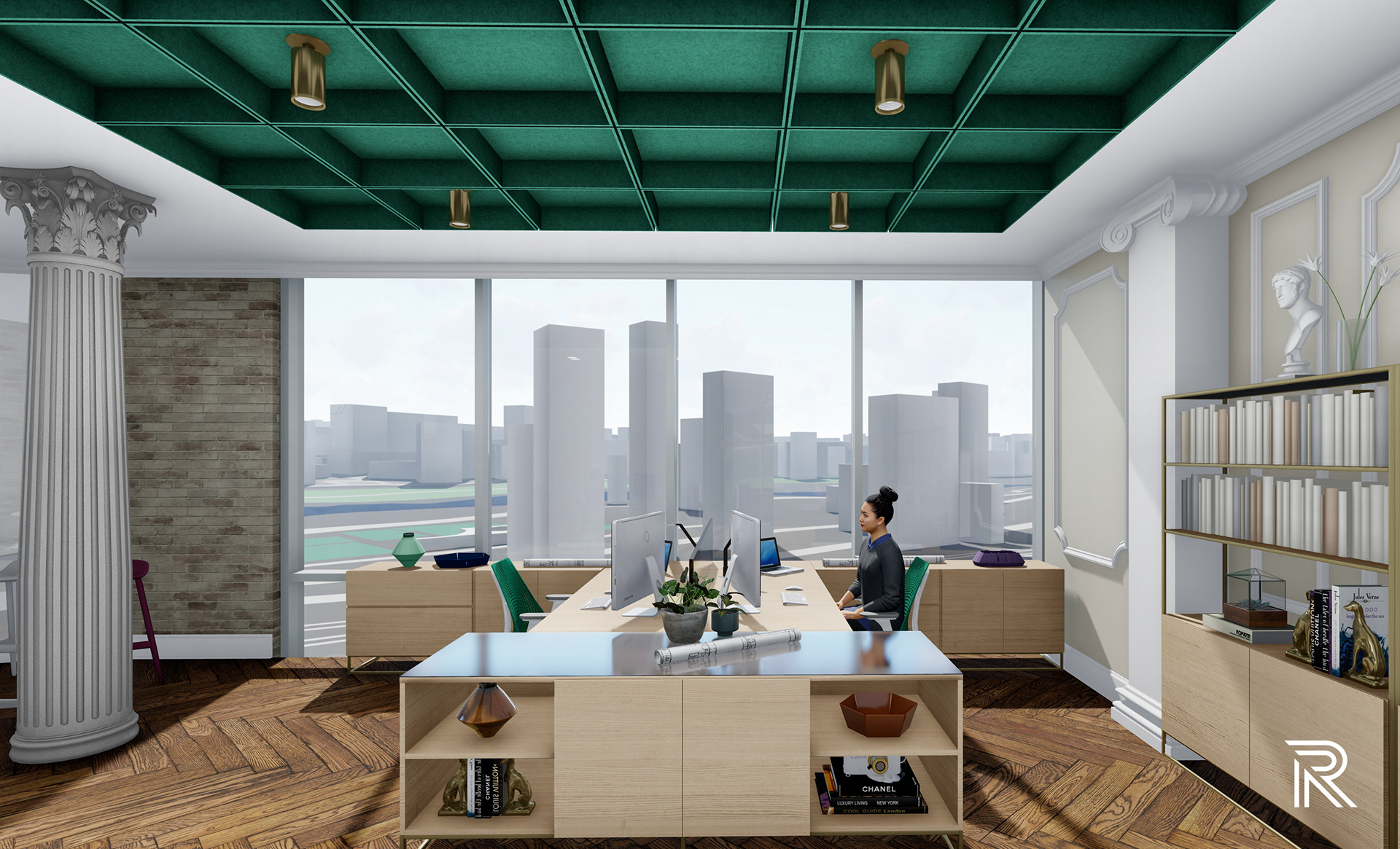
This department gives an example of what an open office environment looks like for this design. Modern coffered green ceiling panels accent the space while providing acoustical function. The rest of the space, highlighted with light wood and brass metal details, create a spacious and calming atmosphere to promote focus and productivity for its users. Ample storage is provided for each employee while still maintaining a clean-lined, modern vibe for the overall space.
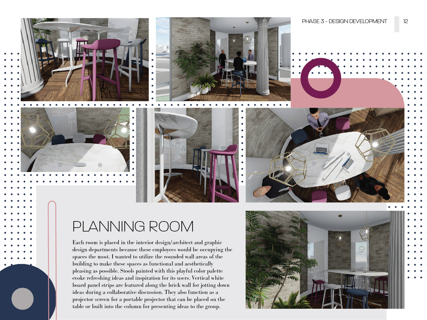
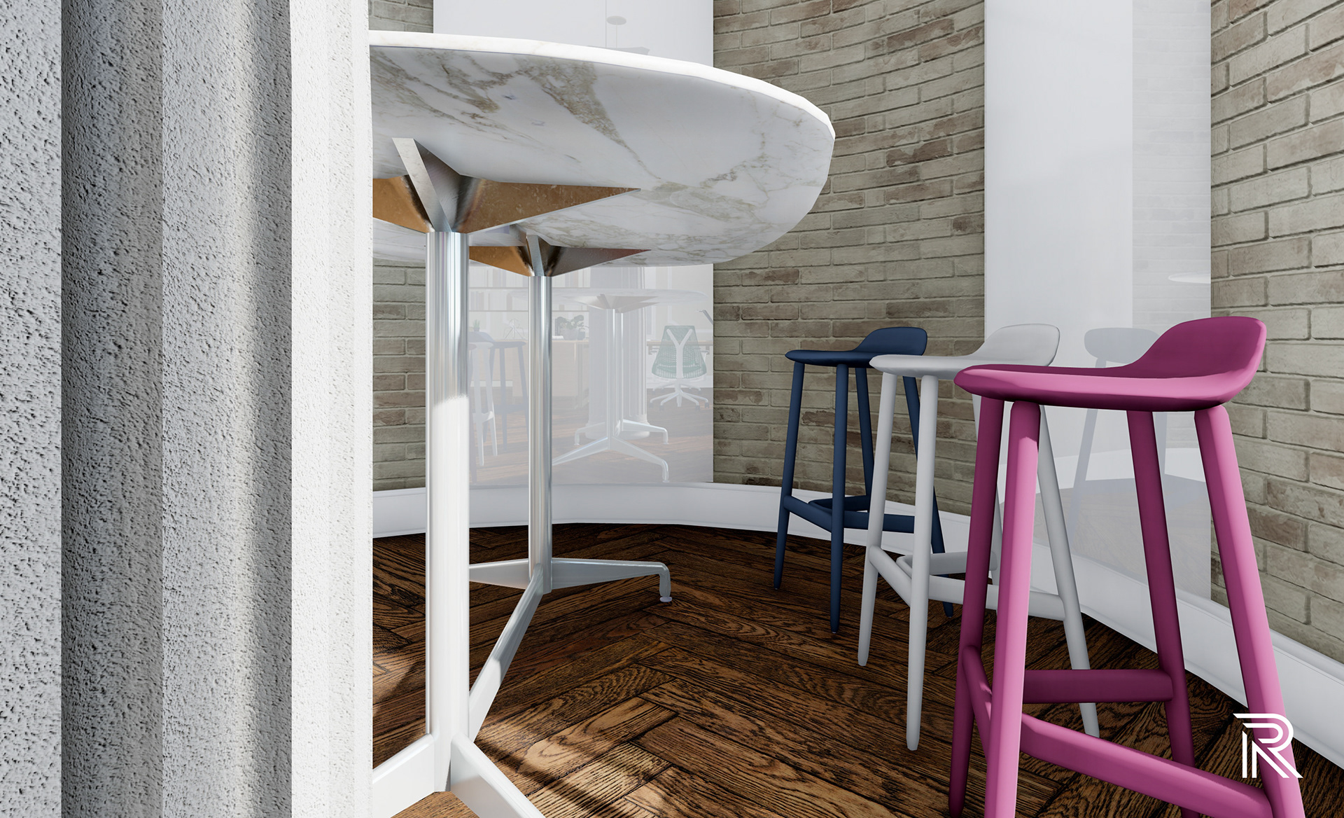
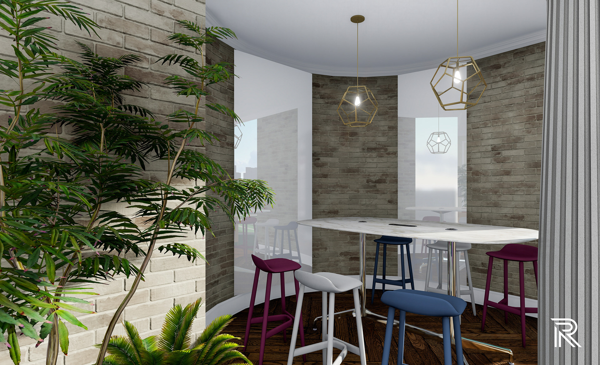
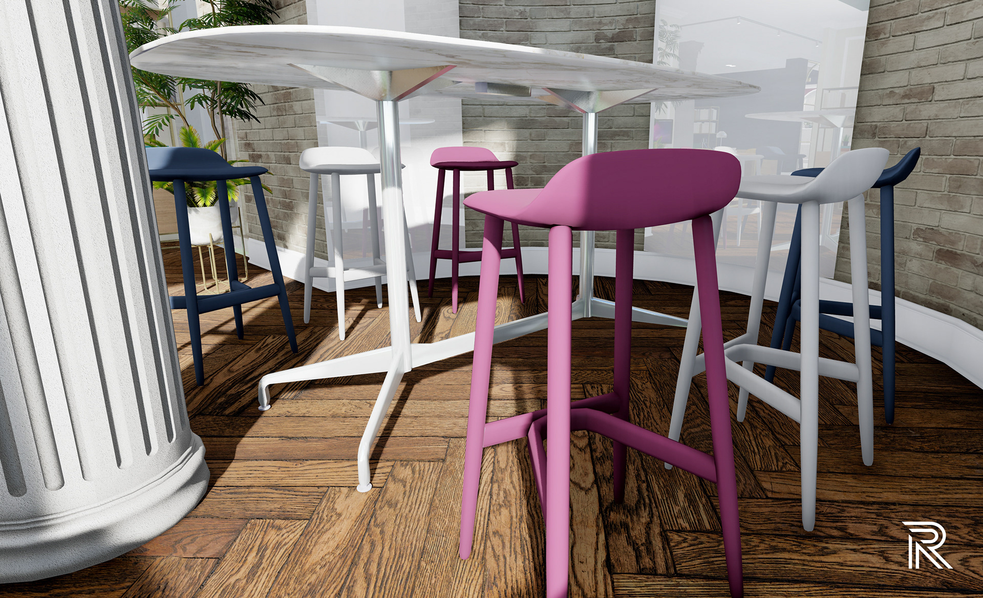
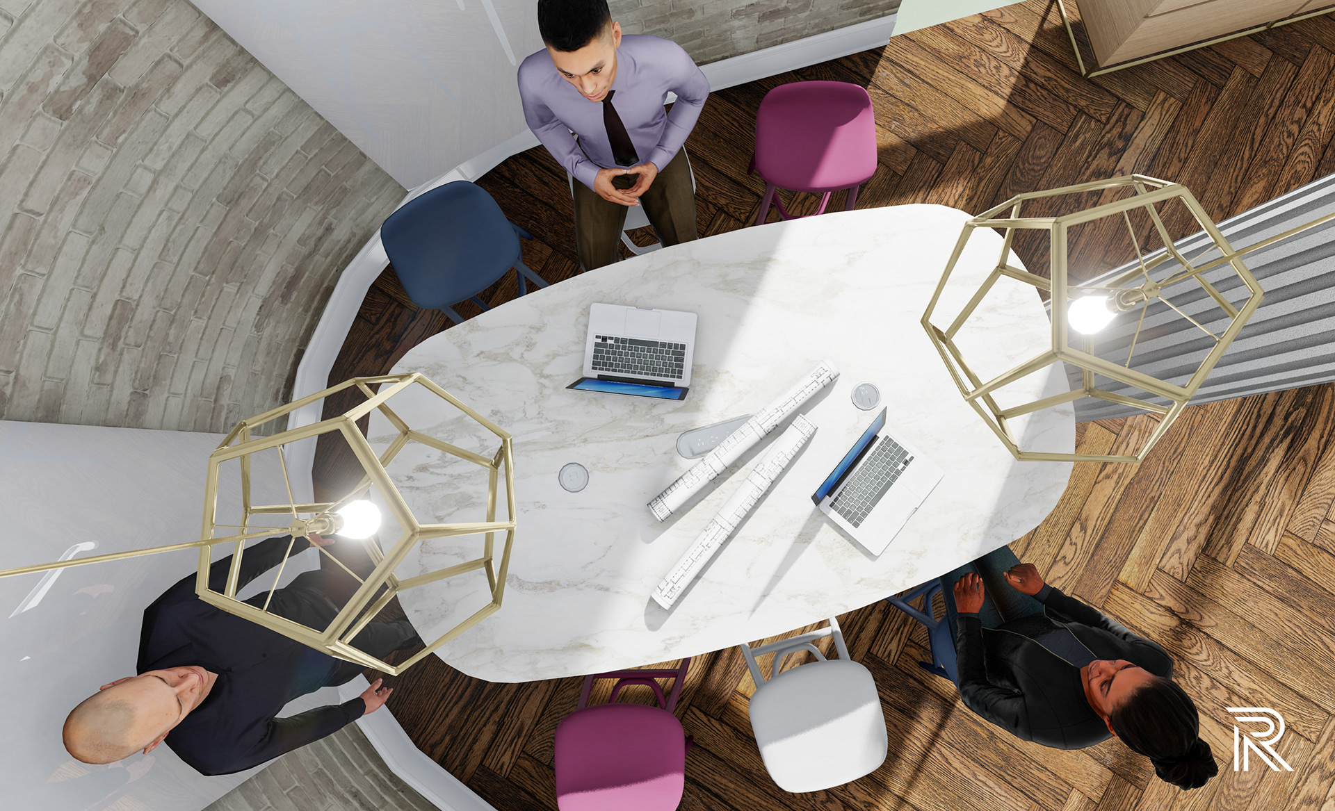
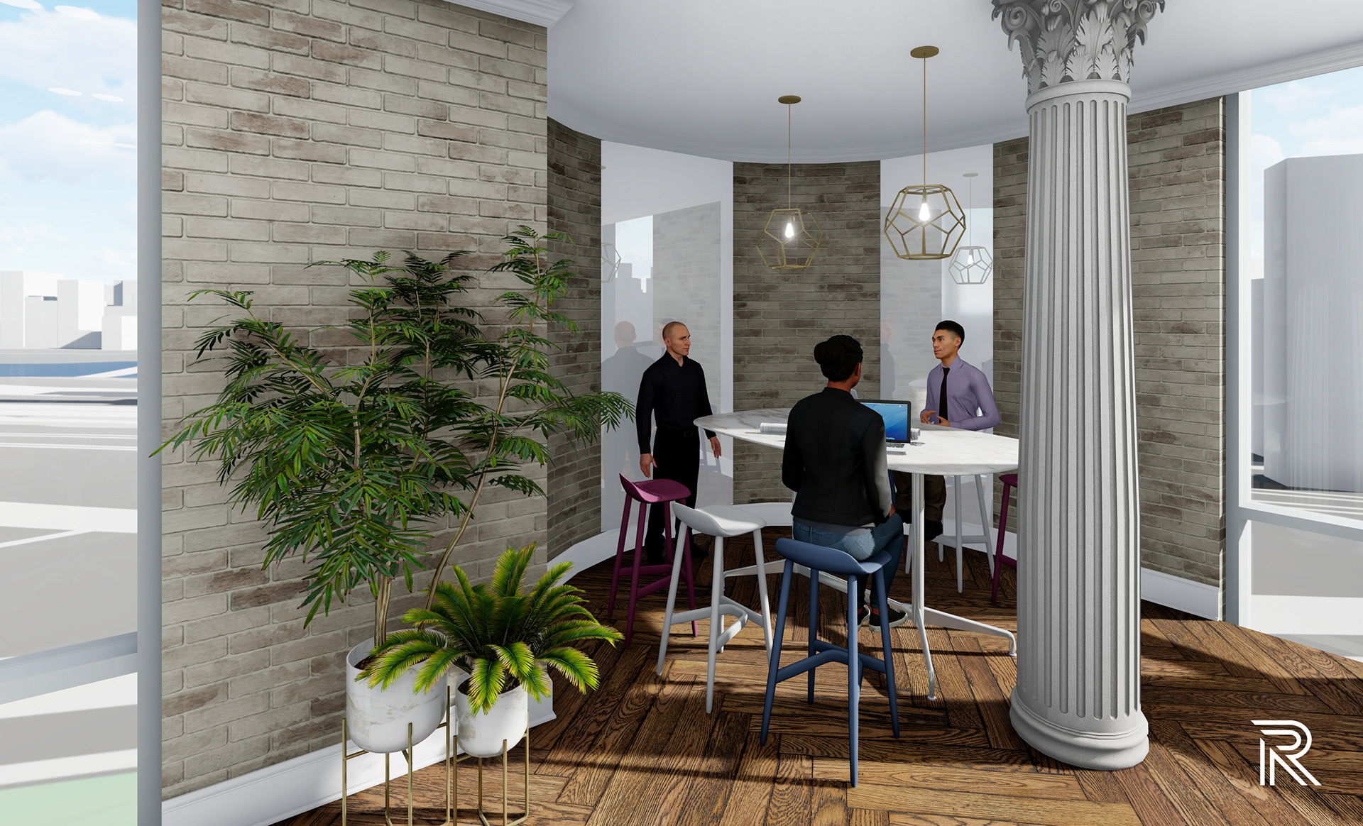
planning room
Each room is placed in the interior design/architect and graphic design departments because these employees would be occupying the spaces the most. I wanted to utilize the rounded wall areas of the building to make these spaces as functional and aesthetically pleasing as possible. Stools painted with this playful color palette evoke refreshing ideas and inspiration for its users. Vertical white board panel strips are featured along the brick wall for jotting down ideas during a collaborative discussion. They also function as a projector screen for a portable projector that can be placed on the table or built into the column for presenting ideas to the group.
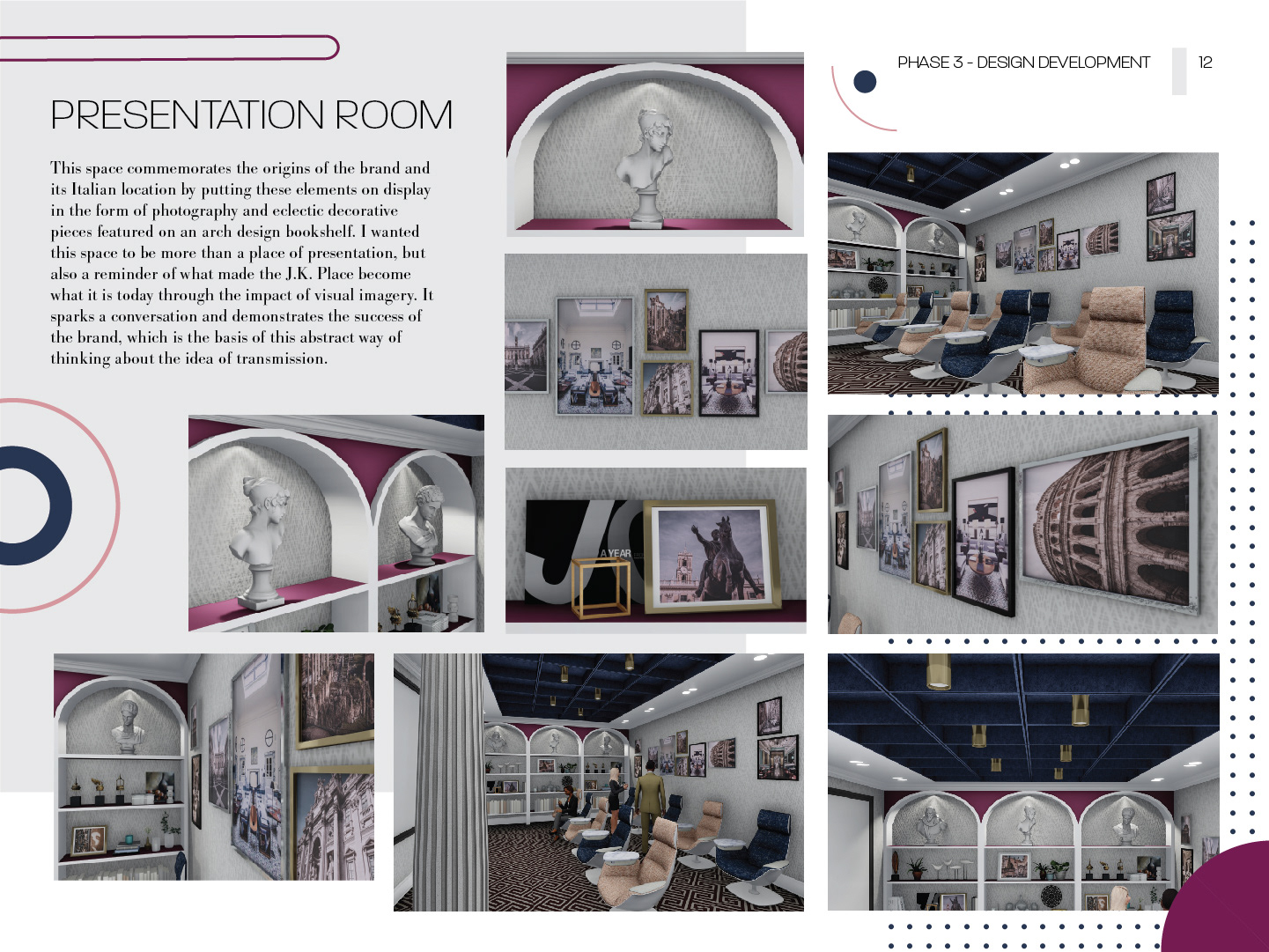
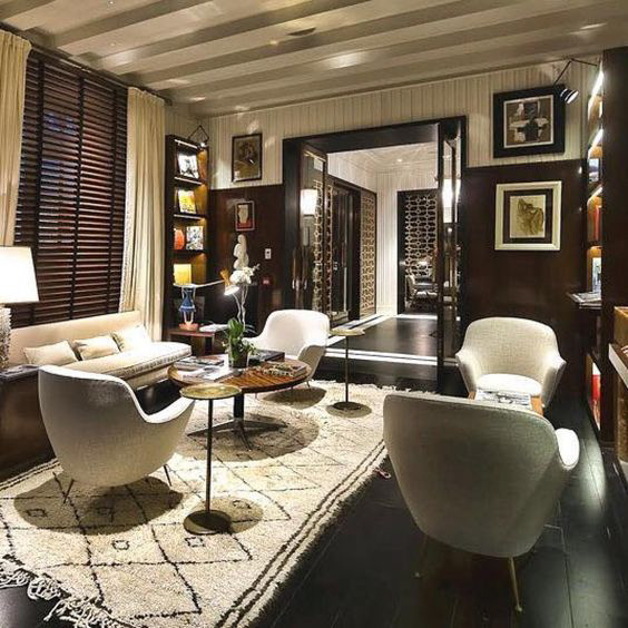
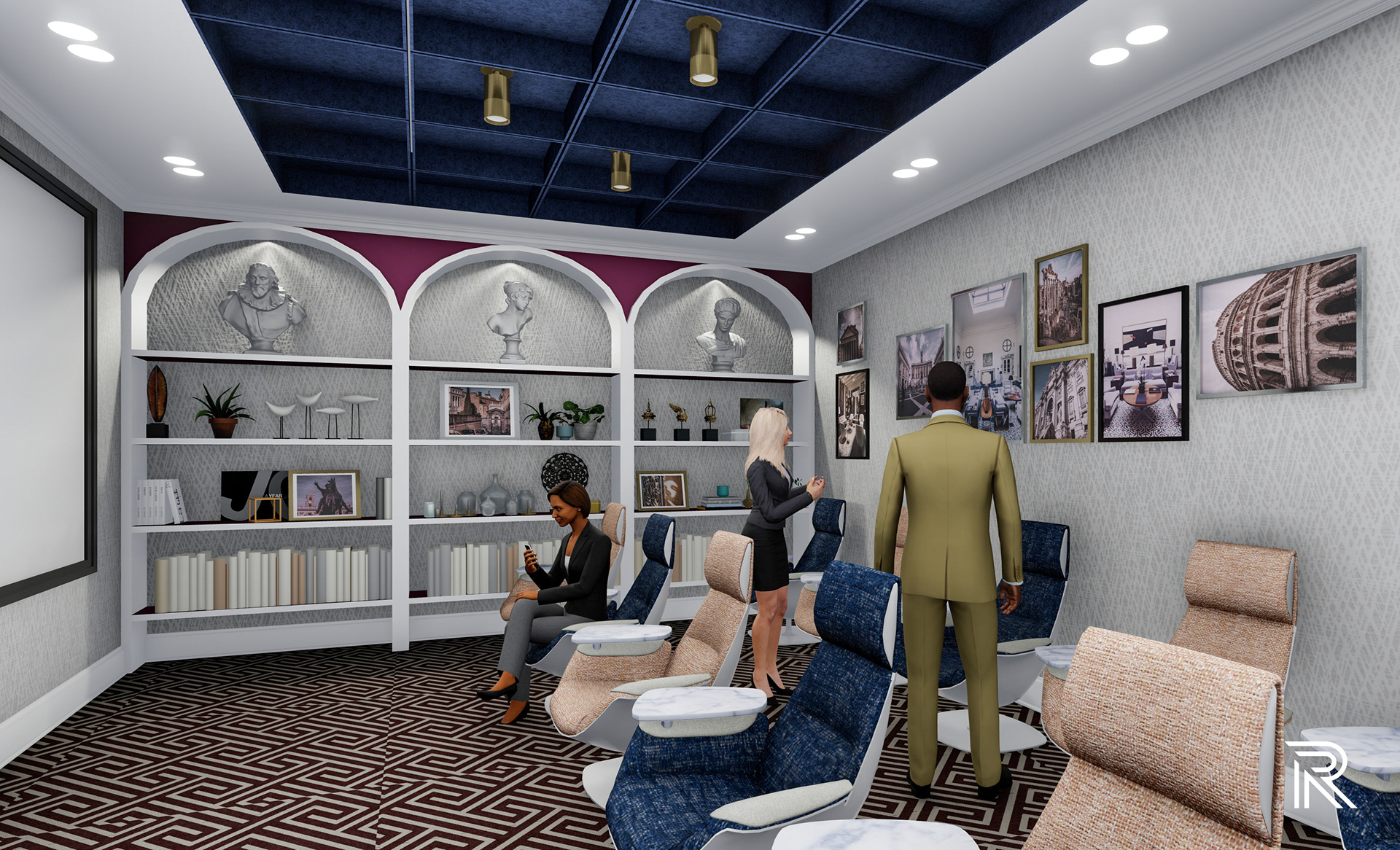
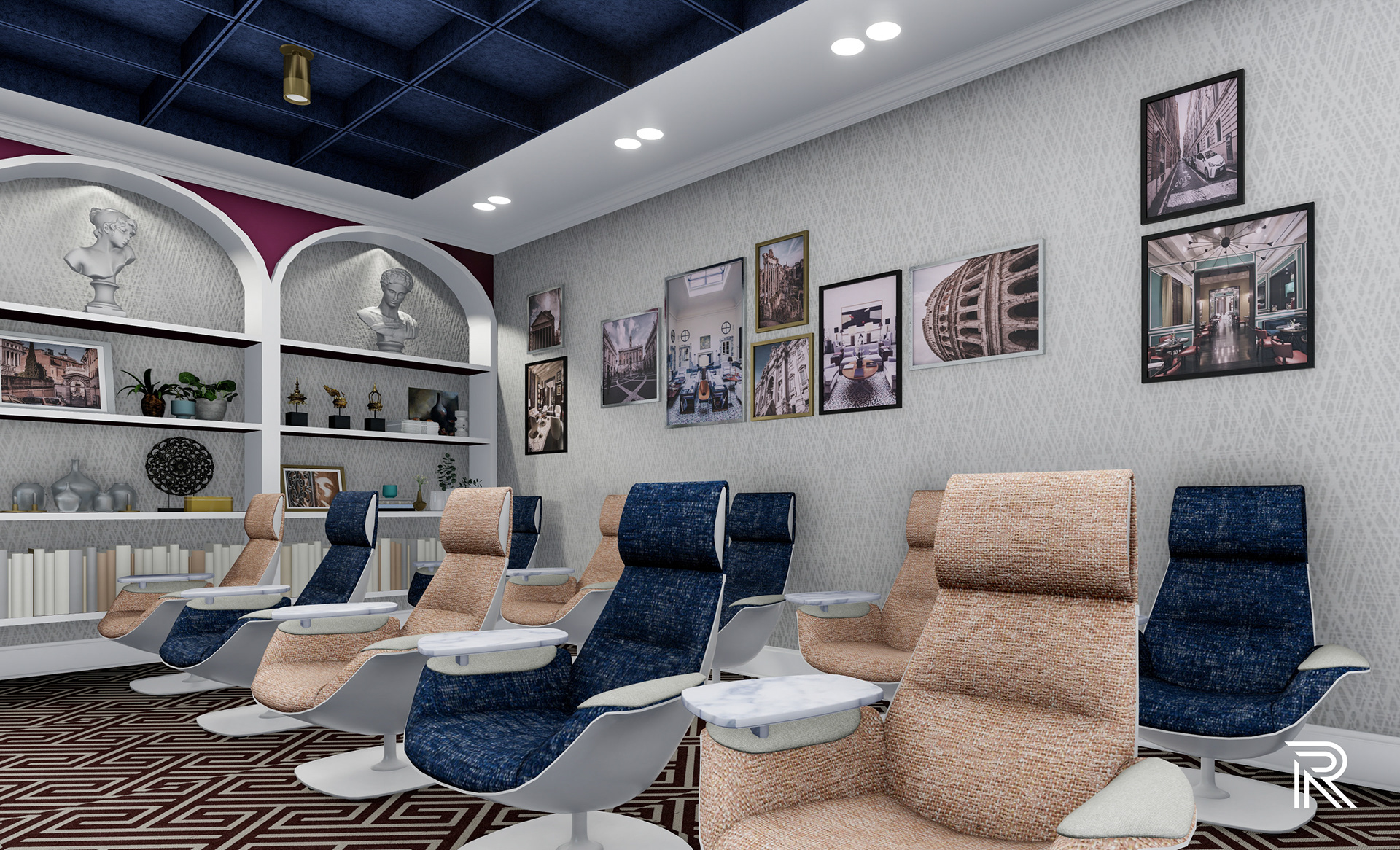
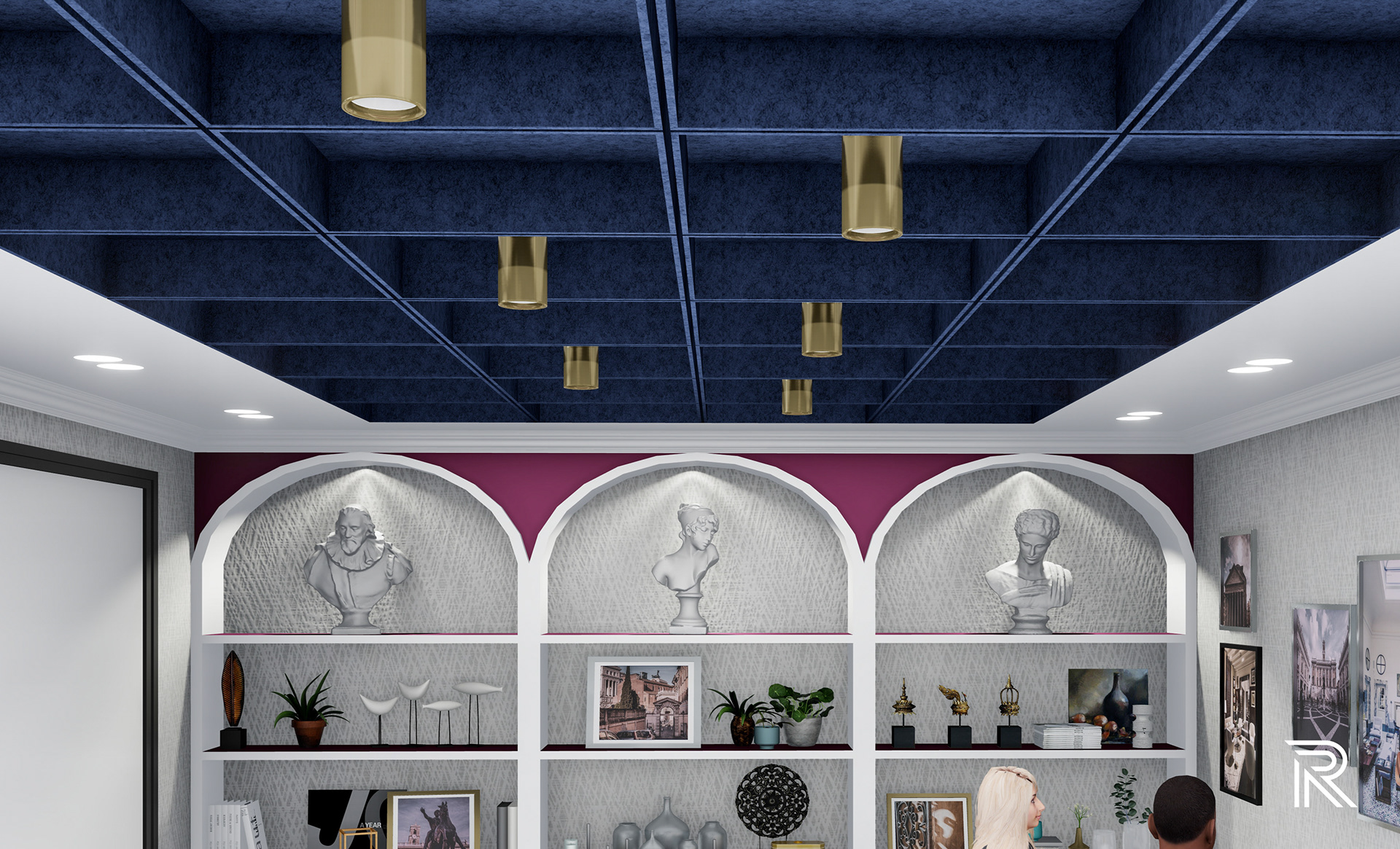
presentation room
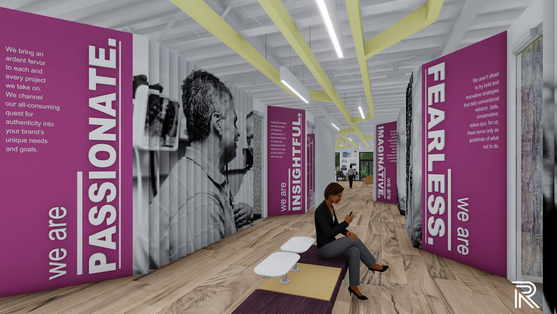
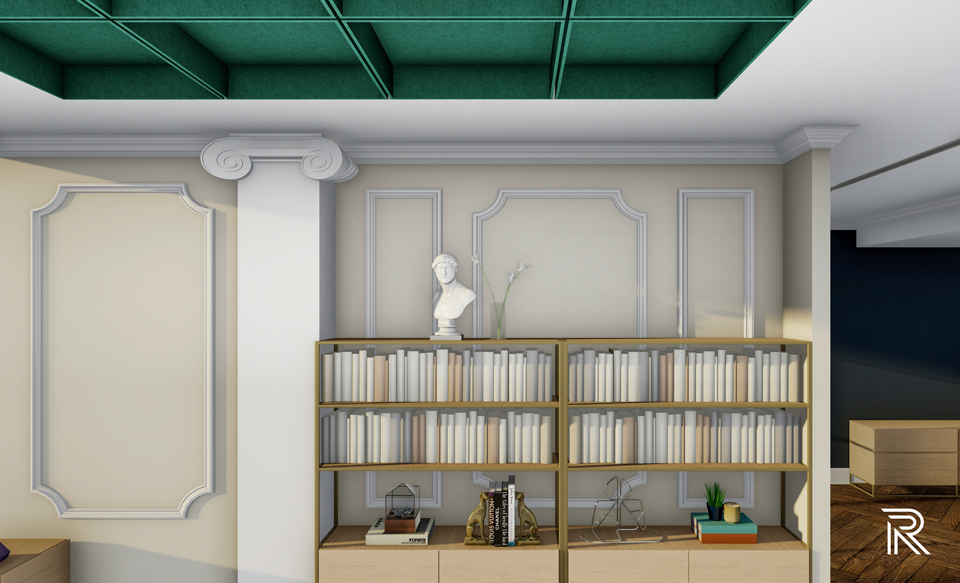
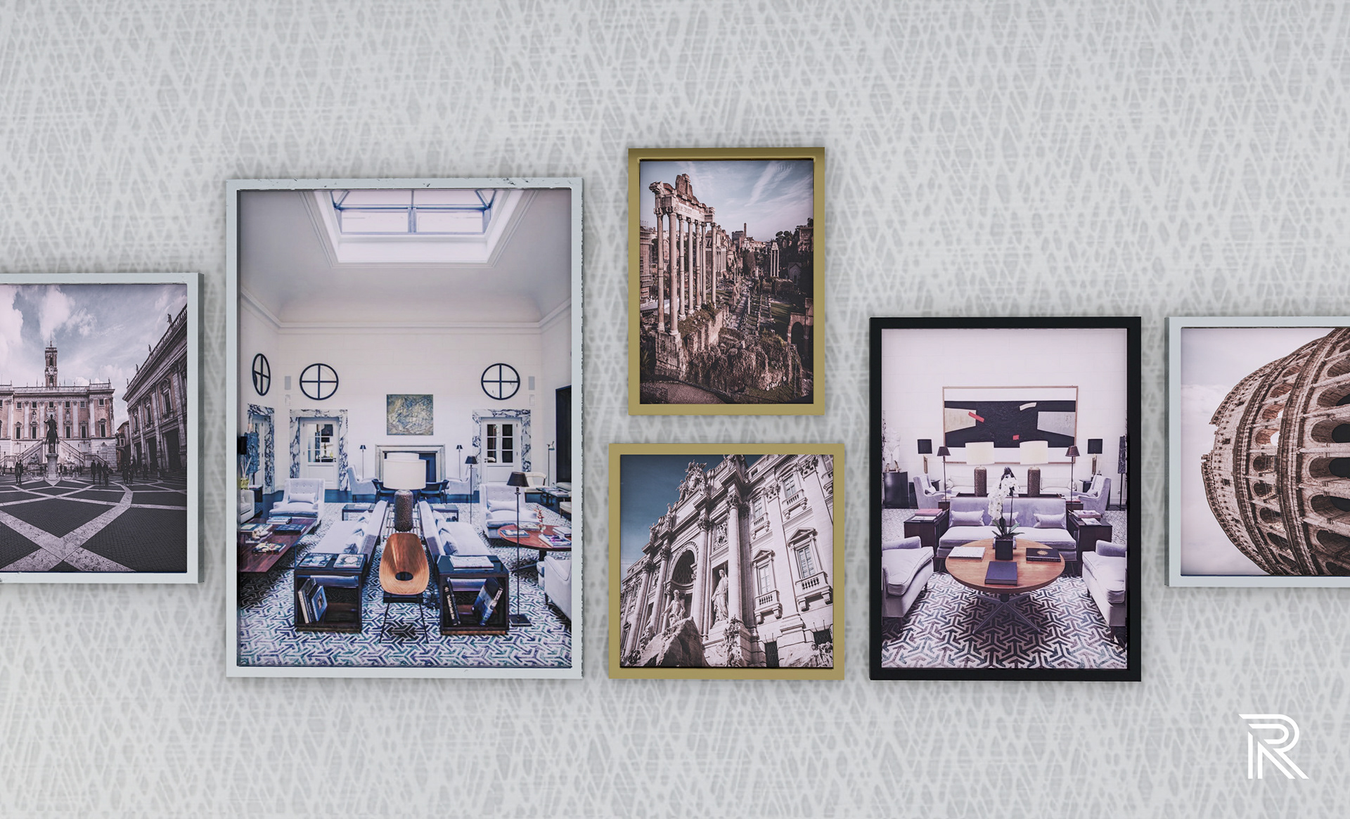
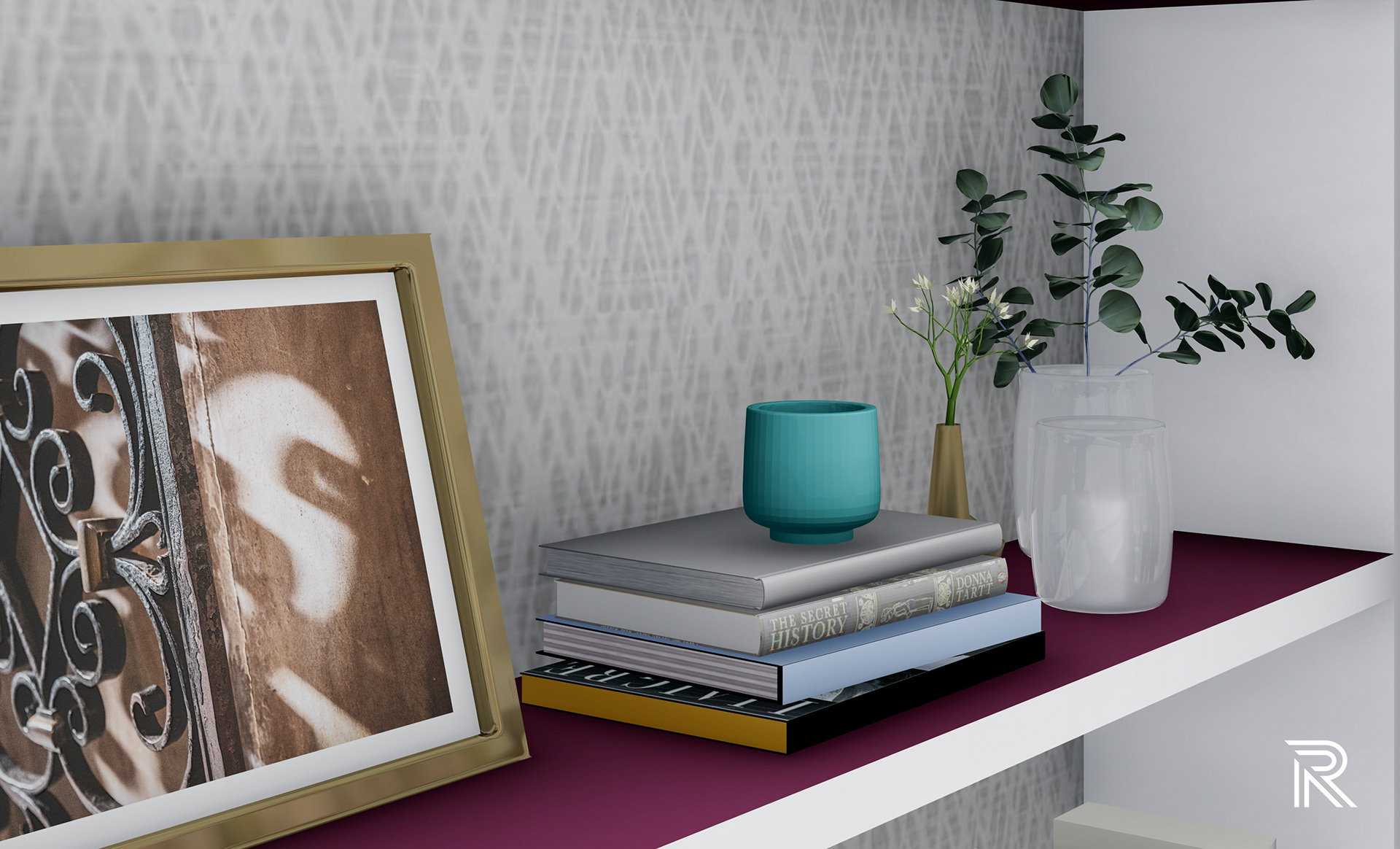
This space commemorates the origins of the brand and its Italian location by putting these elements on display in the form of photography and eclectic decorative pieces featured on an arch design bookshelf. I wanted this space to be more than a place of presentation, but also a reminder of what made the J.K. Place become what it is today through the impact of visual imagery. It sparks a conversation and demonstrates the success of the brand, which is the basis of this abstract way of thinking about the idea of transmission.
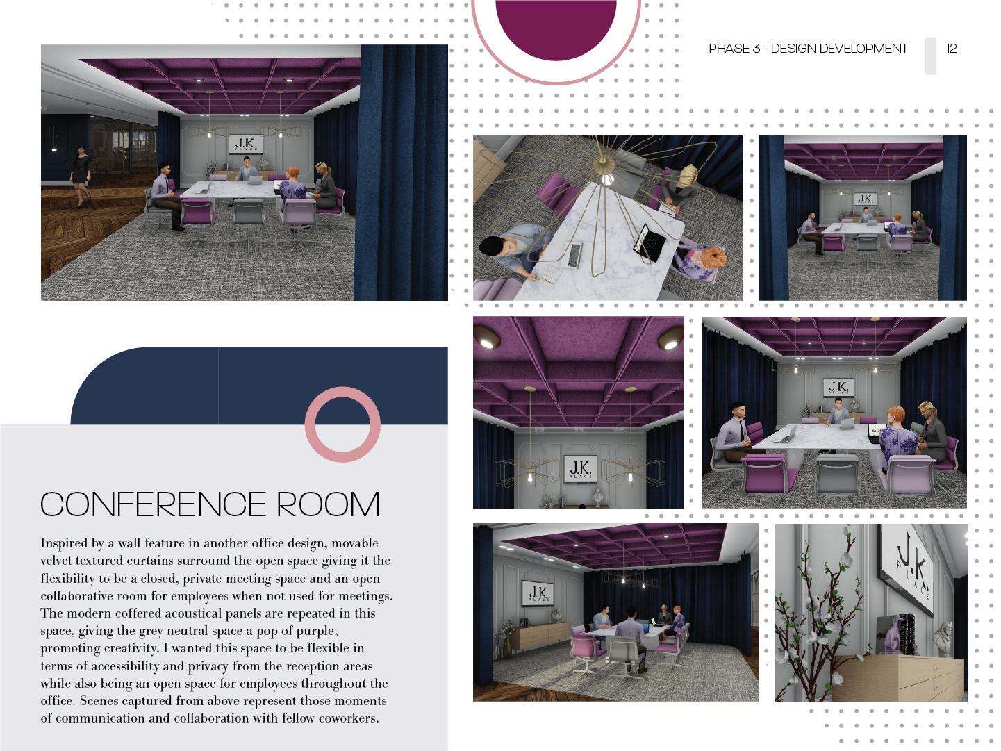
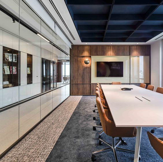
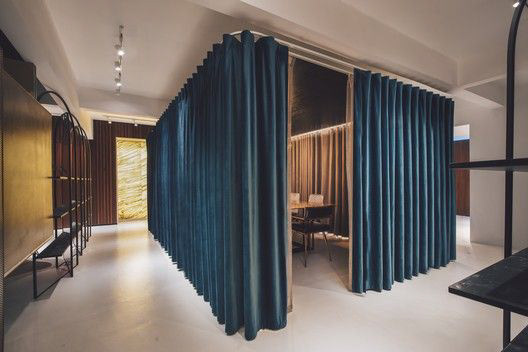
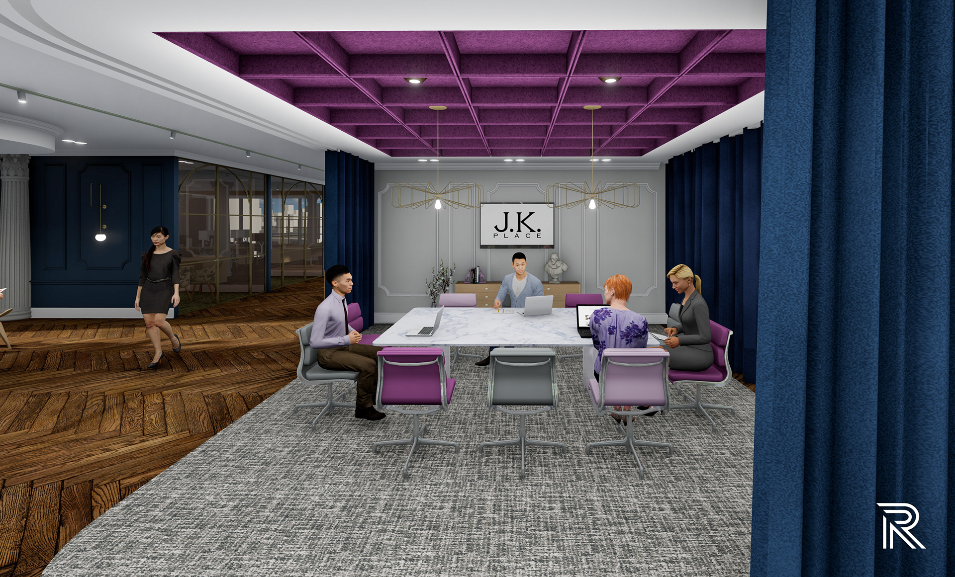
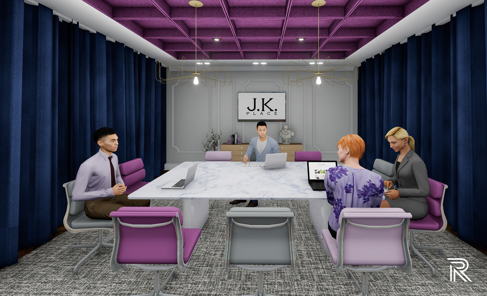
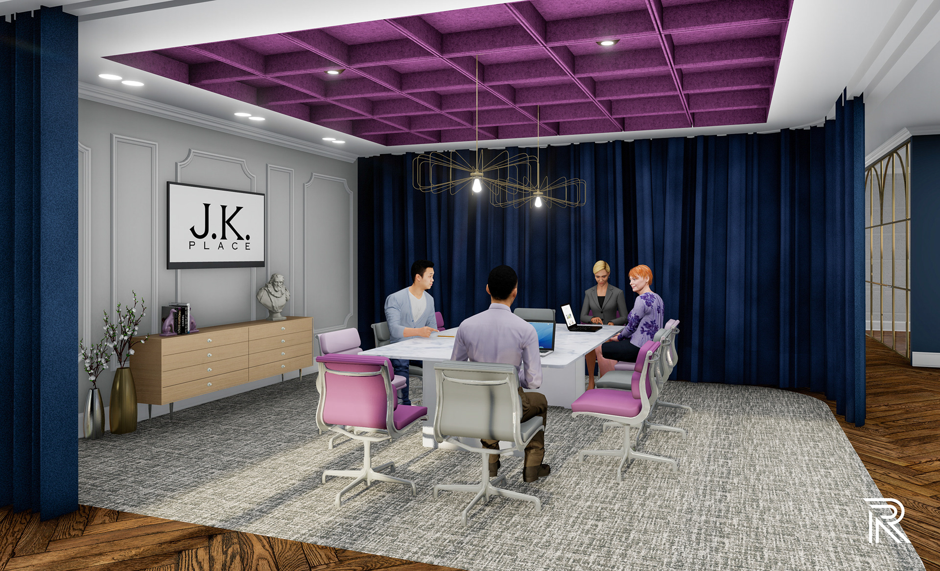
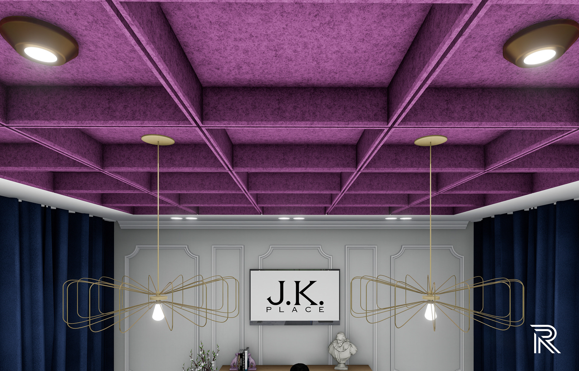
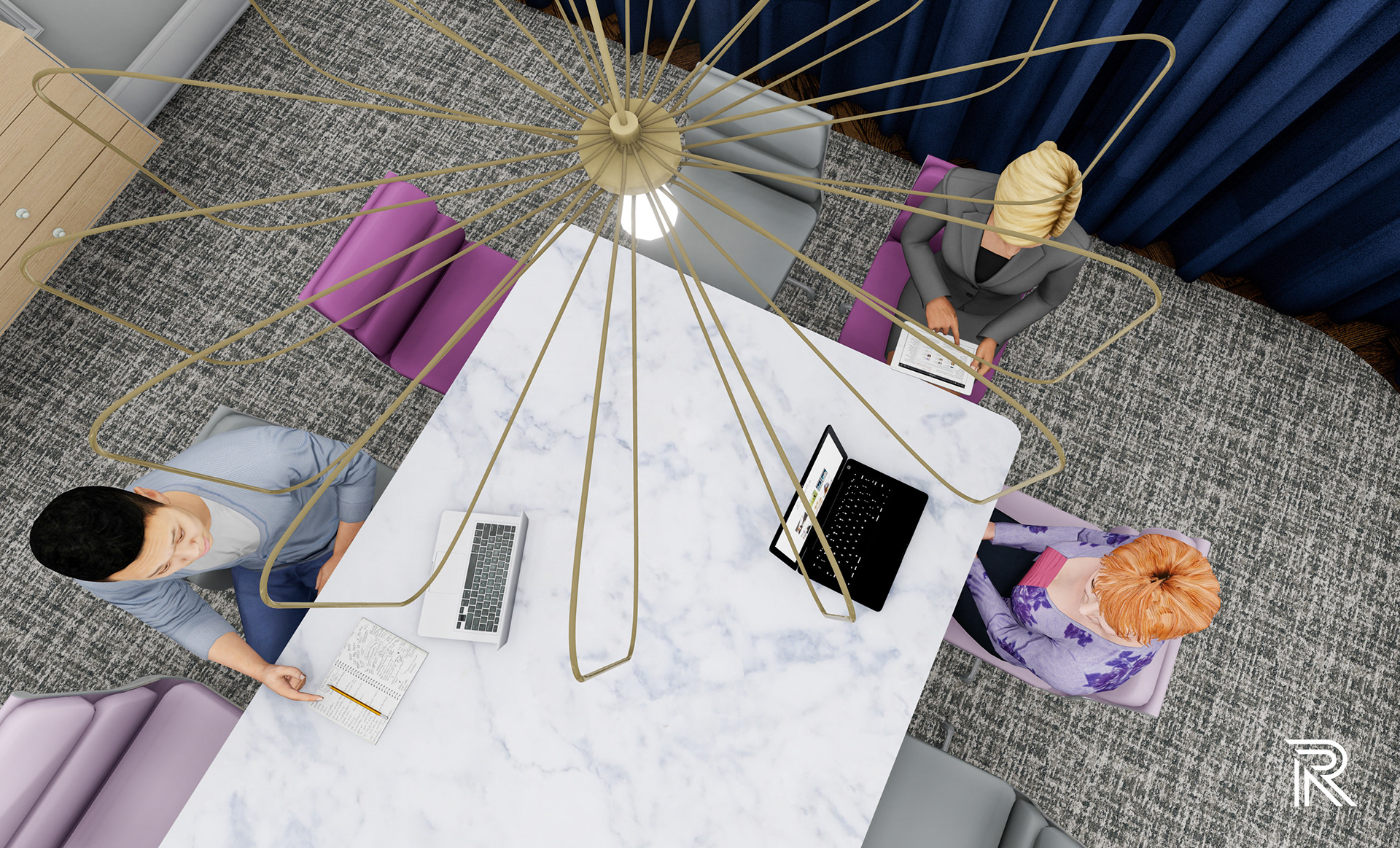
conference room
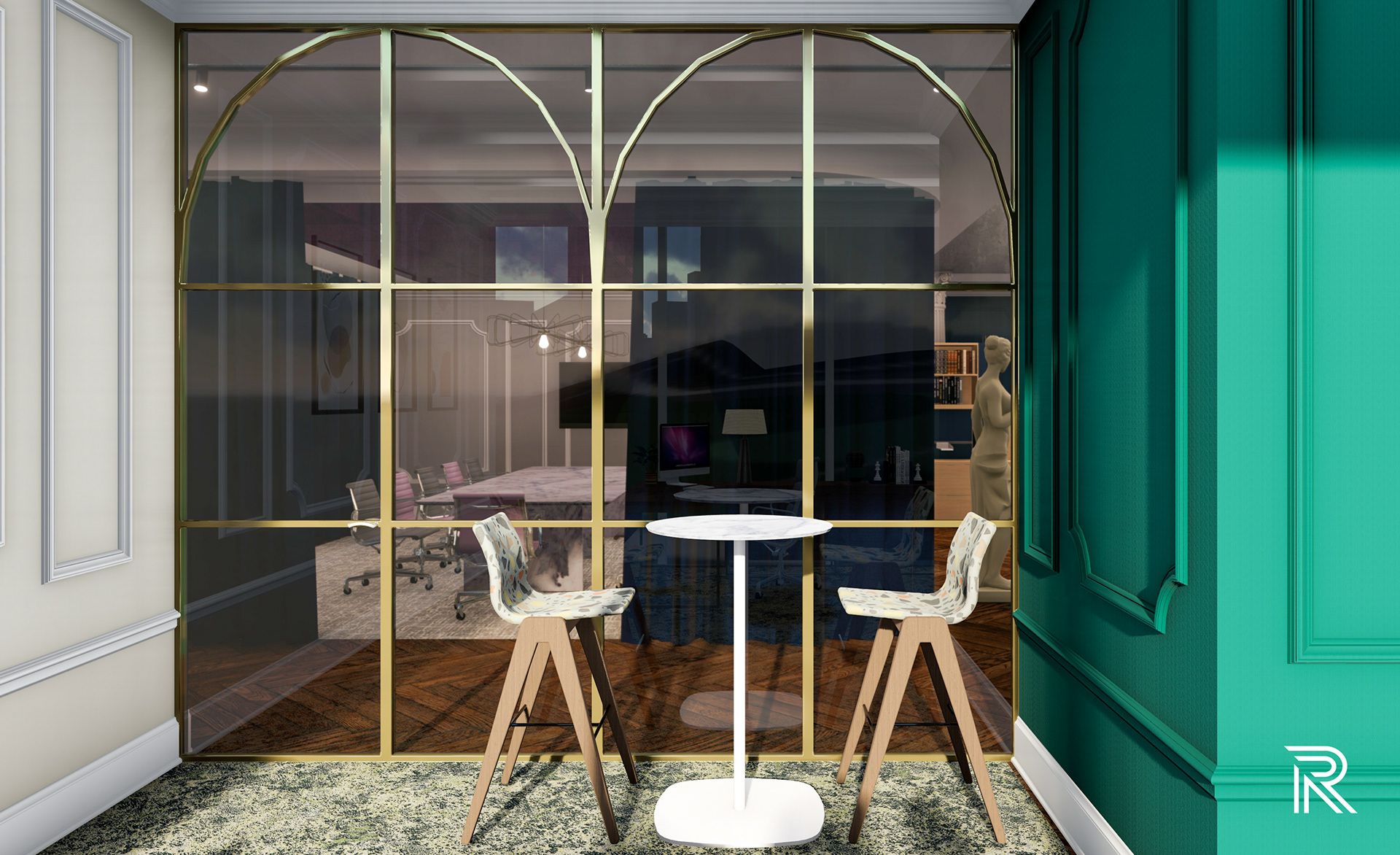
Inspired by a wall feature in another office design, movable velvet textured curtains surround the open space giving it the flexibility to be a closed, private meeting space and an open collaborative room for employees when not used for meetings. The modern coffered acoustical panels are repeated in this space, giving the grey neutral space a pop of purple, promoting creativity. I wanted this space to be flexible in terms of accessibility and privacy from the reception areas while also being an open space for employees throughout the office. Scenes captured from above represent those moments of communication and collaboration with fellow coworkers.
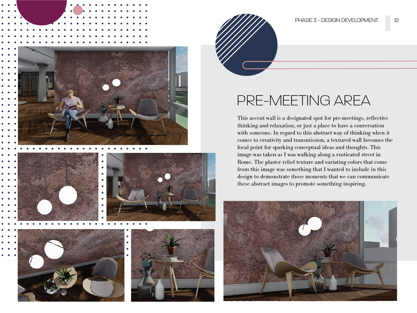
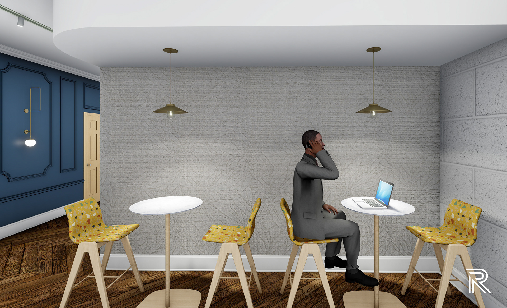
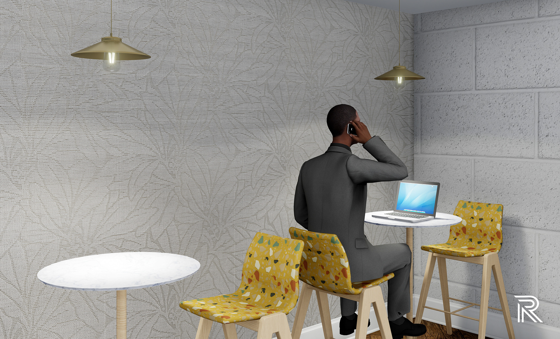
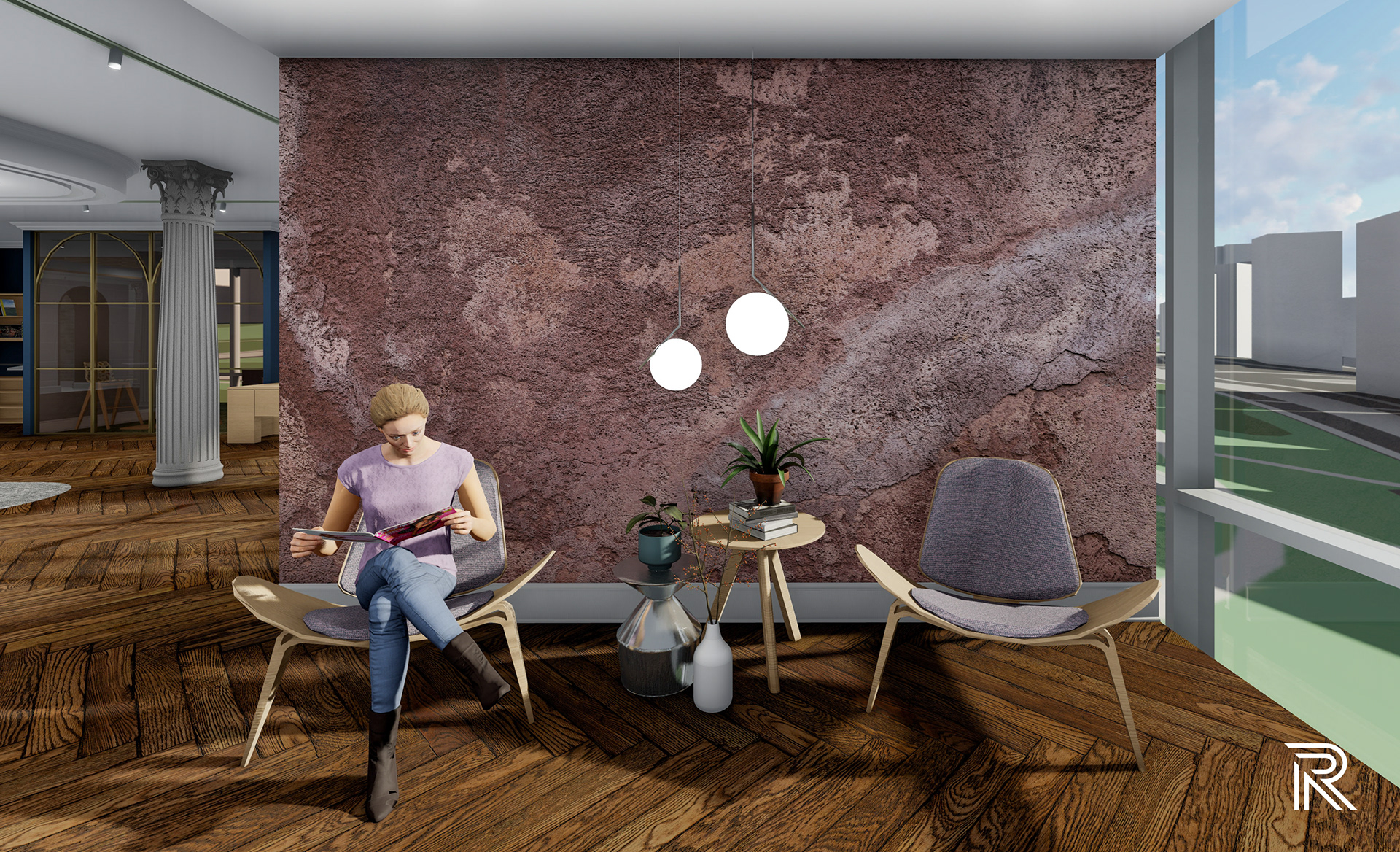
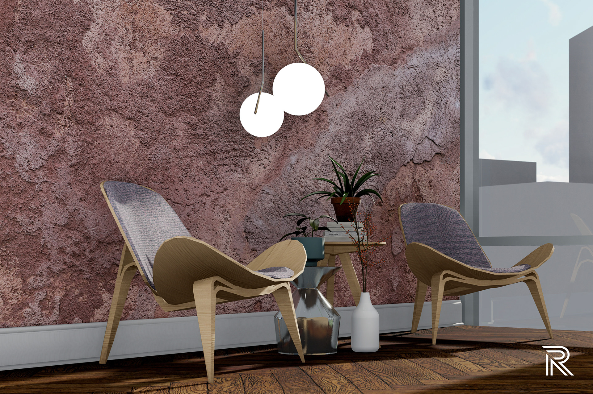
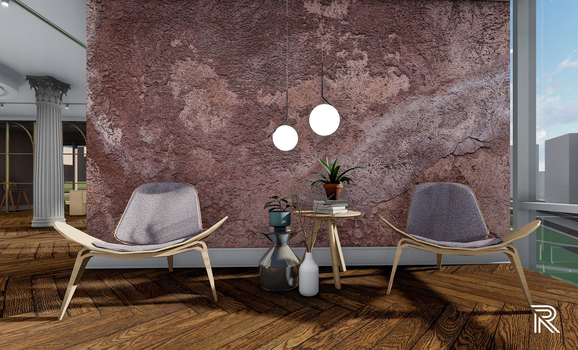
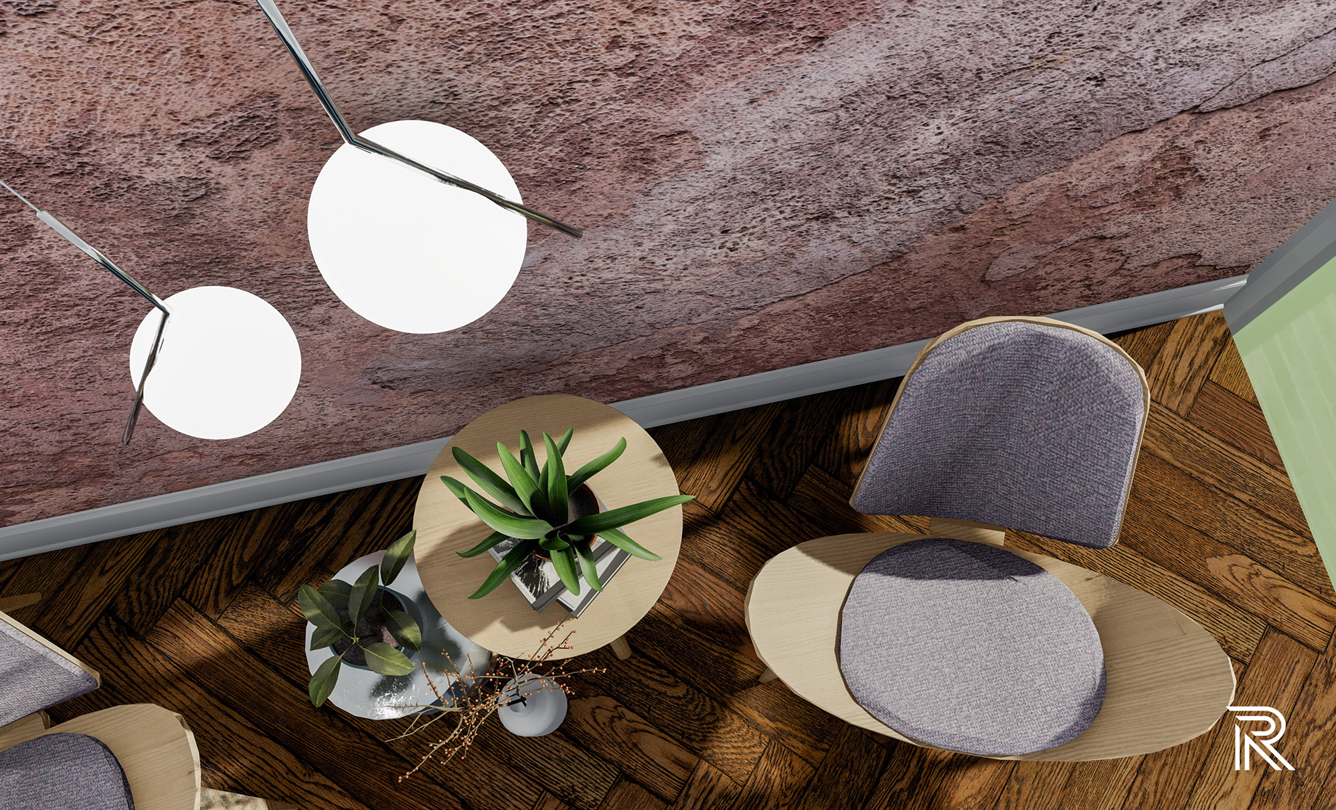
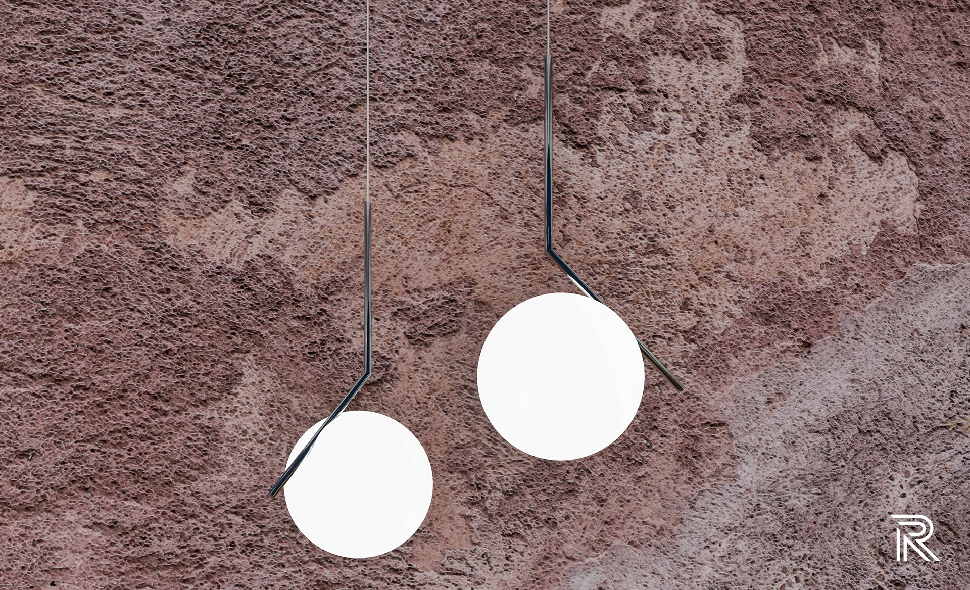
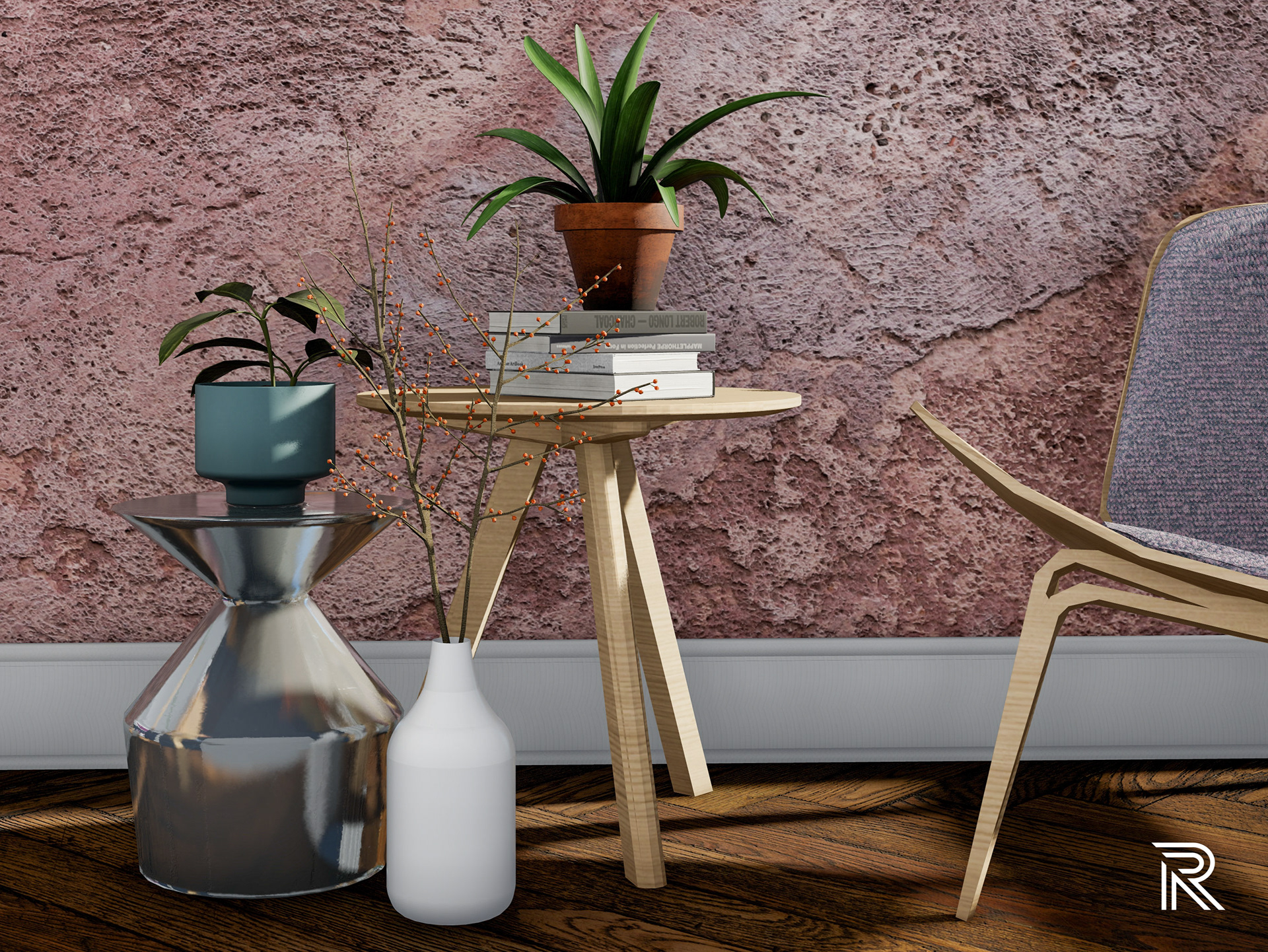
pre-meeting area
This accent wall is a designated spot for pre-meetings, reflective thinking and relaxation, or just a place to have a conversation with someone. In regard to this abstract way of thinking when it comes to creativity and transmission, a textured wall becomes the focal point for sparking conceptual ideas and thoughts. This image was taken as I was walking along a rusticated street in Rome. The plaster relief texture and variating colors that come from this image was something that I wanted to include in this design to demonstrate those moments that we can communicate these abstract images to promote something inspiring.
Presentation Document